Navigation
Install the app
How to install the app on iOS
Follow along with the video below to see how to install our site as a web app on your home screen.
Note: This feature may not be available in some browsers.
More options


You are using an out of date browser. It may not display this or other websites correctly.
You should upgrade or use an alternative browser.
You should upgrade or use an alternative browser.
News New Western Bulldogs logo?
- Thread starter Mr Eagle
- Start date
- Tagged users None

- Apr 26, 2003
- 3,030
- 545
- AFL Club
- North Melbourne
- Other Teams
- Fitzroy, AS Roma, Italy, Melb Storm
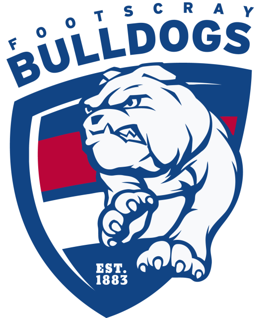
Bloody ripper logo.Ahh, ATMOSS. The gift that keeps on giving just gave a little more.
(and the mis-shapen shield has now officially been overdone. You heard it here first)
I'm not sure if I like amputee dog much more than Robo dog.
Yep, it's rubbish IMO.
Looks like a two legged dog without a body.
Maybe they should give the poor pup some back wheels.
Hank93
Brownlow Medallist
Anyone able to edit the logo with the back legs?
- Aug 21, 2007
- 31,669
- 99,021
- AFL Club
- Port Adelaide
- Other Teams
- Aston Villa, San Antonio Spurs
Adding the back legs would make it look far, far too crowded and messy. The Bulldog isn't perfect but the layout is fine.
I don't like the text being curved around the shield in some mockups here either, it looks better straight and bold.
I don't like the text being curved around the shield in some mockups here either, it looks better straight and bold.
Adding the back legs would make it look far, far too crowded and messy. The Bulldog isn't perfect but the layout is fine.
I don't like the text being curved around the shield in some mockups here either, it looks better straight and bold.
Doesn't even need the back legs, just to look like it actually has a body.
I don't think the dog necessarily needs back legs but it does need to stop floating above the shield if it does only have 2 legs. A problem which lmach fixed, along with a few others.
Hopefully they've made some improvements since it was released 2 years ago. It looks so disjointed and unfinished.
They could also just cut out the legs all together and just use the head which might look a bit more normal.
Hopefully they've made some improvements since it was released 2 years ago. It looks so disjointed and unfinished.
RedStarUncle
Senior List
It reminds me a lot of this...


Lighthouse End
Barracouta For Life
- Jul 29, 2014
- 169
- 105
- AFL Club
- Port Adelaide
- Other Teams
- Queenscliff (ex player 77-84,94-97)
I wonder if anyone else might have noted or commented on this - their 'new ' jumper design?? They nicked this design from Queenscliff. Except they made the collar and cuffs royal blue. ANd didn't they also wear this design in the 50s and 60s as well?Like how they've integrated the new jumper design into the logo, but I'm really not sure about the actual bulldog they've used. Bout a 6 out of 10 from me.
It is an old design that they've brought back- hence their new (as in updated) design. Also, designs aren't stolen or copied as such, rather, they are re used. You could say Essendon and Richmond stole from the other, but we don't. There are huge amounts of clubs that have the same designs, but we don't say the junior club stole Essendons jumper. Plus, if the Bulldogs wore it in the 50s and 60s, then I'm pretty sure that Queenscliff stole (for lack of a better term) it from them, not the other way around.I wonder if anyone else might have noted or commented on this - their 'new ' jumper design?? They nicked this design from Queenscliff. Except they made the collar and cuffs royal blue. ANd didn't they also wear this design in the 50s and 60s as well?
TheHoneyBadger
"I lost my phone"
- Sep 17, 2012
- 13,060
- 18,201
- AFL Club
- Western Bulldogs
- Other Teams
- Footscray
Nicked it from Queenscliff?I wonder if anyone else might have noted or commented on this - their 'new ' jumper design?? They nicked this design from Queenscliff. Except they made the collar and cuffs royal blue. ANd didn't they also wear this design in the 50s and 60s as well?
Wore it for over 70 years in the VFA/VFL, adopting it for the first time in 1901.
Lighthouse End
Barracouta For Life
- Jul 29, 2014
- 169
- 105
- AFL Club
- Port Adelaide
- Other Teams
- Queenscliff (ex player 77-84,94-97)
Maybe it was Brendan McCartney's idea, as homage to the club and guernsey that gave him numerous headaches when he was coaching Ocean Grove? Have the Bulldogs changed their theme song to ' Sons Of The Sea ' as well??It is an old design that they've brought back- hence their new (as in updated) design. Also, designs aren't stolen or copied as such, rather, they are re used. You could say Essendon and Richmond stole from the other, but we don't. There are huge amounts of clubs that have the same designs, but we don't say the junior club stole Essendons jumper. Plus, if the Bulldogs wore it in the 50s and 60s, then I'm pretty sure that Queenscliff stole (for lack of a better term) it from them, not the other way around.
lmach
Naitanui2Yeo
Queenscliff have been around since 1884.Plus, if the Bulldogs wore it in the 50s and 60s, then I'm pretty sure that Queenscliff stole (for lack of a better term) it from them, not the other way around.
who the * are Queenscliff
lmach
Naitanui2Yeo
I thought the same thing until I Googled them...who the **** are Queenscliff
Shame on Footscray for stealing from GLORIOUS QUEENSCLIFF
Lighthouse End
Barracouta For Life
- Jul 29, 2014
- 169
- 105
- AFL Club
- Port Adelaide
- Other Teams
- Queenscliff (ex player 77-84,94-97)
That was a clash Guernsey for matches against Portarlington , who wear Melbourne's traditional red and blue Guernsey. They also experimented for a time in the mid 80s with Footscray's vertical band design of that era and that is still the design on the club's merchandising Rugby tops except the blue is more of a navy than a royal.Haha Queenscliff haven't worn that jumper for longer than Footscray, not that I'm aware of. I'm pretty sure up until the end of 2007 the Coutas wore a vertically striped red white and blue jumper
- Moderator
- #194
That was a clash Guernsey for matches against Portarlington , who wear Melbourne's traditional red and blue Guernsey. They also experimented for a time in the mid 80s with Footscray's vertical band design of that era and that is still the design on the club's merchandising Rugby tops except the blue is more of a navy than a royal.
Interesting, I guess the clash guernsey hasn't been needed since Port reverted to the navy blue
Although the Queenscliff/Barwon Heads jumper clash isn't great
Lighthouse End
Barracouta For Life
- Jul 29, 2014
- 169
- 105
- AFL Club
- Port Adelaide
- Other Teams
- Queenscliff (ex player 77-84,94-97)
No, it is pretty hard on the eye..was one of the two games I made it back for this season and once the ball was at the Crows Nest end ( I was behind the goals at the Ocean View carpark or lighthouse end ) it was hard to distinguish between them. Actually the ' Macleans gelstripe ' guensey was quite a striking one, I would like to see them adopt it for more games. Similarly I would actually like to see them totally break with tradition and adopt Port Adelaide's colours of black white, silver and teal as these would be quite symbolic for Queenscliff, black and white for the lighthouses, and teal for the sea. And of course, a silver ' Barracouta ' on the front.Interesting, I guess the clash guernsey hasn't been needed since Port reverted to the navy blue
Although the Queenscliff/Barwon Heads jumper clash isn't great
Also I correct my above post where I refer to ' vertical band ' , I was referring to Footscray's horizontal one red and two white bands across the centre.
Last edited:
lmach
Naitanui2Yeo
Are you the Queenscliff version of Roylion?No, it is pretty hard on the eye..was one of the two games I made it back for this season and once the ball was at the Crows Nest end ( I was behind the goals at the Ocean View carpark or lighthouse end ) it was hard to distinguish between them. Actually the ' Macleans gelstripe ' guensey was quite a striking one, I would like to see them adopt it for more games. Similarly I would actually like to see them totally break with tradition and adopt Port Adelaide's colours of black white, silver and teal as these would be quite symbolic for Queenscliff, black and white for the lighthouses, and teal for the sea. And of course, a silver ' Barracouta ' on the front.
Also I correct my above post where I refer to ' vertical band ' , I was referring to Footscray's horizontal one red and two white bands across the centre.
Last edited:
RedmanWasHere
Rarely in kitchens at parties.
- Aug 23, 2010
- 26,864
- 29,588
- AFL Club
- Essendon
- Other Teams
- Exers, Gryffindor, Rich+Ess AFLW, Tassie
Any word on when it'll be officially unveiled and put into use?
Trade period, draft time or whatever?
Trade period, draft time or whatever?
Sights
Senior List
- Nov 2, 2011
- 211
- 159
- AFL Club
- Western Bulldogs
- Other Teams
- Footscray, Arsenal, Inter, Williams
Interesting pick up by one of the guys about the "Since 1883" not being there. Pretty big improvement if you ask me.
And also they're still the 'Western' Bulldogs.
Last edited:
- Thread starter
- #200
Might be a minor font change with the text as well.
Similar threads
- Replies
- 1
- Views
- 411
- Replies
- 4
- Views
- 461
- Replies
- 15
- Views
- 2K
- Replies
- 3
- Views
- 577
