


- Sep 8, 2011
- 11,011
- 11,013
- AFL Club
- West Coast
Dockers if they went back the green and red (Which i hope happens)
Should back to purple and green. Red is one too many colours
Follow along with the video below to see how to install our site as a web app on your home screen.
Note: This feature may not be available in some browsers.
Dockers if they went back the green and red (Which i hope happens)
hmmm true but i still think the red still works with itShould back to purple and green. Red is one too many colours
hmmm true but i still think the red still works with it

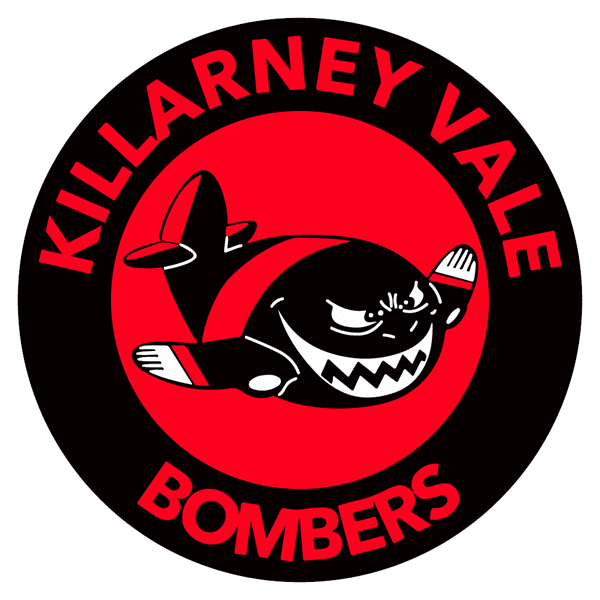
You spud, that's not even a bomber. That's a C-130 Hercules.View attachment 1484450
Heeeeaaavily inspired by Eastleigh FC. Seems odd that the Bombers haven't had a logo of a bomber actually flying up..
hey * you pal
I did this for a small club on the coast, never heard back thoughView attachment 1484450
Heeeeaaavily inspired by Eastleigh FC. Seems odd that the Bombers haven't had a logo of a bomber actually flying up..
.jpeg")
Yea Killarney Vale don't use this at all, but there's a few nice logos up here in the BDAFLI did this for a small club on the coast, never heard back though
View attachment 1485429
Yeah at the time they didn't have rights to the Bombers real logo, so i sketched this on my tablet. Thought it was pretty neat for what it wasYea Killarney Vale don't use this at all, but there's a few nice logos up here in the BDAFL
There logo is pretty much what you had but with the Bombers logo. But they also use this older logo sometimes.Yeah at the time they didn't have rights to the Bombers real logo, so i sketched this on my tablet. Thought it was pretty neat for what it was
Well the original brief was to basically do what they had but had a bit of free reign with font choice, and a re-do of the Bomber was required. So really my logo is theirs lolThere logo is pretty much what you had but with the Bombers logo. But they also use this older logo sometimes.


The Collingwood one gives off great Spurs vibesSome slight updates to some of my logos. Just redoing some of the linework mainly.
View attachment 1515428
View attachment 1515425
View attachment 1515424
There logo is pretty much what you had but with the Bombers logo. But they also use this older logo sometimes.
With Essendon's recent history, it suits pretty well...That third logo with the smiling plane with hands is adorable.
I don't think cute is something you want to go for for a footy club though lol.

Outstanding idea and feels like a no-brainer on-sight.
Ding ding with Spud being the inspiration for doing a punch. I recall seeing a great picture of him punching the ball away and it just had a good silhouette to it.The Lockett and The Frawley?
Ding ding with Spud being the inspiration for doing a punch. I recall seeing a great picture of him punching the ball away and it just had a good silhouette to it.
If I was to do a Lockett stickman it'd need a bit more pudding in the mid-section tho.


