Portfolio Nitpicking Club Logos

Remove this Banner Ad

Was mucking around with our current logo and wanted to see what it looked like with the Port Panel in there.

Forcing the monograms colour to be inverted, also shifting the 1870 up the top (like it is on the back of the jumper).

I feel it has a slightly more Port Adelaide look to it, but do you guys reckon there is too much white?

bcbaf04f7a6baeb825f7a0d1e68d0c2f.jpg 72173120_10156997201953882_3668669942217048064_o.jpg
 
Last edited:

Log in to remove this ad.

Was mucking around with our current logo and wanted to see what it looked like with the Port Panel in there.

Forcing the monograms colour to be inverted, also shifting the 1870 up the top (like it is on the back of the jumper).

I feel it has a slightly more Port Adelaide look to it, but do you guys reckon there is too much white?

View attachment 869690View attachment 869685
It just doesn't work. It can stay a jumper element for mine, no need to use it in your logo.
 
It kind of annoys me that Carlton adopted their jumper monogram as primary logo (due to puma sponsorship?), their previous logo looks very strong and traditional compared to some of the modernised logos in the AFL. But It also annoys me that the previous logo and jumper monograms don't align.

Combining the previous logo and jumper monogram doesn't look as bad as I thought it might, I think either of these two options looks better than just the monogram by itself (the larger monogram without grey details is my preference).


View attachment Carlton_logo.pngView attachment Carlton_logo2.png
 
It kind of annoys me that Carlton adopted their jumper monogram as primary logo (due to puma sponsorship?), their previous logo looks very strong and traditional compared to some of the modernised logos in the AFL. But It also annoys me that the previous logo and jumper monograms don't align.

Combining the previous logo and jumper monogram doesn't look as bad as I thought it might, I think either of these two options looks better than just the monogram by itself (the larger monogram without grey details is my preference).

View attachment 873949View attachment 873950
The first one is probably the best attempt I've seen combining the two, but you can tell the wreathed logo was designed to fit around the round modern monogram. It would take a lot of time to have a fitted logo involving a less refined monogram.
 
The first one is probably the best attempt I've seen combining the two, but you can tell the wreathed logo was designed to fit around the round modern monogram. It would take a lot of time to have a fitted logo involving a less refined monogram.

Yeah thats very true, would be interesting to see a version where the wreath and ribbon followed the curve of the outer C, make the whole thing more of an oval shape. I don't have the nous to make that but would be cool to see.
 
It kind of annoys me that Carlton adopted their jumper monogram as primary logo (due to puma sponsorship?), their previous logo looks very strong and traditional compared to some of the modernised logos in the AFL. But It also annoys me that the previous logo and jumper monograms don't align.

Combining the previous logo and jumper monogram doesn't look as bad as I thought it might, I think either of these two options looks better than just the monogram by itself (the larger monogram without grey details is my preference).


View attachment 873949View attachment 873950

Carlton's jumper monogram is perfect as an iconic symbol of the club and it looks great on club apparel, but I think the logo with the laurels and the shield would look better on memberships, club buildings, letterheads etc. Having two logos is a good way to go, North do it, Brisbane do it, and there's probably more examples I can't think of right now. A lot of clubs use a traditional monogram alongside their regular logo. I think it makes sense for Carlton especially because the jumper CFC existed alongside the fancy club logo CFC for decades.
 
Carlton's jumper monogram is perfect as an iconic symbol of the club and it looks great on club apparel, but I think the logo with the laurels and the shield would look better on memberships, club buildings, letterheads etc. Having two logos is a good way to go, North do it, Brisbane do it, and there's probably more examples I can't think of right now. A lot of clubs use a traditional monogram alongside their regular logo. I think it makes sense for Carlton especially because the jumper CFC existed alongside the fancy club logo CFC for decades.
Monograms generally do look better.
 
Carlton's jumper monogram is perfect as an iconic symbol of the club and it looks great on club apparel, but I think the logo with the laurels and the shield would look better on memberships, club buildings, letterheads etc. Having two logos is a good way to go, North do it, Brisbane do it, and there's probably more examples I can't think of right now. A lot of clubs use a traditional monogram alongside their regular logo. I think it makes sense for Carlton especially because the jumper CFC existed alongside the fancy club logo CFC for decades.
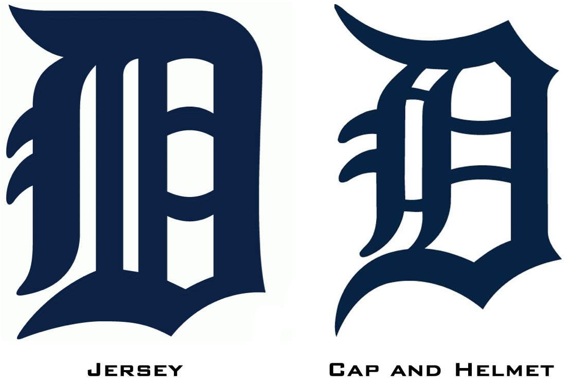
Agreed. Old clubs in the US do it as well. See the Yankees and Tigers:
yankeelogos.png

14141847831_db71817c33_o.png
 
Agreed. Old clubs in the US do it as well. See the Yankees and Tigers:
yankeelogos.png

14141847831_db71817c33_o.png

makes perfect sense. you want something different for a playing strip than what you'd want in a more formal setting. I think Carlton's 2000s monogram particularly looked worse because they went from a logo with lots of sharp corners and blocky letters to a very rounded, smooth one. It just looks less threatening to the human brain
 

(Log in to remove this ad.)

Carlton's jumper monogram is perfect as an iconic symbol of the club and it looks great on club apparel, but I think the logo with the laurels and the shield would look better on memberships, club buildings, letterheads etc. Having two logos is a good way to go, North do it, Brisbane do it, and there's probably more examples I can't think of right now. A lot of clubs use a traditional monogram alongside their regular logo. I think it makes sense for Carlton especially because the jumper CFC existed alongside the fancy club logo CFC for decades.
makes perfect sense. you want something different for a playing strip than what you'd want in a more formal setting. I think Carlton's 2000s monogram particularly looked worse because they went from a logo with lots of sharp corners and blocky letters to a very rounded, smooth one. It just looks less threatening to the human brain

Yeah 100% agree that the traditional jumper monogram is better than the modern rounded monogram.

They had a great primary logo design over the last few seasons with the wreathed logo, so if they combined the best of both worlds (traditional monogram inside wreathed logo as their primary) it could look really good.

Plus like you say the traditional monogram by itself would be a perfect secondary logo to use.

Bit of a side note but while on the topic of clubs using two logos, I personally think Geelong's secondary is by far and away better than their primary logo. The cat silhouette from the secondary logo could then almost be used as a secondary logo by itself.
 
FWIW I prefer the previous Carlton monogram, but understand the current one probably has more affection from Carlton fans (particularly on the jumper). I'd prefer it at least remain on/as the logo. Carlton fans are of course quite within their rights to tell me to get knotted!
 
no the wreaths logo should still have the fancy one in it, because it's a different context to the on field version. you want your club's official coat of arms to look fancy and traditional, and you want your on field gear to look rugged and threatening. no need to combine the two in any way.
 
no the wreaths logo should still have the fancy one in it, because it's a different context to the on field version. you want your club's official coat of arms to look fancy and traditional, and you want your on field gear to look rugged and threatening. no need to combine the two in any way.
100x this. Context matters. There's nothing wrong with a bit of brand inconsistency in the name of historical importance.
 
It kind of annoys me that Carlton adopted their jumper monogram as primary logo (due to puma sponsorship?), their previous logo looks very strong and traditional compared to some of the modernised logos in the AFL. But It also annoys me that the previous logo and jumper monograms don't align.

Combining the previous logo and jumper monogram doesn't look as bad as I thought it might, I think either of these two options looks better than just the monogram by itself (the larger monogram without grey details is my preference).


View attachment 873949View attachment 873950

Really annoyed me that the jumper monogram didn’t match the logo. They had an all time logo, went away from it, went back ~5 years ago and then go away from it again. ******* mindless club


Sent from my iPhone using BigFooty.com
 

Remove this Banner Ad

Back
Top