TheLoungeLizard
The world's most handsome man
Not a cluewho’s Hawthorn going with in 2022
Follow along with the video below to see how to install our site as a web app on your home screen.
Note: This feature may not be available in some browsers.
Not a cluewho’s Hawthorn going with in 2022
who’s Hawthorn going with in 2022
They do seem a little underwhelming. I personally thought your Adidas Guernsey from 2011-12 was your best one this century, the weird collar was disguised by the great Adidas Logo placing.
The '03 one was superbI liked all our Adidas guernseys except for the 09-10 one funnily enough.
Some of ISC’s were ok and the less said about Star the better.

Unrelated to the thread, but North are set to play the opening five weeks of the season in the same kit (home jumper, home shorts). Rounds 1, 3 and 4 were/are home games, while Round 2 was away to the Suns and Round 5 will be at the Cattery. Round 6 against Fremantle in Perth will see them wear the traditional white jumper for the first time in 2021.
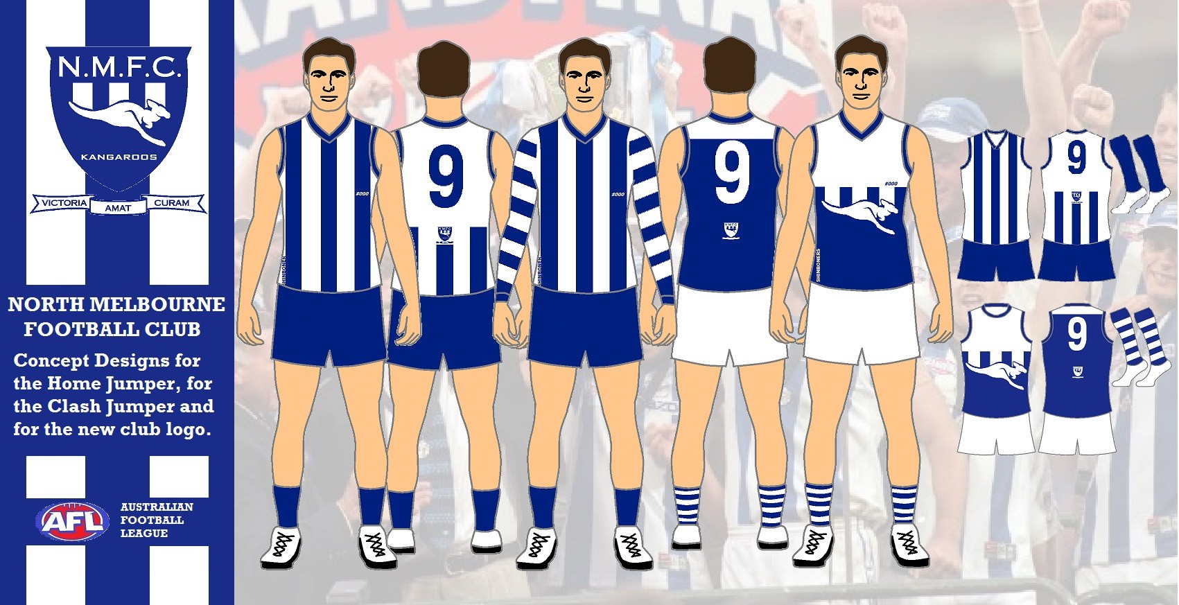
It's a very simple task for Puma, don't fu** it up.
- (Home) A white V-neck guernsey with a Thick Royal Blue Stripes/collar/cuffs (no sponsorship cut-offs) Royal Blue shorts and Royal Blue socks.
- (Away) The same guernsey, but with White shorts and Blue & White hooped socks
- (Clash) The Bounding Roo Guernsey from 2019 (perfected by the Puma design).

View attachment 1095995
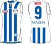
minor details i hate about the north melbourne jumper
1. the pinstripes are horrible
2. cutoff middle strip
3. shineboner on the side on the front of the jumper
4. the est.1869 does it even need to be there?
5. the mazda is big and cuts off way too much off the stripe, why can’t it be like how the mazda logo was from 1999-2008
6. the fact it’s white stripes on a blue jumper when it should be the other way around
all these minor details really bug me. because we had the best looking jumper till the started adding all these little details and made our jumper the worst looking jumper in the AFL
posted this in the another thread but hopefully if north goes with puma we can get things back to normal
It's a very simple task for Puma, don't fu** it up.
- (Home) A white V-neck guernsey with a Thick Royal Blue Stripes/collar/cuffs (no sponsorship cut-offs) Royal Blue shorts and Royal Blue socks.
- (Away) The same guernsey, but with White shorts and Blue & White hooped socks
- (Clash) The Bounding Roo Guernsey from 2019 (perfected by the Puma design).
This.I highly doubt Puma has much say in what the final product will be design wise.

Na that's the new Canterbury logo... trollololol
Different board I thinkMakes you wonder why North pushed the shorts issue so hard if they're going to be switching back.
Different board I think
If they do go back to nike, i would like richmond to scrap the back sash. honestly, it looks better.Richmond, Collingwood and Sydney. Those 3 clubs are Nike tier, so i won't be surprised if it ends that way. Poor west coast though. A big club that can't land a big apparel sponsor, lol.
Makes you wonder why North pushed the shorts issue so hard if they're going to be switching back.
The head of communications at North had a huge say in changing to predominantly blue a few years back and he’s accepted a job elsewhere this year. Whether that played a part in going back to white I doubt, but still worth remembering
If they do go back to nike, i would like richmond to scrap the back sash. honestly, it looks better.
I agree it looks better, but I just can't see the club going back to it now.If they do go back to nike, i would like richmond to scrap the back sash. honestly, it looks better.