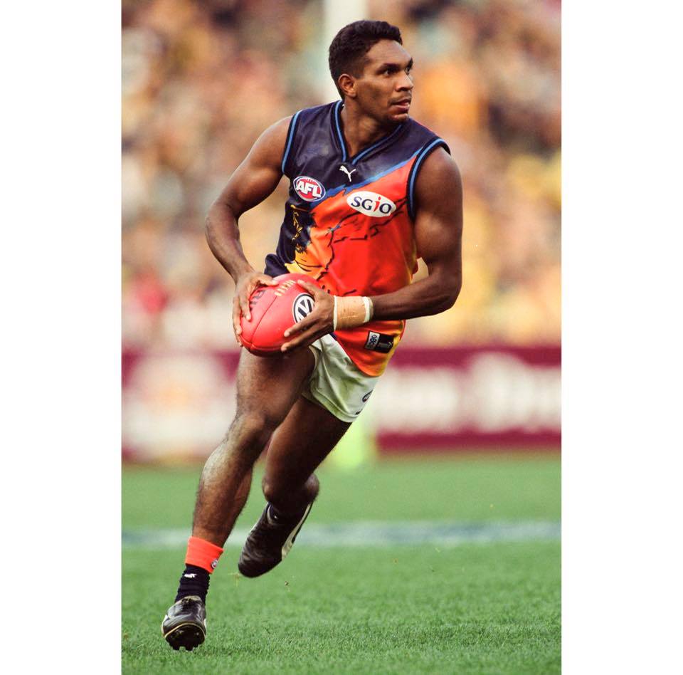
Ochre guernsey love thread

Remove this Banner Ad

Round 1, 2000 vs North - one of the two games we ever won in the ochre (the other being against Collingwood later that year).


I think this video goes to the root of the problem - The Ochre was only ever worn in away matches, so the majority of fans only ever saw it on TV. With such poor-quality SD pictures, the true glory of it was never seen. In todays HD era, The Ochre would be seen in its full brilliance in crisp, sharp detail and become loved by the masses.
 
I think this video goes to the root of the problem - The Ochre was only ever worn in away matches, so the majority of fans only ever saw it on TV. With such poor-quality SD pictures, the true glory of it was never seen. In todays HD era, The Ochre would be seen in its full brilliance in crisp, sharp detail and become loved by the masses.
tenor.gif
 

Log in to remove this ad.

I think this video goes to the root of the problem - The Ochre was only ever worn in away matches, so the majority of fans only ever saw it on TV. With such poor-quality SD pictures, the true glory of it was never seen. In todays HD era, The Ochre would be seen in its full brilliance in crisp, sharp detail and become loved by the masses.
Hopefully someone remembers as well, one of the years there was a little team photo sticker book to collect and the eagles wore this and the players had the socks pulled up! Best thing I’ve ever seen. May have been around 2000-2002 maybe? If someone happens to have one you’ll see it in full flight and it’s glorious
 
The ochre on a modern day template would look pretty schmick I reckon. Obviously wouldn't want to see it full time but I'd certainly have a laugh for a one off game. Oh and I would definitely buy it!

yeah I wouldnt mind seeing super dark navy, with ochre wings and eagle head with an electric blue outline, as an 'alternative' for one year.

I just think of BC and Gardi tearing it up on and off the field when I think of Ochre.

Watching that 2000 season opener, when did they start making the fields immaculate? The cricket pitch is patchy AF
 
This ochre love needs to be stamped out. Before it takes root.
I'm always a little worried that some time, someone somewhere might miss the fact that this whole thing is a huge piss-take.
The ochre is kind of like the swastika flag. It's a sad reminder of a tragic era that must never be forgotten, but must really never be repeated.

Ok, now back to pretending that some people actually dig it....

jfc that's a bit of a ****ed comparison to make.

But anyway, it's not a piss-take at all. The Ochre was actually a pretty neat and niche design and ahead of its' time - the colouring is wonderful and it actually does a decent job of representing the state with the outline, the red dirt and the blue oceans. Sure, there's the issues of it replacing the wings (wings are ofc the ideal) and the fat budgie/bald eagle (could have been done better) but overall it was a unique design that unfortunately existed during a time of poor form and a poorly executed club rebrand.

22540210_10155324126947224_5023850204621677598_n.jpg
 
jfc that's a bit of a ****** comparison to make.
I may have gone slightly too far with that one, I admit.

But anyway, it's not a piss-take at all. The Ochre was actually a pretty neat and niche design and ahead of its' time - the colouring is wonderful and it actually does a decent job of representing the state with the outline, the red dirt and the blue oceans. ... overall it was a unique design that unfortunately existed during a time of poor form and a poorly executed club rebrand.
It was so ahead of its time that it was ugly then, and is still ugly now, but at some point in the future people will be like "holy **** this is fantastic!!" and sadly the artist will not be fully appreciated until they have passed away, just like Monet.

Did I do it right? ;)

[Ok clearly I do not belong in this thread. I apologise and promise to stay out of here from now on.]
 

(Log in to remove this ad.)

The Ochre on it's own is a bold, unique, ground-breaking, don't-give-no-f*cks design, but it's true genius is only fully realised when taken in context of the one-two punch of the home and away combo. Having the 'flying eagle' spread across the tripanel home was ok but seeing that concept taken to the nth degree on the away was where it blew everything else away. So far ahead of its time we may never catch up, the way the universe is expanding exponentially and we will never be able to see certain galaxies.
 

Remove this Banner Ad

Back
Top