Official Carn The Pear T-Shirts

Remove this Banner Ad

I hate them. Sorry.

And that's completely okay. To each their own and all that.

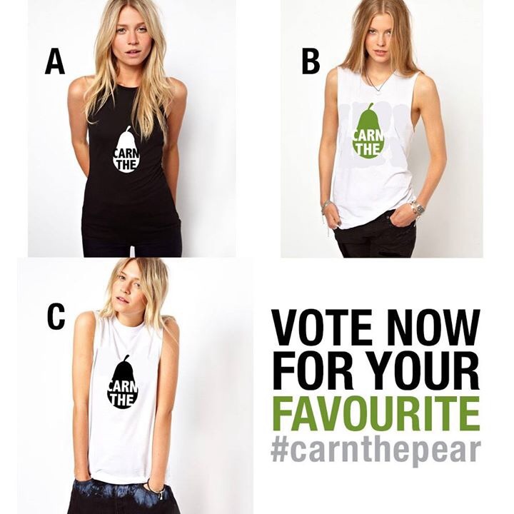
But what's exceedingly irritating is the naysaying tsunami whenever understated/'everyday' merch is attempted by the club who scream the place down because 1) ITS TOO AMERICAN or 2) THERES NOT ENOUGH TEAL/FISTS WITH THUNDERBOLTS/PICTURES OF CHOCO PLAYING CANASTA WITH ADRIAN SETTRE!

Even if the execution isn't 100% it's another step in the right direction for supporters who want merch options that doesn't make them look like they've missed the Footy Express to Noarlunga and are on Day 4 of the expedition back.
 

Log in to remove this ad.

20j00lj.jpg


"A. But the stem should be teal!"

"The pear or the writing should be teal"

I am speechless. Without speech.
 
20j00lj.jpg


"A. But the stem should be teal!"

"The pear or the writing should be teal"

I am speechless. Without speech.

Turn those pics into an animated gif and I'll be without speech for a few minutes... ;)

Ad should have read:

VOTE NOW
FOR YOUR
FAVOURITE
#pear
 
this piece of merchandise is the sort of thing - eventually - to get the majority of people in this state saying "The Power" and "Port Adelaide" instead of "Port Power". it's not just about "going to the footy" type fans. and that's ok. a bit of fun with no negativity is ok. it doesn't confuse any of our other trademarks. it's a brilliant idea and will sell like crazy and should be on Gruen Transfer.
 

(Log in to remove this ad.)

Should give people a free bottle of Shampoo with every purchase.

883484000878.jpg
 
That green pear looks similar to apples..............apple. I hope we don't get in strife
 
I think if they made the logo quite small (like a normal sports brand badge) and sold good quality shirts I think they may have found a new earning stream.

I like the idea, but both shirts just look a little clunky in the sizing of the writing/pear.
 
20j00lj.jpg


"A. But the stem should be teal!"

"The pear or the writing should be teal"

I am speechless. Without speech.
B and C are fine but should the pear in the first photo be bit lower?
 
I think if they made the logo quite small (like a normal sports brand badge) and sold good quality shirts I think they may have found a new earning stream.

I like the idea, but both shirts just look a little clunky in the sizing of the writing/pear.
I remember the black 2004 premiership polo. First wash with my socks and it was rooted. Cheap quality but now I know not to wash socks and shirts together.
 
That green pear looks similar to apples..............apple. I hope we don't get in strife
Maybe Steve Jobs can sue god now he is up there for creating pyrus pyrifolia, aka nashi pear, which obviously infringes on Apple's trade mark.

I remember the black 2004 premiership polo. First wash with my socks and it was rooted. Cheap quality but now I know not to wash socks and shirts together.
I've still got mine and it is good condition. :thumbsu:
 

Remove this Banner Ad

Back
Top