Navigation
Install the app
How to install the app on iOS
Follow along with the video below to see how to install our site as a web app on your home screen.
Note: This feature may not be available in some browsers.
More options


You are using an out of date browser. It may not display this or other websites correctly.
You should upgrade or use an alternative browser.
You should upgrade or use an alternative browser.
Portfolio Port Adelaide Logo Refresh
- Thread starter Dylan8
- Start date
- Tagged users None
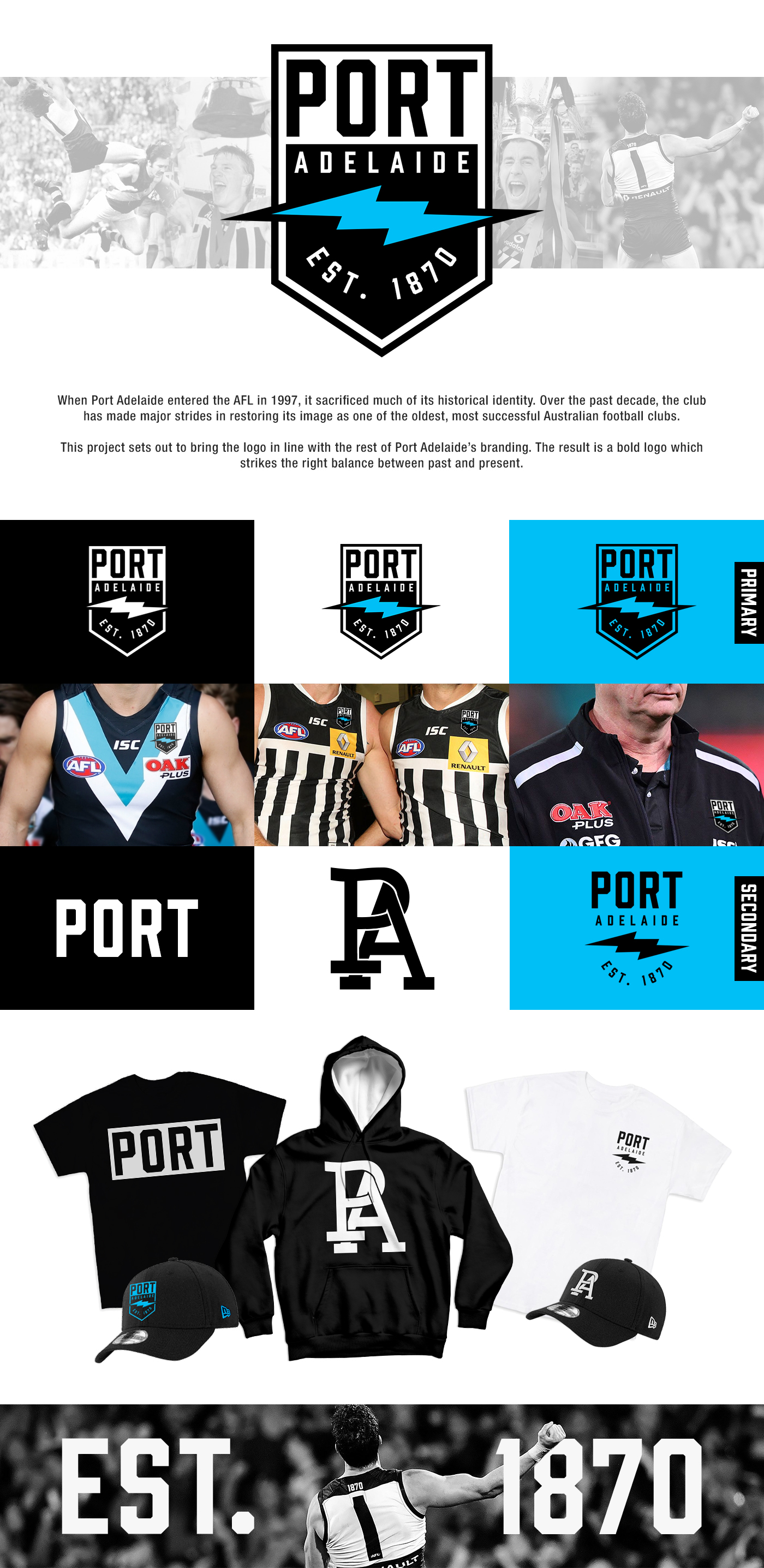
Nice! One of the cleanest Port concepts I’ve seen, not trying to shoehorn too many elements into the one logo. I’m a little surprised you went with a lightning bolt though. I thought that was something most Port fans wanted to distance themselves from a bit?
- Thread starter
- #3
Basically my line of thinking is there isn't any stronger central element for a Port logo that isn't too distanced from the current branding. Some have suggested the prison bars be used as an element in a new logo but I don't think it's anywhere near as strong an icon as it is as a jumper design.Nice! One of the cleanest Port concepts I’ve seen, not trying to shoehorn too many elements into the one logo. I’m a little surprised you went with a lightning bolt though. I thought that was something most Port fans wanted to distance themselves from a bit?
I think there's a desire to distance ourselves from the Power moniker a bit, which is reflected here.
hitthepost
Norm Smith Medallist
I'd like to see a logo where the only change between Power and Magpies is the mascot.
For example it could be the current Power logo for the Power and for the Magpies, replace the fist and lightning bolt with the Magpie. All other elements the same. Bit of brand continuity.
For example it could be the current Power logo for the Power and for the Magpies, replace the fist and lightning bolt with the Magpie. All other elements the same. Bit of brand continuity.
- Thread starter
- #5
There's not going to be another Magpies logo. The one being used now is going to continue to be used until we stop fielding a team in the SANFL or for whatever reason decide to retire the name officially and consign it to retro memorabilia.I'd like to see a logo where the only change between Power and Magpies is the mascot.
For example it could be the current Power logo for the Power and for the Magpies, replace the fist and lightning bolt with the Magpie. All other elements the same. Bit of brand continuity.
This logo is intended to work as a one club logo for
hitthepost
Norm Smith Medallist
And that's great and your concept. What you'd like to see. I'm just putting forward my version of the same.There's not going to be another Magpies logo. The one being used now is going to continue to be used until we stop fielding a team in the SANFL or for whatever reason decide to retire the name officially and consign it to retro memorabilia.
This logo is intended to work as a one club logo forifwhen our reserves team is swallowed into a national reserves competition.
the thicker monogram really works well in an americanised logo kind of way, works perfectly on the baseball cap.
- Thread starter
- #8
Glad someone noticed. It comes out actually looking thicker when its embroided on New Era hats but on the rest of our merch and digitally it looks like this, which has always felt a bit weak for me.the thicker monogram really works well in an americanised logo kind of way, works perfectly on the baseball cap.

Freight Train
Once hit the sign at the Mercantile Mutual Cup
- Moderator
- #9
As I have said as you showed me the development of this - this is the best Port Adelaide logo that has ever been created - official or otherwise.
caloschwaby
Whisper
- Jan 3, 2017
- 4,845
- 6,457
- AFL Club
- Collingwood

- Other Teams
- Celtics, Renegades, Packers
Love it, so simple yet bold.
Only feedback I could suggest is that it feels a bit too "tall"? If you're going for that "Port" branding direction, could you have a go at dropping the "Adelaide" text and shrinking the logo down a bit?
Here's what I mean;

What do you think?
Only feedback I could suggest is that it feels a bit too "tall"? If you're going for that "Port" branding direction, could you have a go at dropping the "Adelaide" text and shrinking the logo down a bit?
Here's what I mean;

What do you think?
Fizzler
BBTB
- Dec 26, 2013
- 12,756
- 16,340
- AFL Club
- Port Adelaide
- Other Teams
- OKC, Coburg, Werribee, Storm, QPR
While it definitely looks good, it doesn’t help to remove the whole “Port Power” nickname that we’ve tried to distance ourselves from post-One Club. Keeping the word Adelaide in there makes it certain that it’s Port Adelaide rather than Port Power.Love it, so simple yet bold.
Only feedback I could suggest is that it feels a bit too "tall"? If you're going for that "Port" branding direction, could you have a go at dropping the "Adelaide" text and shrinking the logo down a bit?
Here's what I mean;
View attachment 751619
What do you think?
seaforthswan
glebegreyhound
- Apr 18, 2013
- 350
- 465
- AFL Club
- Sydney
- Other Teams
- UTS Bats, Manly Marlins
Oh man change that teal to electric blue tomorrow Port Adelaide!!
Love it so much
Love it so much
- Nov 7, 2012
- 9,625
- 31,348
- AFL Club
- St Kilda
- Other Teams
- Bristol City FC, Urawa Red Diamonds FC
Beautiful. The colours, the accentuated PORT, the rounded path of the Established text, the horizontal bolt. Clean, bold, love it!
I personally might consider making the outline of the bolt a little narrower or flattening the angles on the left and right extremities, just to keep it tight. It's the one thing that I can see in this design as NQR. Nice work!
I personally might consider making the outline of the bolt a little narrower or flattening the angles on the left and right extremities, just to keep it tight. It's the one thing that I can see in this design as NQR. Nice work!
How about replacing "PORT" with "PAFC"?Love it, so simple yet bold.
Only feedback I could suggest is that it feels a bit too "tall"? If you're going for that "Port" branding direction, could you have a go at dropping the "Adelaide" text and shrinking the logo down a bit?
Here's what I mean;
View attachment 751619
What do you think?
Great minds..


- Thread starter
- #18
Yours is really close to what we're apparently getting, and it's also better.
GremioPower
Taking notes of policy re: bikini/lingerie images
- May 26, 2017
- 20,902
- 43,030
- AFL Club
- Port Adelaide
- Other Teams
- Grêmio, DC United, Pistons
My take, Dylan. I would:
- put "Adelaide" on the white background along with "Port";
- add the prison bars underneath the bolt;
- add a teal chevron right on top of the white one (both would have the same size);
and
- either get rid, or put the "Est. 1870" below the badge.
Still, only small suggestions. Great job!
Fizzler
BBTB
- Dec 26, 2013
- 12,756
- 16,340
- AFL Club
- Port Adelaide
- Other Teams
- OKC, Coburg, Werribee, Storm, QPR
Some of these have merit, although simplicity is key here I feel.My take, Dylan. I would:
- put "Adelaide" on the white background along with "Port";
- add the prison bars underneath the bolt;
- add a teal chevron right on top of the white one (both would have the same size);
and
- either get rid, or put the "Est. 1870" below the badge.
Still, only small suggestions. Great job!
- Jun 9, 2015
- 12,031
- 9,267
- AFL Club
- St Kilda
If they picked this, they would have to change the pre game song to icehouse surely?Oh man change that teal to electric blue tomorrow Port Adelaide!!
Love it so much
GremioPower
Taking notes of policy re: bikini/lingerie images
- May 26, 2017
- 20,902
- 43,030
- AFL Club
- Port Adelaide
- Other Teams
- Grêmio, DC United, Pistons
I don't want to kill the simplicity. The end result would still have a clean look.Some of these have merit, although simplicity is key here I feel.
Fizzler
BBTB
- Dec 26, 2013
- 12,756
- 16,340
- AFL Club
- Port Adelaide
- Other Teams
- OKC, Coburg, Werribee, Storm, QPR
A bit of a stretch, and yes it was mentioned in a different thread
Similar threads
- Poll
- Replies
- 8
- Views
- 669
- Replies
- 18
- Views
- 965
- Replies
- 0
- Views
- 332
- Replies
- 3
- Views
- 422
