


Off the top of my head this year's black varsity jackets. Some other stuff too but i can't remember. It's definitely no longer exclusive to NE but they could just be licensing it out or something.What ISC stuff is the monagram on? Yeah the custom merch is great, wish I'd got the hoodie too. Ah well.
Navigation
Install the app
How to install the app on iOS
Follow along with the video below to see how to install our site as a web app on your home screen.
Note: This feature may not be available in some browsers.
More options
You are using an out of date browser. It may not display this or other websites correctly.
You should upgrade or use an alternative browser.
You should upgrade or use an alternative browser.
Workshop Port Adelaide's perfect logo
- Thread starter SgtSchulz
- Start date
- Tagged users None
- Thread starter
- #327

Suit
All Australian
- Sep 25, 2013
- 953
- 1,850
- AFL Club
- Port Adelaide
- Other Teams
- • UCI: MTS, LTS • F1: DR, CL, MV
Like the black diamond concept, and I think deanjrobinson's take on the monogram is glorious (love the larger 'P'). So I knocked these up in good ol' MS Paint.

Note: Credit to deanjrobinson for the monogram


Note: Credit to deanjrobinson for the monogram
Suit
All Australian
- Sep 25, 2013
- 953
- 1,850
- AFL Club
- Port Adelaide
- Other Teams
- • UCI: MTS, LTS • F1: DR, CL, MV
I, for one, don't subscribe to the archaic anti-teal rhetoric that thrives on BF.
Once again, these are rough, and were hurriedly done in MS Paint. Silver/grey would be utilised in a monochromatic instance
Edit: Credit to deanjrobinson's monogram
Once again, these are rough, and were hurriedly done in MS Paint. Silver/grey would be utilised in a monochromatic instance


Edit: Credit to deanjrobinson's monogram
Last edited:


- Thread starter
- #331
I like.
I'm surprised you managed to incorporate teal so well. I still prefer the bolder black and white but that's pretty pretty pretty good.
I'm surprised you managed to incorporate teal so well. I still prefer the bolder black and white but that's pretty pretty pretty good.
- Thread starter
- #332
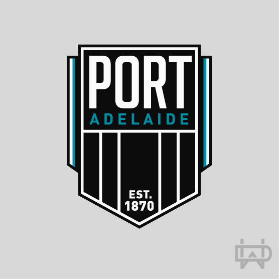
Logo from the PAFC History account on Twitter.


- Thread starter
- #333
Apparently David Koch is quite a fan of this logo.


- Thread starter
- #335
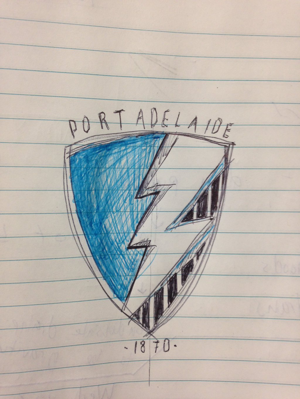
This is nice.my suggestion i my avatar, or this:

Your avatar is the homer car.
This is nice.
Your avatar is the homer car.
harsh
- Thread starter
- #337
Just a lot going on and too many ideas.harsh
Contested Marx
Schrodinkley's Cat
- Jun 21, 2014
- 11,632
- 25,880
- AFL Club
- Port Adelaide
- Other Teams
- Maggies, Spurs, Raiders?
Ok knobheads
I've sat by and watched for too long many feeble attempts at coming up with a perfect new logo. One which meets the following criteria
a) provides a link between our past successes in the Sanfell and our future as a juggernork in the AFL
2) is modern and dynamic, exciting future generations
iii] is a traditional logo
Four: is easy for the kids to draw
Eat that peasants
Last edited:
- Thread starter
- #339
Bow downOk knobheads
I've sat by and watched for too long many feeble attempts at coming up with a perfect new logo. One which meets the following criteria
a) provides a link between our past successes in the Sanfell and our future as a juggernork in the AFL
2) is modern and dynamic, exciting future generations
iii] is a traditional logo
Eat that peasants
We are not worthy.
Fizzler
BBTB
- Dec 26, 2013
- 12,765
- 16,359
- AFL Club
- Port Adelaide
- Other Teams
- OKC, Coburg, Werribee, Storm, QPR
Hahahaha #lol that was funny ahaha you are great welcome in.Ok knobheads
I've sat by and watched for too long many feeble attempts at coming up with a perfect new logo. One which meets the following criteria
a) provides a link between our past successes in the Sanfell and our future as a juggernork in the AFL
2) is modern and dynamic, exciting future generations
iii] is a traditional logo
Eat that peasants
- Jul 1, 2014
- 1,138
- 1,840
- AFL Club
- Carlton
GeniusEat that peasants
MKMatty
Busy Vibin’
#minimalism.Ok knobheads
I've sat by and watched for too long many feeble attempts at coming up with a perfect new logo. One which meets the following criteria
a) provides a link between our past successes in the Sanfell and our future as a juggernork in the AFL
2) is modern and dynamic, exciting future generations
iii] is a traditional logo
Eat that peasants

Contested Marx
Schrodinkley's Cat
- Jun 21, 2014
- 11,632
- 25,880
- AFL Club
- Port Adelaide
- Other Teams
- Maggies, Spurs, Raiders?
Lol Dylan I'd forgotten that I posted that here.
It needed a bit more loveLol Dylan I'd forgotten that I posted that here.

- Thread starter
- #347


If the technology to put animations onto jumpers is coming, hey why not have an official logo that's animated?
The diamond would never get accepted without something that makes it obviously Port Adelaide to those that don't know what the diamond is.
Especially now that you're trying to grow in China, just having your establishment date in a diamond won't make those you're trying to attract notice or understand the brand.
Especially now that you're trying to grow in China, just having your establishment date in a diamond won't make those you're trying to attract notice or understand the brand.
Similar threads
- Poll
- Replies
- 8
- Views
- 704
- Replies
- 18
- Views
- 979
- Replies
- 0
- Views
- 334
- Replies
- 3
- Views
- 425
