

- Thread starter
- #351
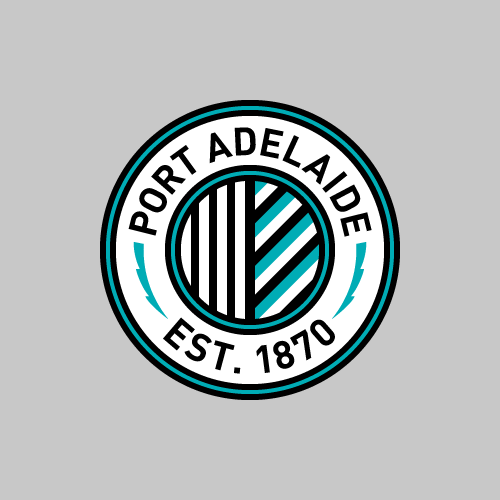
The diamond would never get accepted without something that makes it obviously Port Adelaide.
How is this obviously Port Adelaide?

Follow along with the video below to see how to install our site as a web app on your home screen.
Note: This feature may not be available in some browsers.
LIVE: Richmond v Melbourne - 7:25PM Wed
Squiggle tips Demons at 77% chance -- What's your tip? -- Team line-ups »
The diamond would never get accepted without something that makes it obviously Port Adelaide.
As someone who grew up unaware of the port Adelaide situation, I immediately identify that as port Adelaide.How is this obviously Port Adelaide?
View attachment 258288
Love this, but the font is way off.
And this. Logo is clean lines and sharp corners... serifs and soft corners don't match up.Love this, but the font is way off.

Sorry, but my first thought was: rooster.This is an idea that I've been playing around with the last cupla days. Something a bit different.
We're already using his fist, so I thought I'd reveal the man/god beyond the quadrangle and go with a Zeus head (in all its bearded glory) to convey the Power theme. There's a subtle nod to our previous mascot in there as well.
View attachment 280182
Sorry, but my first thought was: rooster.
")
SameSorry, but my first thought was: rooster.
North Ballarat could always use a new logo, nice work!This is an idea that I've been playing around with the last cupla days. Something a bit different.
We're already using his fist, so I thought I'd reveal the man/god beyond the quadrangle and go with a Zeus head (in all its bearded glory) to convey the Power theme. There's a subtle nod to our previous mascot in there as well.
View attachment 280182
The whole Port board is behind Matt though I completely absolutely forgot to keep watching after the first episode
The M&E board are also 100% behind Matt as well. He'll pretty much be wearing something Port Adelaide related at all times. It's usually his Port Adelaide basketball singlet in challenges.The whole Port board is behind Matt though I completely absolutely forgot to keep watching after the first episode
That is actually the best Port logo I have seen so far, wonder what an inverted version woild look like though?Another day another PAFC logo #nevergiveup
Another day another PAFC logo #nevergiveup
I tried but it disrupts... sorry can't find a better word... disrupts the flow of it or whatever. I figure, best not to compromise. The current logo isn't a paragon for incredible logos but it doesn't exactly look prison-bar-y with its black and white stripes either.The black and white needs to look more prison bar-y, somehow...
Thanks mate, most feedback I'm getting from Port people is negative. Nice to hear someone likes it.That is actually the best Port logo I have seen so far, wonder what an inverted version woild look like though?

The black and white needs to look more prison bar-y, somehow...
I really like this. Best Port logo that immediately comes to mind, maybe only matched by the stormy2quadzilla diamondAnother day another PAFC logo #nevergiveup

I tried but it disrupts... sorry can't find a better word... disrupts the flow of it or whatever. I figure, best not to compromise. The current logo isn't a paragon for incredible logos but it doesn't exactly look prison-bar-y with its black and white stripes either.
Thanks mate, most feedback I'm getting from Port people is negative. Nice to hear someone likes it.
Like this? Not into it as much as the white, particularly as I was initially sparked by the Manchester City logo and the white roundel goes hand in hand with the Magpies logo.
View attachment 308550
Thanks mate. The idea flopped like Jack Darling on the Port board.This should be the logo, no doubt.
Sick, this should be on a hoodie.This was just discovered from a 1911 Port Adelaide Membership ticket booklet on eBay.
It is beautiful.
View attachment 320388
Inspiration for this perhaps;This was just discovered from a 1911 Port Adelaide Membership ticket booklet on eBay.
It is beautiful.
View attachment 320388

 ).
).


