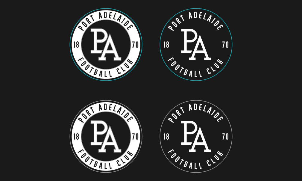
Workshop Port Adelaide's perfect logo

Remove this Banner Ad

What does anyone have to gain from changing anything?

I don't understand how a hypothetical question turned into the standard Harold holt.
What disappeared here?
Maybe the magpies should be called the power?
Would work and it would rub out an identity crisis. But I don't think they want to rub out away 145 years of history.
Not sure why your club never dropped the magpies and power monikers when they officially joined as one and just went with PORT ADELAIDE UNITED FC?
To soccery. We have joined but we should have both teams called PAFC/Port Adelaide FC.
 
What does anyone have to gain from changing anything?

I don't understand how a hypothetical question turned into the standard Harold holt.
Better branding, but Port don't really need that considering they would be one of the better branded clubs in the league, so a changed logo, unless it's much better than either of the current both in relevancy and aesthetically, isn't needed in this case.
To0 soccery. We have joined but we should have both teams called PAFC/Port Adelaide FC.
no body really refers to Port as the Power anyway,everyone knows them as Port or Port Adelaide. I don't see a need to drop either moniker, as-is is fine.
 
Power is used a lot. Port Power very rarely now.

Would work and it would rub out an identity crisis. But I don't think they want to rub out away 145 years of history.
There is no identity crisis
To soccery. We have joined but we should have both teams called PAFC/Port Adelaide FC.
The club is Port Adelaide m8. The teams have different monikers but it has zero bearing on anything.
 

Log in to remove this ad.

Niceeeee.

What would it look like at the bottom if it was

18
70

in smaller font in the same spot?
I assume you mean like this. Looked bare at the bottom so I added stars. 1 Star for 10 premierships (not including Championship of Australia titles).
upload_2015-8-22_21-25-49.png
 
Made these ages ago with a more LA Dodgers style monogram.
UnT0lpS.png
 

(Log in to remove this ad.)

Lol at the Black Power fist in some of these concepts. People have been trying it on here for years and it'll never happen, way too rooted in politics and race to ever have a place on a sporting logo across the other side of the world.
 
Lol at the Black Power fist in some of these concepts. People have been trying it on here for years and it'll never happen, way too rooted in politics and race to ever have a place on a sporting logo across the other side of the world.
I often wonder what an American would think of a team called 'power' with a fist for a logo.
 
This is just my opinion but I do think Port missed out on an enormous opportunity when joining the AFL to embrace their history by using the pre Magpies nickname of the Magentas. They could have kept the prison bar jumper but made the 'stripes' magenta as to appease Collingwood
 
This is just my opinion but I do think Port missed out on an enormous opportunity when joining the AFL to embrace their history by using the pre Magpies nickname of the Magentas. They could have kept the prison bar jumper but made the 'stripes' magenta as to appease Collingwood
Mm nah
 
Currently the club has two logos, one for Power and one for Magpies, and in many cases they are used together to indicate the club as a whole as opposed to one individual team or the other.
If they wanted to continue down this road they could "align" the branding to have consistent logos, similar to how most of the state cricket associations now use the same shield shape and the NRL programmes as use the same logo as a basis:
Port-Adelaide-logo-1997.gif
33nb2no.jpg

Use the same name above each (PORT ADELAIDE in similar fashion to the "Port Power" but with "Port" being big and "Adelaide" smaller.
Consistency of the brand whilst keeping the two identities of the teams.
EDIT: Thanks to whomever it was on the request thread who did me up the Magpie one late last season.
 
Last edited:

Remove this Banner Ad

Back
Top