

- May 2, 2014
- 4,385
- 11,738
- AFL Club
- Carlton
- Other Teams
- Baghdad Bombers
So good! 
Follow along with the video below to see how to install our site as a web app on your home screen.
Note: This feature may not be available in some browsers.
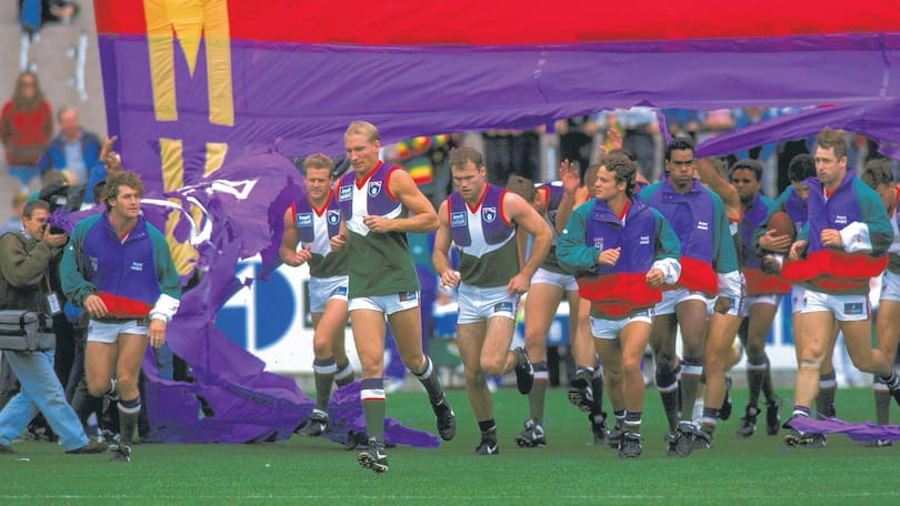
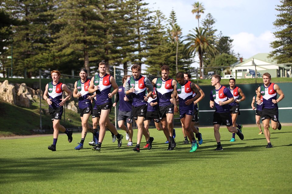
I've always thought this too!Way better than their 25 chevron jumper they wore against Norths. It's a shame they're not wearing their 1995 away "green machine" this year as well though.
I miss the red and green on their guernseys. They need to bring back the red and green into their regular guernseys like so View attachment 699245
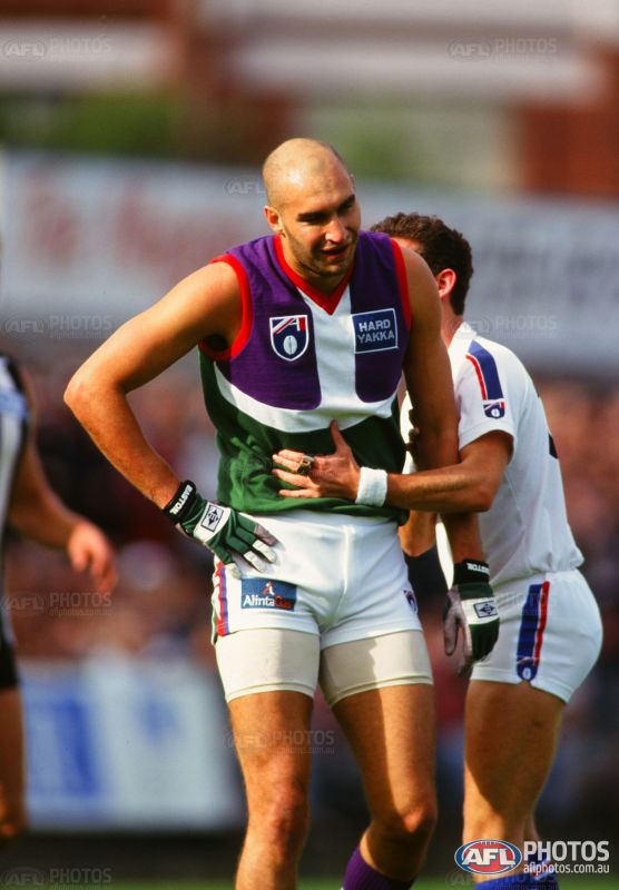
Mundy likes it. Or he's cold.Everyone else’s thoughts?
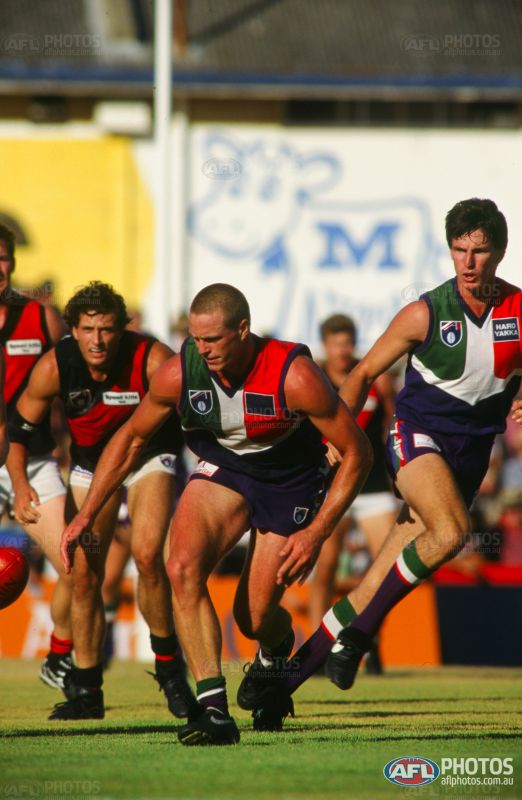
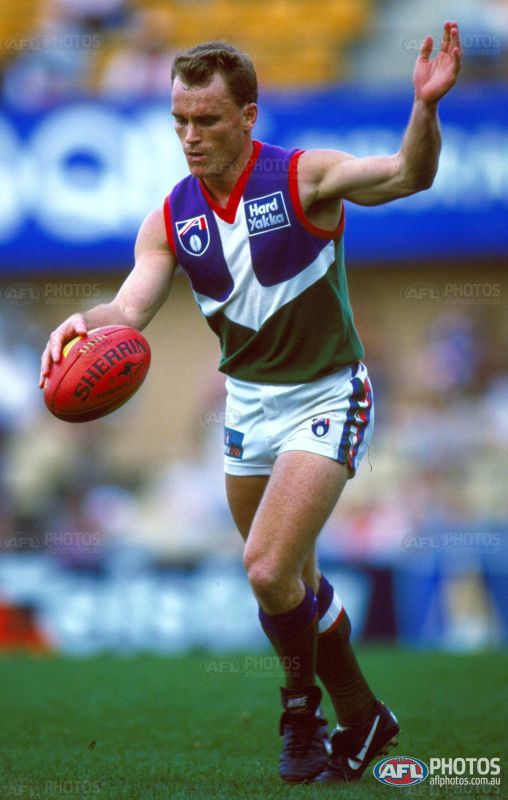
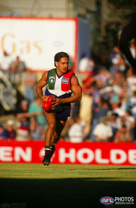
Year 2000 away game for Freo (both Getty Images):Any pictures of games from back in the day versus essendon to see the match up?


Personally, I just think it’s a unique and bold colour combination. I like the design because I feel it’s the only way these colours work with one another, any other design and I think it would probably look ridiculous.Are people loving the execution of the old guernsey and its nostalgia, or genuinely liking the design?
As much as I love a nod to the past and appreciate the execution of this strip, I don't like the design in the first place. Red green purple and white don't work together. I always preferred the green away strip.
Any pictures of games from back in the day versus essendon to see the match up?
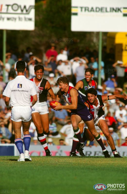
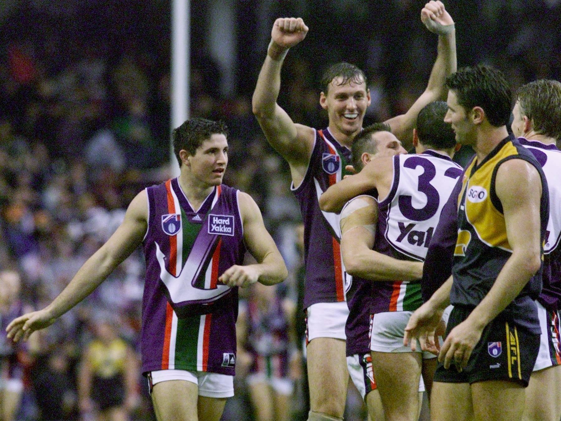
Something like this
That one might even be from their first ever Practice Match - Pre Round 1.
Pretty sure that’s David Muir (centre) and Craig Burrows.
If you can produce some Leigh Waddell-Johnson, Clinton Wolf or Peter Miller, I’ll be even more impressed..
Yeah, I was thinking this too. As well as the proportions, I don't think the Anchor comes far enough down the jumper either.Hmmm looking at those old pictures now, I’m less enthused about the anchor. Proportions are all wrong. Possibly just looks bad because it gets stretched with modern material, but the horizontal part of the anchor is too thick IMO.

That 25 years one with the 'wow we're so crafty' chevrons is so lame.

