

- Apr 30, 2015
- 13,616
- 24,442
- AFL Club
- West Coast
How can you tell that the wings are shallow?
Follow along with the video below to see how to install our site as a web app on your home screen.
Note: This feature may not be available in some browsers.
Only basing is on the fact the AFL and HJs logo aren’t entirely inside the wings, like they have been the last few years. In 2014/15 when we had tiny wings, the logos were all half in the wings and half out. So I’m assuming they’ll be similar (probably not as bad though)How can you tell that the wings are shallow?
Wings are cutting through the AFL/sponsors logo again. Although to be fair, those logos look very low and central compared to the 'Castore' jumpers where the logos are in line with the manufacturers logo. It didn't cut through the wings on the ISC jumpers either though.How can you tell that the wings are shallow?
.jpeg")
.jpeg")
.jpeg")
Not as shallow as the puma wings at first glance


That was a low ebb. We played a GF in those. Puke.View attachment 1502498
These ones were the worst. 2014/15. Tight player issues even worse still
View attachment 1502500
I heard that Ampol will be neck sponsor instead of the NB logo.. same as what saints and suns have done .. so could be prototypeTo be fair, that could be a fake/initial prototype and the actual version of it could have all our issues resolved. I'm not holding my breath.
Strange since those two clubs need the sponsorship. Will just make our kit look cheapI heard that Ampol will be neck sponsor instead of the NB logo.. same as what saints and suns have done .. so could be prototype
One thing they like more then success on the field it’s cash ..Strange since those two clubs need the sponsorship. Will just make our kit look cheap
On a seperate note it’s interesting such a big brand like NB would allow clubs to do so. Would have thought smaller brands such as ISC would have gone down that routeOne thing they like more then success on the field it’s cash ..
 thewest.com.au
West Coast have marked down their 2022 Castore range by up to 70 per cent, making way for the incoming range.
Men’s home guernseys have been slashed from $110 to $44 while the club’s 2022 Indigenous round guernsey is available for $40. The Eagles were one of three clubs to recycle their 2021 Indigenous design. West Coast CEO Trevor Nisbett earlier this year described elements of the union as “unsuccessful”.
Clearly better, just takes some getting used to
don't mind it
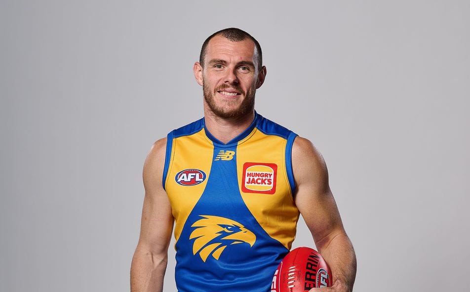
Shoulders arent great but wings look pretty deep

wing tips on back are prob more of mystery
Shoulders arent great but wings look pretty deep
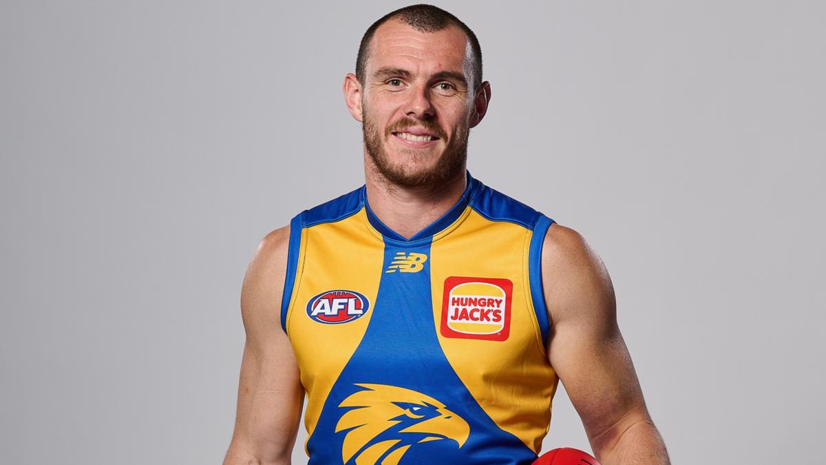
Solid looking getup from the front.
Shoulders arent great but wings look pretty deep

