Norrtelje Dockers
Draftee
- Apr 9, 2019
- 4
- 7
- AFL Club
- Fremantle
Hi all,
Another Stockholm team here looking for help with design work. I seen the great efforts by the community here for the South Stockholm Giants so decided why not give it a shot for our club. I'll use the same structure as they did to make it easy to read and follow.
The Outline
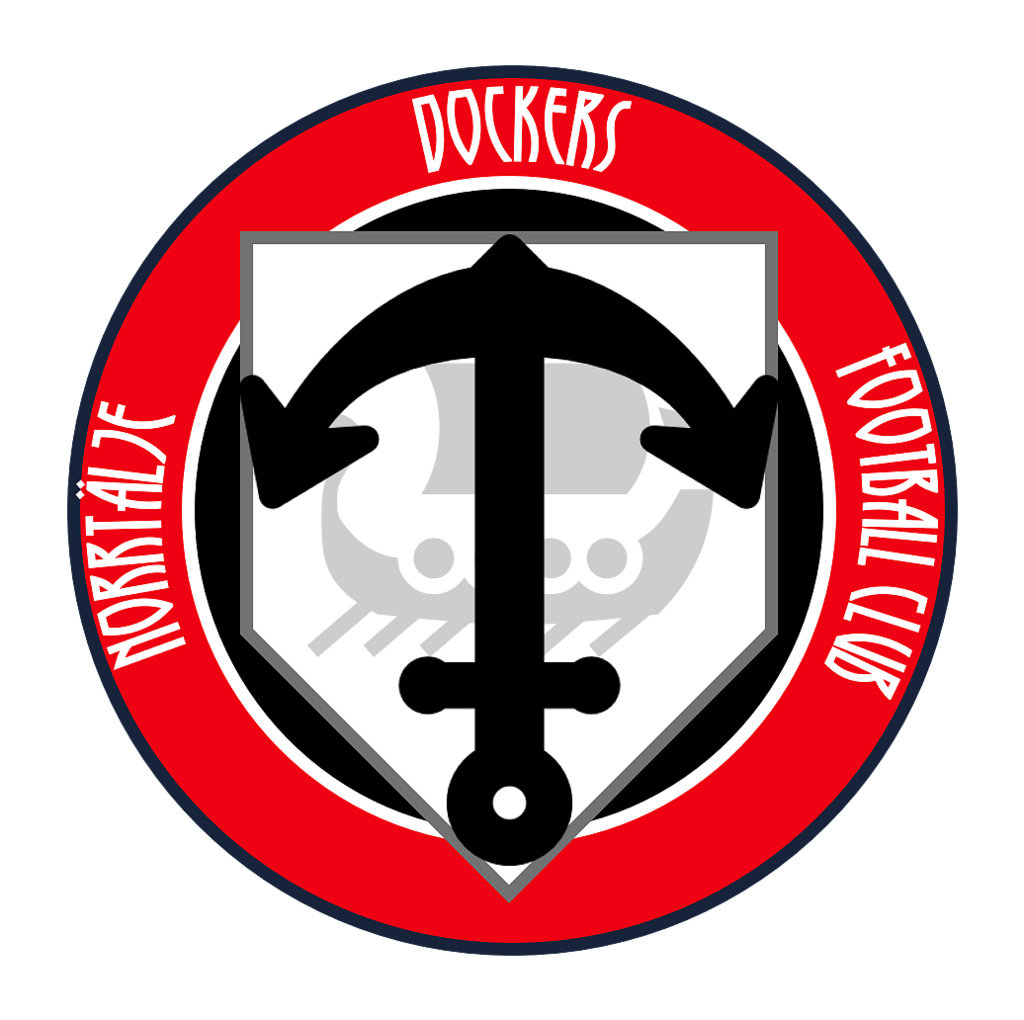
We have had a logo since our beginning in 2012. We feel it is outdated and it doesn't translate that well onto marketing material or clothing. To be honest the grey shield is the biggest problem, very boring! Anyway we are looking for a revamp!
The Brief
The team is the Norrtälje Dockers. Norrtälje is a harbour city about 70km's north of Stockholm hence the Dockers moniker. Our colours are red (I think the old logo was #d1232e jumpers have C105), black and white. You will see the previous logo has a splash of blue. That is a throwback to the colour of the municipality of Norrtälje. The old font is Copperplate Gothic Bold, do not feel obligated to use that.
The upside down anchor means "always on the move" and is central to our city and our team. Other than the anchor and the colours feel free to gather some inspiration from the archipelago, boats/sea workers, and the water. Our current jumpers are black with 3 red chevrons.
Payment
Winner receives $50 aud or piece of merch (jumper, training shirt). I can pay with PayPal or Australian bank transfer.
The decision
Once the designs have been brought in, I'll take them to the team and discuss them. We will have a vote and decide on a winner. Please note we also have some local artists working on the same project. We will try to be as transparent as possible with the voting process. Probably a livestream or IG video!
Deadline
We aren't in any rush but better to have it done sooner rather than later. 28th April is the last day for submissions.
Thanks for your help!!
.png")
Another Stockholm team here looking for help with design work. I seen the great efforts by the community here for the South Stockholm Giants so decided why not give it a shot for our club. I'll use the same structure as they did to make it easy to read and follow.
The Outline
We have had a logo since our beginning in 2012. We feel it is outdated and it doesn't translate that well onto marketing material or clothing. To be honest the grey shield is the biggest problem, very boring! Anyway we are looking for a revamp!
The Brief
The team is the Norrtälje Dockers. Norrtälje is a harbour city about 70km's north of Stockholm hence the Dockers moniker. Our colours are red (I think the old logo was #d1232e jumpers have C105), black and white. You will see the previous logo has a splash of blue. That is a throwback to the colour of the municipality of Norrtälje. The old font is Copperplate Gothic Bold, do not feel obligated to use that.
The upside down anchor means "always on the move" and is central to our city and our team. Other than the anchor and the colours feel free to gather some inspiration from the archipelago, boats/sea workers, and the water. Our current jumpers are black with 3 red chevrons.
Payment
Winner receives $50 aud or piece of merch (jumper, training shirt). I can pay with PayPal or Australian bank transfer.
The decision
Once the designs have been brought in, I'll take them to the team and discuss them. We will have a vote and decide on a winner. Please note we also have some local artists working on the same project. We will try to be as transparent as possible with the voting process. Probably a livestream or IG video!
Deadline
We aren't in any rush but better to have it done sooner rather than later. 28th April is the last day for submissions.
Thanks for your help!!
.png")