

- May 1, 2018
- 3,893
- 30,357
- AFL Club
- Richmond
Follow along with the video below to see how to install our site as a web app on your home screen.
Note: This feature may not be available in some browsers.
Need a more vibrant blackThe black looks kinda dull, actually.
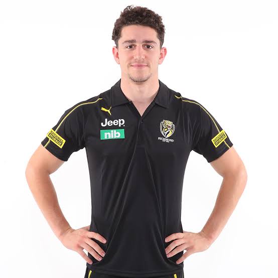
I guess it was only a matter of time until Nike gave Carlton the flick.2020 Puma polo's?
Not a fan, not much different to this year's Richmond which were disappointing.
Having said that, moving the Puma logo to the right side is a subtle but big improvement on a bland design..... As long as we get rid of the single yellow lines down the sleeves, it will be a big improvement. This years looked like those fake 2 stripe Adidas knocks off from the market.

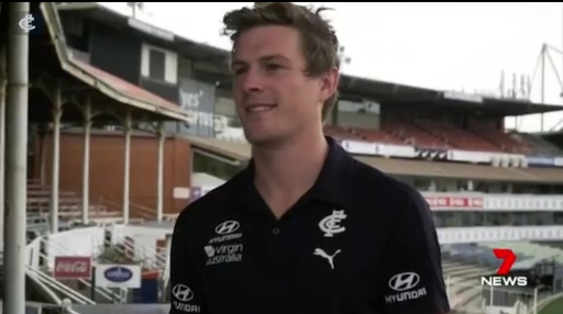
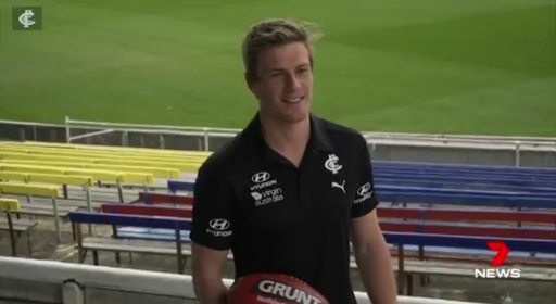
2019 design
No idea who the bloke is for modelling the polo for Carlton.
What a list.
2020 Puma polo's?
Not a fan, not much different to this year's Richmond which were disappointing.
Having said that, moving the Puma logo to the right side is a subtle but big improvement on a bland design..... As long as we get rid of the single yellow lines down the sleeves, it will be a big improvement. This years looked like those fake 2 stripe Adidas knocks off from the market.
2019 design
our polos are s**t cos of the ugly green nib logo and the eyesore national storage s**t2020 Puma polo's?
Not a fan, not much different to this year's Richmond which were disappointing.
Having said that, moving the Puma logo to the right side is a subtle but big improvement on a bland design..... As long as we get rid of the single yellow lines down the sleeves, it will be a big improvement. This years looked like those fake 2 stripe Adidas knocks off from the market.
2019 design
I think it's photoshopped, the watermark design goes into italso the 2020 richmond jumper will have a new v neck collar and no yellow piping going off this pic
View attachment 773635
dont reckonI think it's photoshopped, the watermark design goes into it
our polos are s**t cos of the ugly green nib logo and the eyesore national storage s**t
blooze one also looks s**t for some reason
the yellow was great on all merch but the guerney because of the s**t material they use. They actually used the same yellow as our logo and came out good on merch but s**t on the jumper because of the crap material Tyrone Brant was using so that he could by a 250k mercBLK were great. Great yellow.
Haere Ra
the yellow was great on all merch but the guerney because of the s**t material they use. They actually used the same yellow as our logo and came out good on merch but s**t on the jumper because of the crap material Tyrone Brant was using so that he could by a 250k merc
what a s**t campaigner
i hate him cos now he made us go too far with the yellow and made us adopt fluro which we have never had in our history
I’m 5ft8-9 fit and suntanned , would a medium fit . I don’t like the skin tight Peter Andre look , please advise


