akkaps
Community Leader
- Mar 20, 2012
- 47,444
- 32,665
- AFL Club
- Carlton
- Moderator
- #1
Friday 26th August
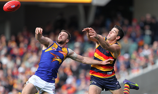
Adelaide Crows v West Coast Eagles at Adelaide Oval
Saturday 27th August
Geelong Cats v Melbourne at Simonds Stadium
Essendon v Carlton at the MCG
Sydney Swans v Richmond at the SCG
Gold Coast Suns v Port Adelaide at Metricon Stadium
North Melbourne v GWS Giants at Etihad Stadium
Sunday 28th August
St. Kilda v Brisbane Lions at Etihad Stadium
Hawthorn v Collingwood at the MCG
Fremantle v Western Bulldogs at Domain Stadium
Tipping
https://sites.google.com/site/bfjumpertipping/2016/round-23
 just really dislike navy vs royal