Discussion Rugby League/Union Kits discussion

Remove this Banner Ad

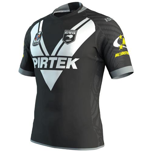
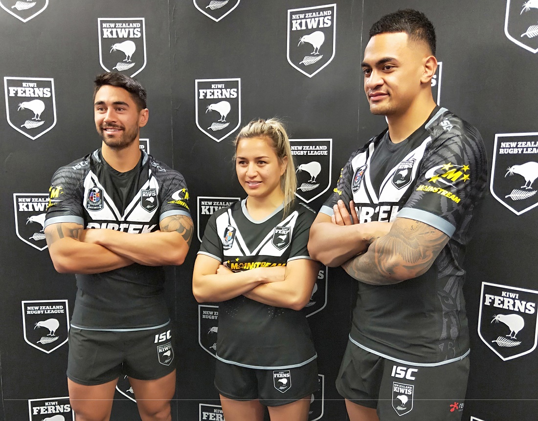
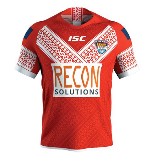
Is that for test matches or sevens? I wonder if next year we'll be getting fashion-conscious jerseys because it's a world cup year? Kinda like what we saw in soccer this year.
 
I was browsing around on websites looking for Australian Kangaroos jerseys today and I noticed the NZ Kiwis have quietly switched over to ISC continuing with the Western Suburbs esque jersey. Additions to this jersey are Ferns in grey on the shoulders and sleeves and what appears to be Maori art on the side panels, as well as a new sponsor on the sleeve. I found it on the website for What's Your Team based in Redcliffe in Queensland


18NZKiwis_Jersey.jpg

https://whatsyourteam.com.au/collec...-2018-mens-home-jersey?variant=14590691082313
 

Log in to remove this ad.

I was browsing around on websites looking for Australian Kangaroos jerseys today and I noticed the NZ Kiwis have quietly switched over to ISC continuing with the Western Suburbs esque jersey. Additions to this jersey are Ferns in grey on the shoulders and sleeves and what appears to be Maori art on the side panels, as well as a new sponsor on the sleeve. I found it on the website for What's Your Team based in Redcliffe in Queensland


18NZKiwis_Jersey.jpg

https://whatsyourteam.com.au/collec...-2018-mens-home-jersey?variant=14590691082313

Actual photo of the men's and women's versions of the jersey

Team-announcements.jpg
 
So it appears to be a new company supplying the Red's apparel from next year called Dynasty and I haven't been able to get much info on them other than they're supplying Canterbury Rugby Union and their website isn't operational yet, so here is their facebook page


(Log in to remove this ad.)

So bad. The rendition of storm man was so much better on the 20th anniversary logo. It's much more jagged now. The wordmark has no flow with the logo and the removal of yellow just makes the brand duller.

Definite downgrade.
Agreed. Some of the best Storm kits included yellow.
 
New Storm logo.

It's only just launched and already I can find four different versions of the logo, none of which work properly:

storm1.png storm2.png storm3.png storm4.png

These violate several basic principles of logo design that some of us were taught at university.

"Brand agency WiteKite" -- you're shite.
 
It's only just launched and already I can find four different versions of the logo, none of which work properly:

View attachment 576521 View attachment 576522 View attachment 576523 View attachment 576524

These violate several basic principles of logo design that some of us were taught at university.

"Brand agency WiteKite" -- you're shite.
I concur. Out of curiosity, where can I find some of these basic design principles? I feel like I would know them once I see them..
 
I concur. Out of curiosity, where can I find some of these basic design principles? I feel like I would know them once I see them..
I found a logo design text book at my local library recently and will borrow it at some stage. Yours might have something similar - worth checking out
 

Remove this Banner Ad

Back
Top