Jones2ByrneJones
Hour of Pessimism
- Jul 27, 2012
- 15,816
- 27,971
- AFL Club
- Port Adelaide
- Thread starter
- #26
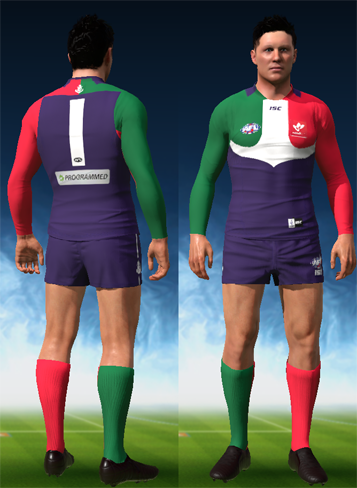
Bump with a mockup of the ideal set. Connor Blakely and New Player are the models.

And they all have appropriately coloured sleeves and socks like below
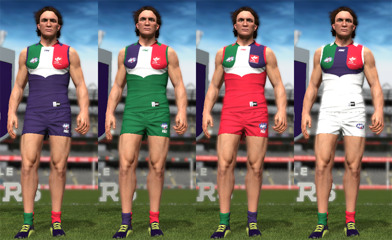
And they all have appropriately coloured sleeves and socks like below