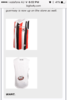
I'm sure that the jumper featuring our present logo dog (whom I shall refer to as Gordo), was not created with the purpose in mind that the supporters should find it pretty.
Can any of you very clever people suggest a reason or reasons why the jumper was created the way it was?
Can any of you very clever people suggest a reason or reasons why the jumper was created the way it was?