- Mar 30, 2014
- 2,606
- 4,270
- AFL Club
- Brisbane Lions
- Other Teams
- Dolphins, Seattle Kraken
After 6 weeks without a win and narrowly avoiding the wooden spoon, GB Designs took out the coveted Collingwood trophy.
Now, shut up, idiots.
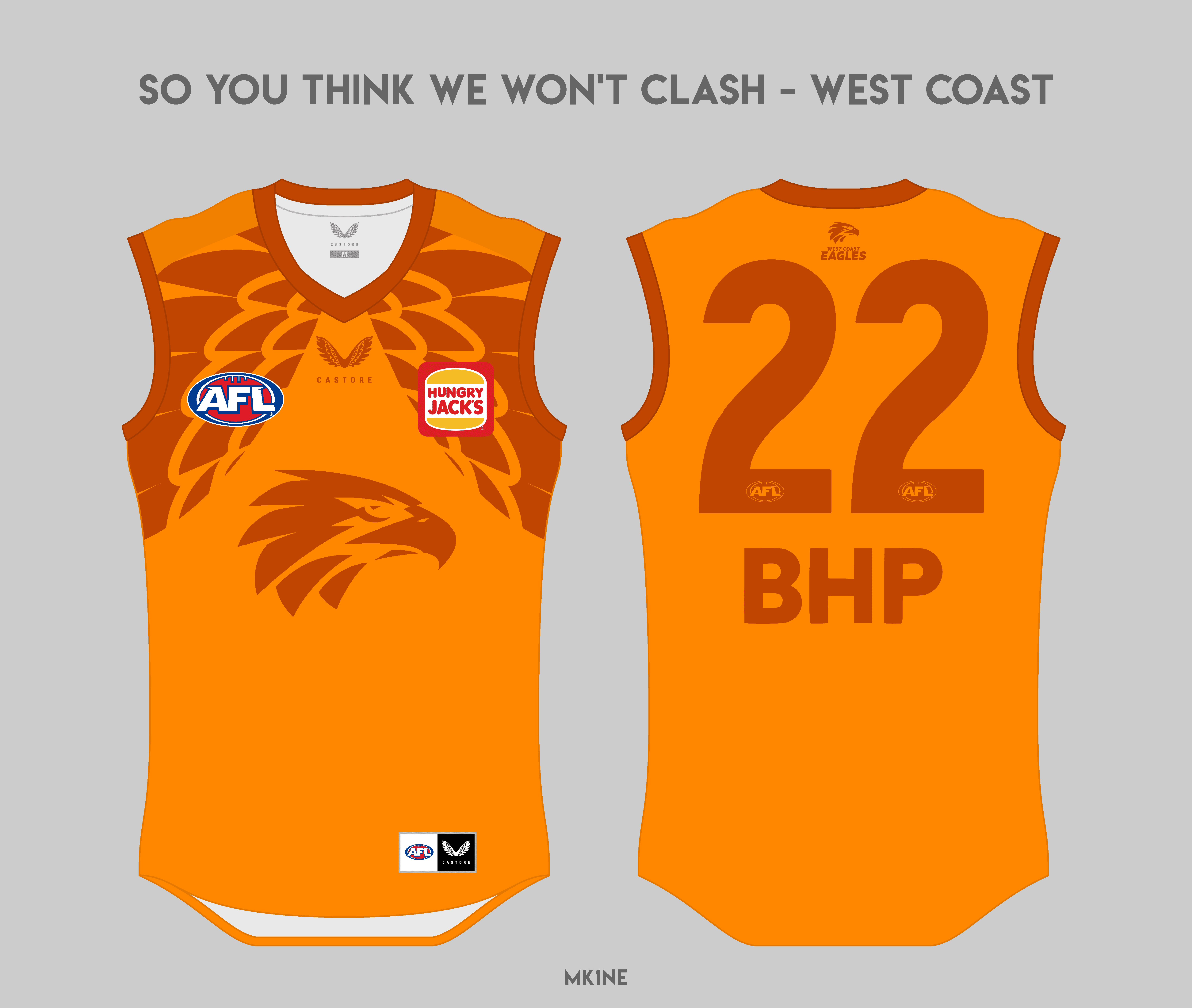
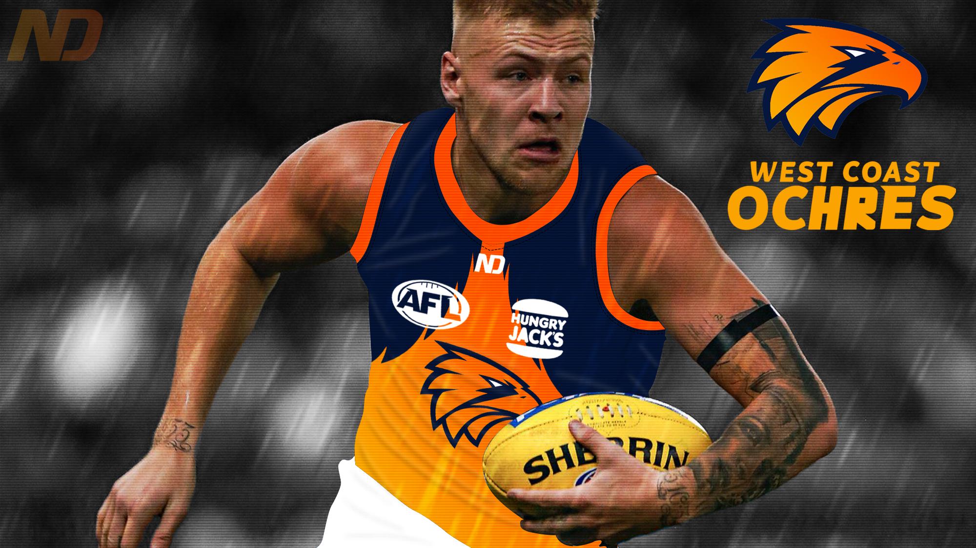
This weeks team is the West Coast Eagles and to celebrate their gloriousness their colour is not just one colour, not just two colours but a fantastically delectable ochre.
The Rules
- You must build a single AFL kit for this weeks chosen AFL team using the specific colour mentioned above as the primary colour. This colour is chosen from all the colours ever worn by the selected team. Please try to stick specifically to the colour, as subsequent teams may use different shades of the same colour spectrum.
- Only a jersey is required, but you are welcome to make a full kit.
- The jersey cannot be an exact replica/recolour of existing or previous jerseys.
- A winner is chosen by voting.
- The winner of each week chooses the next team.
- Please post your winning team choice along with your entry
- Each subsequent team will use a unique colour to each team.
- Standard AFL logo/sponsors and placement apply
- Entries for this comp will run until Saturday 22nd of May

Previous Weeks winning design:
Week 1 Melbourne - Magpienato
Week 2 GWS - exile
Week 3 Sydney - Magpienato
Week 4 Essendon - Fancyscum
Week 5 Fremantle - GB Designs
Week 6 Brisbane - Fancyscum
Week 7 Adelaide - just_kick_it
Week 8 Geelong - GB Designs
Week 9 Port Adelaide - mk1ne
Week 10 St Kilda - magpienato
Week 11 Umpires - just_kick_it
Week 12 Carlton - fancyscum
Week 13 Hawthorn - The Victorian
Week 14 Collingwood - GB Designs
Any questions, please ask!