

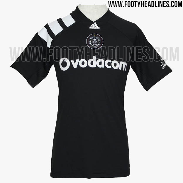
This cant be real. It's too cool. Even the cut looks ridiculously sleeve-heavy like the 90s kits.Orlando Pirates 17-18 kits.
Home

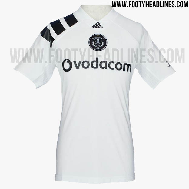
Away
Navigation
Install the app
How to install the app on iOS
Follow along with the video below to see how to install our site as a web app on your home screen.
Note: This feature may not be available in some browsers.
More options
You are using an out of date browser. It may not display this or other websites correctly.
You should upgrade or use an alternative browser.
You should upgrade or use an alternative browser.
Discussion Soccer/Association Football New Kits
- Thread starter Silent Alarm
- Start date
- Tagged users None
- Status
- Not open for further replies.
Why the hell release something like that exclusively for a South African team? The profile is so low for a well crafted throwback look which could easily be used to spin some cash with a bigger club.
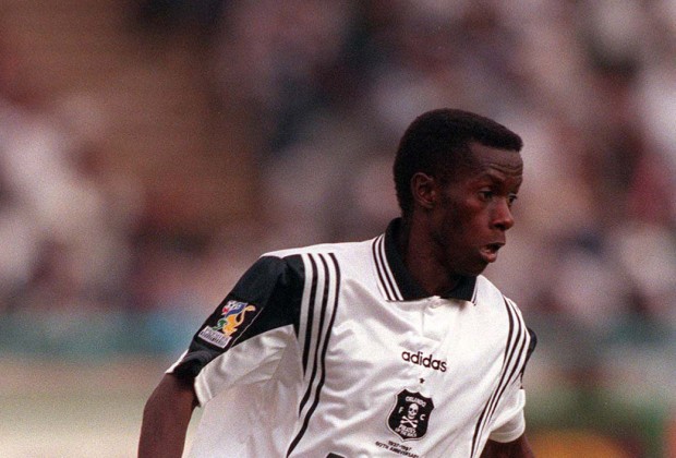
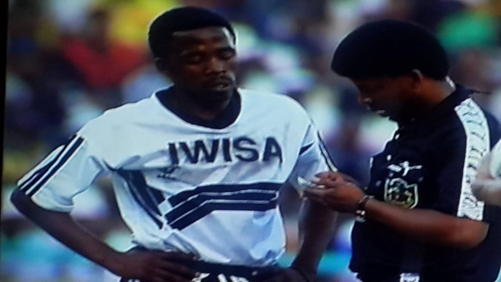
Clearly the Pirates have had a decent connection to Adidas through the years though. Some great kits... rare to see a nice black and white in soccer.

Clearly the Pirates have had a decent connection to Adidas through the years though. Some great kits... rare to see a nice black and white in soccer.

Freight Train
Once hit the sign at the Mercantile Mutual Cup
- Moderator
- #6,503
Well I know which kits I'll be using for FUT 18.
- Jul 9, 2010
- 24,163
- 26,536
- AFL Club
- Fremantle
- Thread starter
- #6,504
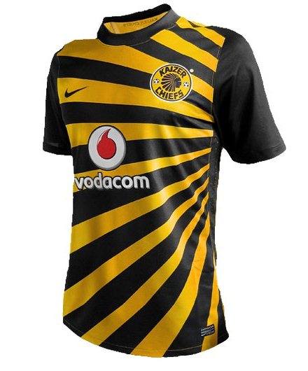
Agreed - how good are Kaizer Chiefs strips too? As you've said about Orlando Pirates it's a team who pull of an ugly colour way really way... and do it yearly. I've always wanted one of their Nike strips. Maybe that's next for the collection.Why the hell release something like that exclusively for a South African team? The profile is so low for a well crafted throwback look which could easily be used to spin some cash with a bigger club.
Clearly the Pirates have had a decent connection to Adidas through the years though. Some great kits... rare to see a nice black and white in soccer.
View attachment 391297
- Jul 9, 2010
- 24,163
- 26,536
- AFL Club
- Fremantle
- Thread starter
- #6,505
Also interesting factoid... that template, which I think was debuted for the Euro in 92 or something, actually kick started Adidas using the modern logo we see now and not the trefoil.
Every country with Adidas wore those templates and it was under the 'Adidas Equipment' guise as some sort of marketing thing. Anyway it took off for some reason and they ditched the trefoil. There ya go.
Adidas going back to the trefoil was something I thought we'd see in a few years. Would be great to have the 90s revivalism back.
- Jan 29, 2007
- 912
- 1,175
- AFL Club
- Melbourne
All the gambling advertising on soccer kits is disgusting.
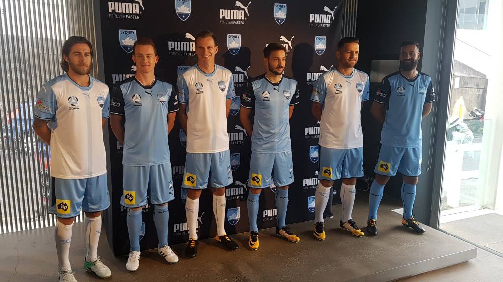
Sydney FC 17/18 kit.
3rd kit to be released tonight with all Puma 3rd kits world wide.
Sent from my SM-G950F using Tapatalk
3rd kit will be just be a navy blue version.
And the back of the kits:


Those cuffs aren't large enough for my liking.
The backs of the kits look great, shame about the fronts..
The backs of the kits look great, shame about the fronts..
- Moderator
- #6,511
Sydney FC 17/18 kit.
3rd kit to be released tonight with all Puma 3rd kits world wide.
Sent from my SM-G950F using Tapatalk
I know Facebook is usually 'lowest common denominator' stuff, particularly with all the faux rivalries in the A-League, but the people calling these kits "boring" must be pretty stupid... If you say a plain, simple, nice-looking kit is boring then you end up with a big palm tree on your kit the next season!
Klim
Brownlow Medallist
- Sep 17, 2013
- 12,532
- 10,363
- AFL Club
- Sydney
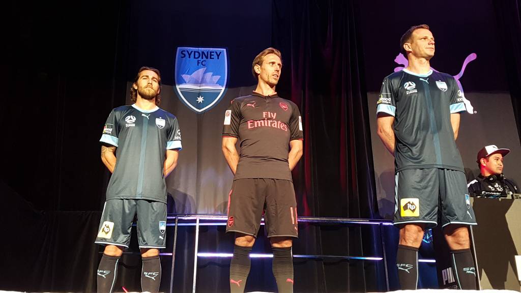
Sydney FC getting the Arsenal treatment for teamwear.
Klim
Brownlow Medallist
- Sep 17, 2013
- 12,532
- 10,363
- AFL Club
- Sydney
Sydney FC getting the Arsenal treatment for teamwear.
Fairfax Media said:Gunners' major sponsor, Emirates airline, was previously in negotiations with Sydney FC to become their primary commercial partner.

- Jul 9, 2010
- 24,163
- 26,536
- AFL Club
- Fremantle
- Thread starter
- #6,518
That Arsenal third is awful. Far out. I like what Puma have done with the home strips - even if there's one or two elements too many - but the third and away kits have been so try hard and so irrelevant all at once. It's sort of like a bad Hummel away strip.
The Sydney FC home shirt looks great even if reusing templates a year later than top level clubs (ha ha - yes yes, I know) annoys me and it's made worse by the fact they'll be playing the team who last wore it. But it's a decent strip. The extra bit of white really cleans it up and ties it together... felt like the two tone precious outfits just lacked something. It ain't orange but that tees up the Glory to make it their own...
Also imagine if Sydney FC got the Emirates sponsorship - that'd look great. Would also be a nice little addition to their rivalry with Melbourne City.
On iPhone using BigFooty.com mobile app
That Arsenal third is awful. Far out. I like what Puma have done with the home strips - even if there's one or two elements too many - but the third and away kits have been so try hard and so irrelevant all at once. It's sort of like a bad Hummel away strip.
Really? I love it (and am just waiting for my discount code from my home shirt purchase to get it). It looks classy and is different enough to be a 3rd/European cup competition kit which is all that it is. The new away is probably the worst kit Puma will have made despite the unique gradient pattern it is a really poor looking kit (from the leaks)
I also have been a fan of a majority of the away and 3rd kits from Puma. The 2014/15 away (first of the contract) being the weakest of the lot.
But the Gold away was really nice however was beaten out by last seasons yellow and charcoal beauty.
The diagonal blues and lime green 3rd is one of my favourites, and though I was skeptical of the black with 3 colours diagonal stripes kit, when I saw it in person I completely changed my view and was really close to buying it, and last seasons 3rd was certainly different but wasn't that bad.
Usually the all black kits are dull but the Arsenal kit looks really nice on Alexis.
Klim
Brownlow Medallist
- Sep 17, 2013
- 12,532
- 10,363
- AFL Club
- Sydney
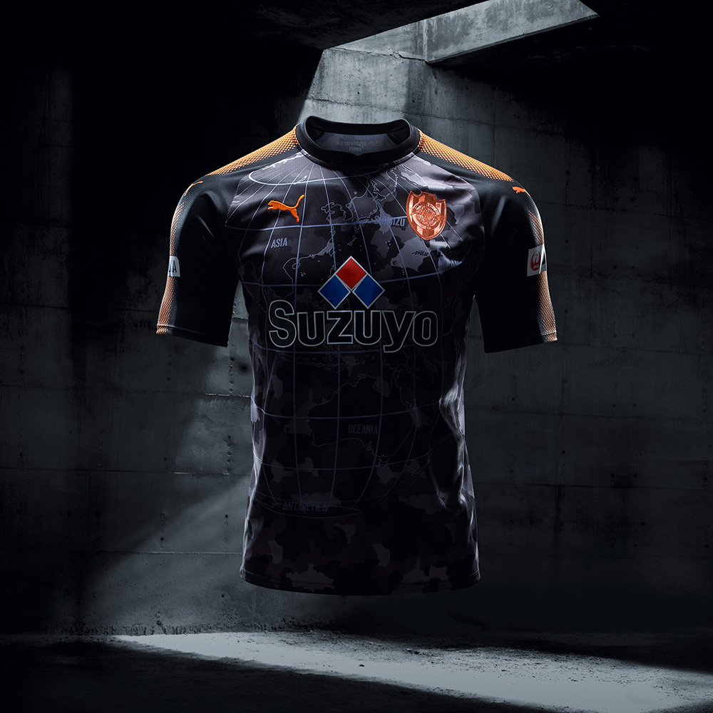
Shimizu S-Pulse third kit.
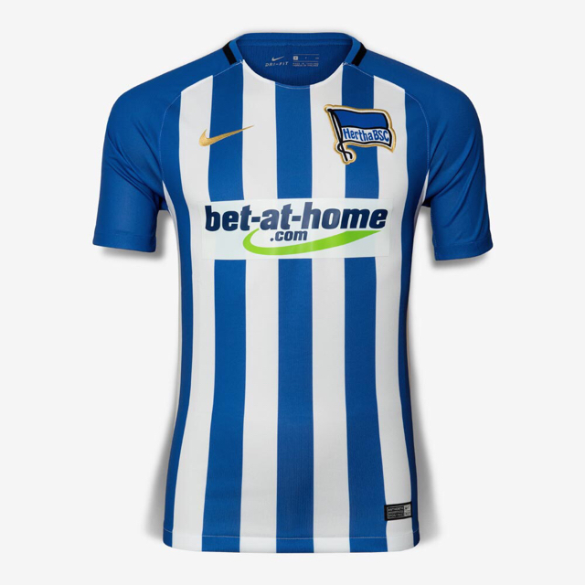
All the gambling advertising on soccer kits is disgusting.
Precisely why I couldn’t stomach buying the Hertha kit
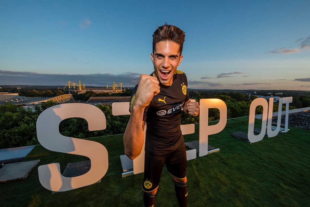
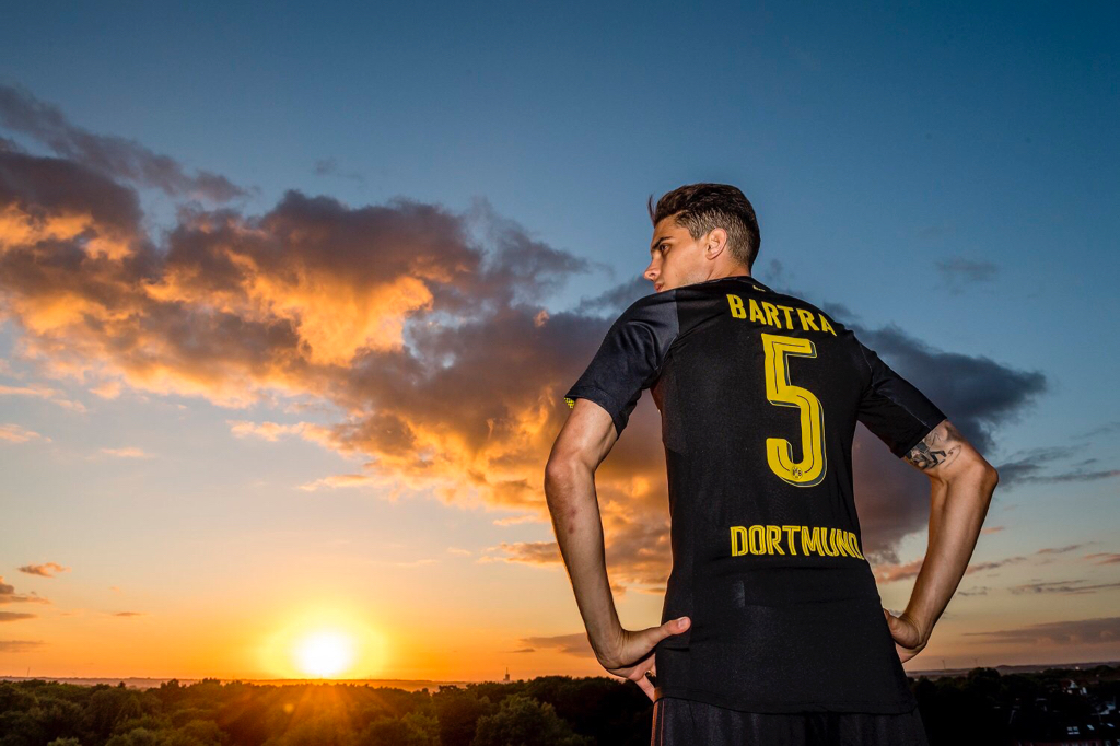
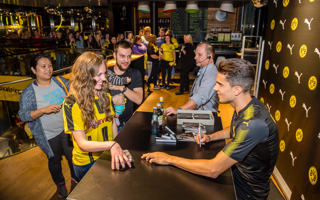
BVB Away Kit
- Jul 9, 2010
- 24,163
- 26,536
- AFL Club
- Fremantle
- Thread starter
- #6,524
I went into the Arsenal store at the Emirates yesterday and the pink stuff just looks even worse. It reminds me of something a bogan from Rockingham would wear.
The new Premier League looks really good though, not very unique unfortunately but it's bold and it stands out and I can see it working with both modern and classic designs.
On iPhone using BigFooty.com mobile app
The new Premier League looks really good though, not very unique unfortunately but it's bold and it stands out and I can see it working with both modern and classic designs.
On iPhone using BigFooty.com mobile app
Fizzler
BBTB
- Dec 26, 2013
- 12,756
- 16,343
- AFL Club
- Port Adelaide
- Other Teams
- OKC, Coburg, Werribee, Storm, QPR
Erm... no.It reminds me of something a bogan from Rockingham would wear.
- Status
- Not open for further replies.
Similar threads
- Replies
- 41
- Views
- 2K
- Replies
- 2
- Views
- 184
- Replies
- 42
- Views
- 2K
