

I want to get both NUFC's home and third kits but not gonna do it with a bloody overseas gambling company on it. Wonga was bad enough but carn.
Navigation
Install the app
How to install the app on iOS
Follow along with the video below to see how to install our site as a web app on your home screen.
Note: This feature may not be available in some browsers.
More options
You are using an out of date browser. It may not display this or other websites correctly.
You should upgrade or use an alternative browser.
You should upgrade or use an alternative browser.
Discussion Soccer/Association Football New Kits
- Thread starter Silent Alarm
- Start date
- Tagged users None
- Status
- Not open for further replies.
Klim
Brownlow Medallist
- Sep 17, 2013
- 12,532
- 10,363
- AFL Club
- Sydney
Spotted at JD sports.


- Moderator
- #6,529
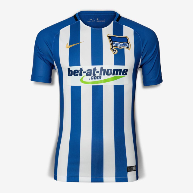
Precisely why I couldn’t stomach buying the Hertha kit
Same reason I bought a cap instead of a kit when I was over there. I wouldn't mind getting one of the old Deutsche Bahn sponsored ones off CFS though.
- Moderator
- #6,530
Spotted at JD sports.
So s**t. The vapor template sucks nuts and the sponsor integration is even worse this year. Where's the A-League logo?
Fizzler
BBTB
- Dec 26, 2013
- 12,764
- 16,356
- AFL Club
- Port Adelaide
- Other Teams
- OKC, Coburg, Werribee, Storm, QPR
So close, yet so, so far.
- Aug 20, 2010
- 4,860
- 5,377
- AFL Club
- Collingwood

- Other Teams
- FC Bayern, Chelsea FC, Raiders
- Banned
- #6,532
Please for the love of god move the A league logo to the sleeve and put the kit supplier logo's where they belong!!
Sent from my SM-G930F using Tapatalk
Sent from my SM-G930F using Tapatalk
I went into the Arsenal store at the Emirates yesterday and the pink stuff just looks even worse. It reminds me of something a bogan from Rockingham would wear.
The new Premier League looks really good though, not very unique unfortunately but it's bold and it stands out and I can see it working with both modern and classic designs.
On iPhone using BigFooty.com mobile app
The pink looked fantastic tonight at the game. The whole 3rd kit was really nice.
- Aug 21, 2007
- 31,666
- 98,998
- AFL Club
- Port Adelaide
- Other Teams
- Aston Villa, San Antonio Spurs
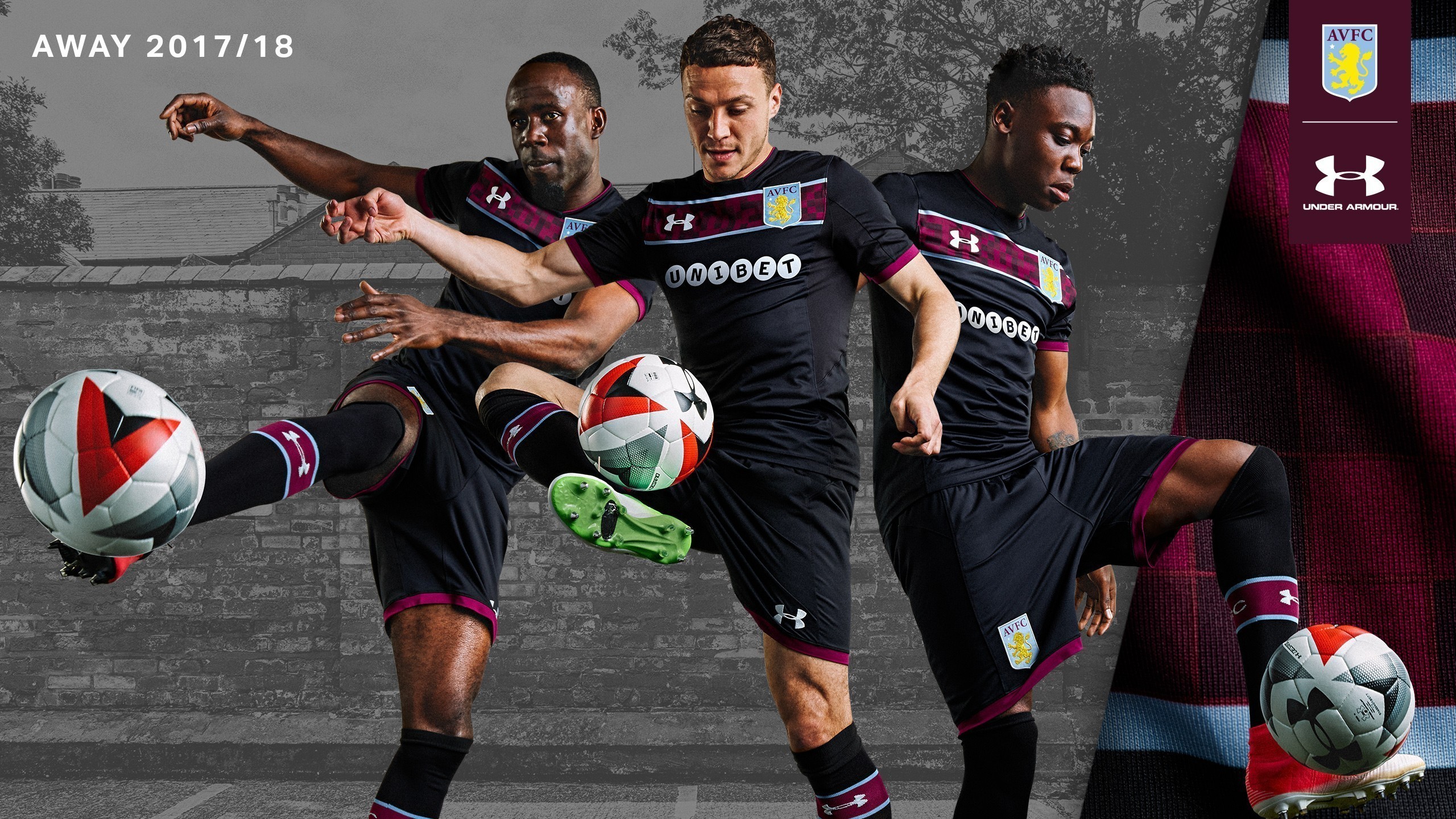
I liked the new Villa kits a lot better before the Unibet sponsorship went on.
Fortunately we were saved from having to use their bright green colouring, but tht playful tilted letters are completely at odds with the classy look of the rest of the kit. It clashes really harshly.
It's not quite as bad on the away and that's the one i'll probably get this year, but it's annoying.
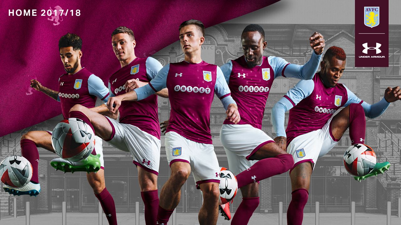
I think Unibet looks good there actually. Top notch as far as betting sponsors go.
Where's England's Brave John Terry?
Where's England's Brave John Terry?
- Aug 21, 2007
- 31,666
- 98,998
- AFL Club
- Port Adelaide
- Other Teams
- Aston Villa, San Antonio Spurs
I think Unibet looks good there actually. Top notch as far as betting sponsors go.
Where's England's Brave John Terry?
I think it suits the away more than the home, definitely. It's pretty unobtrusive, it's hard to complain, I just feel the styling of the sponsor doesn't match the home kit well.
I assume all the photos were taken before we signed him, but he was front and centre as the kit was released.
- Jan 29, 2007
- 912
- 1,175
- AFL Club
- Melbourne
Precisely why I couldn’t stomach buying the Hertha kit
Cringe.
- Jan 29, 2007
- 912
- 1,175
- AFL Club
- Melbourne
I think Unibet looks good there actually. Top notch as far as betting sponsors go.
Betting is legal, but there's just something about promoting it on a sports team that makes me uncomfortable.
It's just also sad that so many teams now have different betting agencies as their sponsors, as if that is the only way to make money now.
DiamondGuy
Le goûter qui »BANG«
- Sep 25, 2013
- 972
- 2,265
- AFL Club
- Geelong
- Other Teams
- Norwich, St Kilda
Speaking of betting -- urgh
Speaking of betting -- urgh
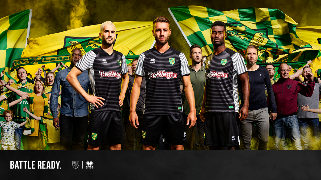
Norwich have a strong colour scheme that has a level of exclusivity at club level. It's a shame it's bottled by the appearance of shite sponsors year after year. They also haven't had decent manufacturer since the last millennium.
That away kit is putrid. Not only is it dull but a total mess.
That away kit is putrid. Not only is it dull but a total mess.
DiamondGuy
Le goûter qui »BANG«
- Sep 25, 2013
- 972
- 2,265
- AFL Club
- Geelong
- Other Teams
- Norwich, St Kilda
The first shirt that Errea produced after getting the contract, which coincided with re-appearance in the Prem, was a classic.
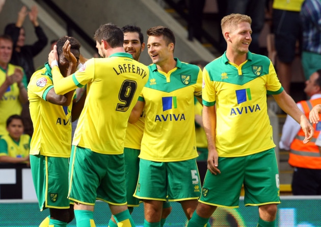
Aviva was a decent sponsor, nice colours that fit with the kit and a company with historical presence in Norwich.
Everything since then has gone consistently downhill but I agree that new away shirt is a new level of bad.
It's all yours for only $113 AUD including P&P or only $164 including more betting sponsors (Sky bet patches) and player numbering, LOL
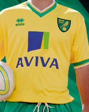
Aviva is just massive and it showed when Errea tried to do that half half kit which is a nice idea.The first shirt that Errea produced after getting the contract, which coincided with re-appearance in the Prem, was a classic.
Aviva was a decent sponsor, nice colours that fit with the kit and a company with historical presence in Norwich.
Everything since then has gone consistently downhill but I agree that new away shirt is a new level of bad.
It's all yours for only $113 AUD including P&P or only $164 including more betting sponsors (Sky bet patches) and player numbering, LOL
Thought that yoke kit was quite nice from a few years ago. The rest are just kind of underwhelming and they've probably only made a couple of decent away kits - the 90s throwback and the green one from a couple of years ago.
fancyscum
Radical Crommunist
And the third kit is always the worst, boy oh boy wow wee! (I mean besides last year, so that really only means that the orange hoops, but you get what I mean)Speaking of betting -- urgh
I thought the opposite. I reckon it suits the home more than the away. The away is black, with a relative dark maroon lines. The bright part is the blue but that's framing the maroon and works together. The sponsor, however, is a stark white and stands out severely. On the Home, the sponsor colour is lessened somewhat with the large amount of blue in the sleeves (if that makes sense)I think it suits the away more than the home, definitely. It's pretty unobtrusive, it's hard to complain, I just feel the styling of the sponsor doesn't match the home kit well.
I assume all the photos were taken before we signed him, but he was front and centre as the kit was released.
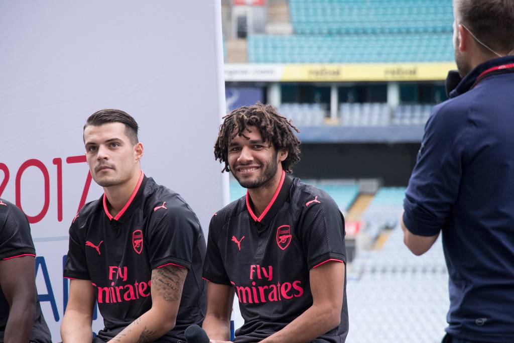
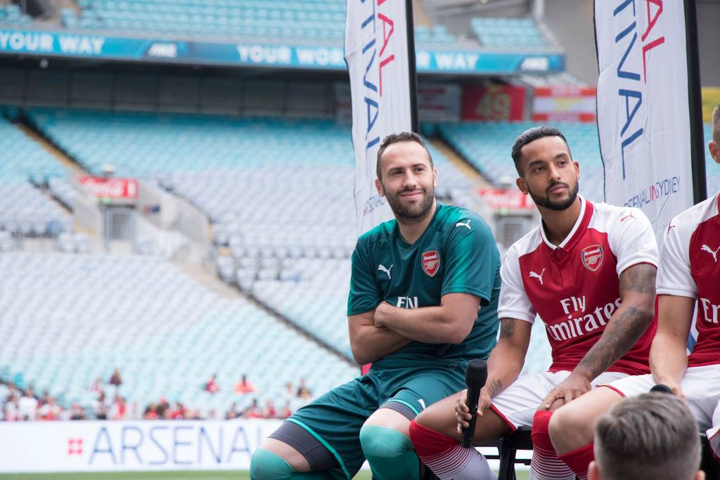
A good look at the 2017/18 Arsenal Home/Home GK/3rd Kits (retail versions) from today's fan day.
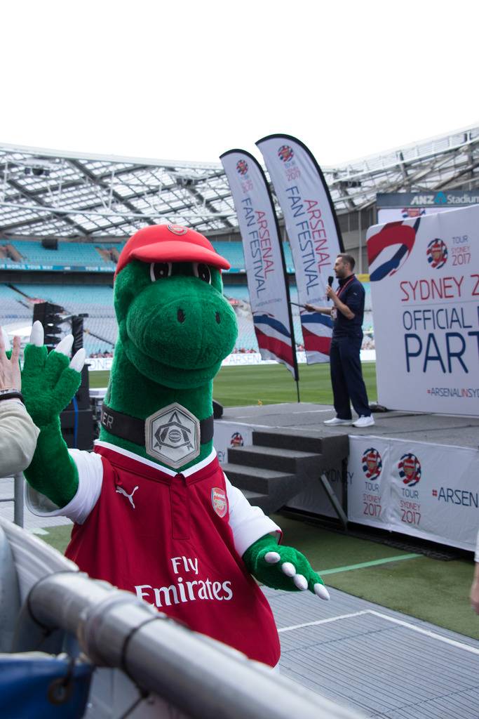
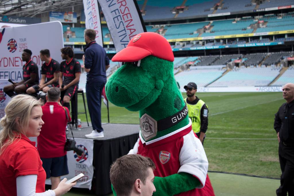
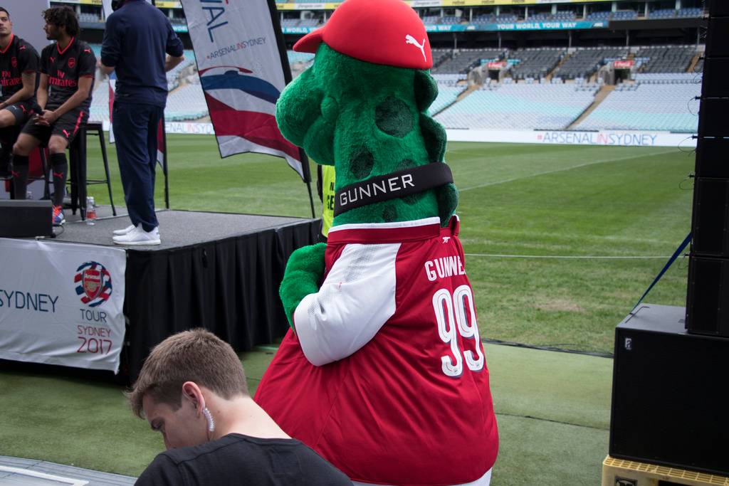
And the version for the extra large mascots out there (including a view of the Arsenal font)
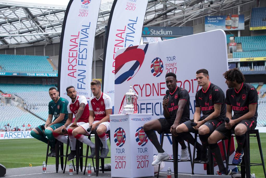
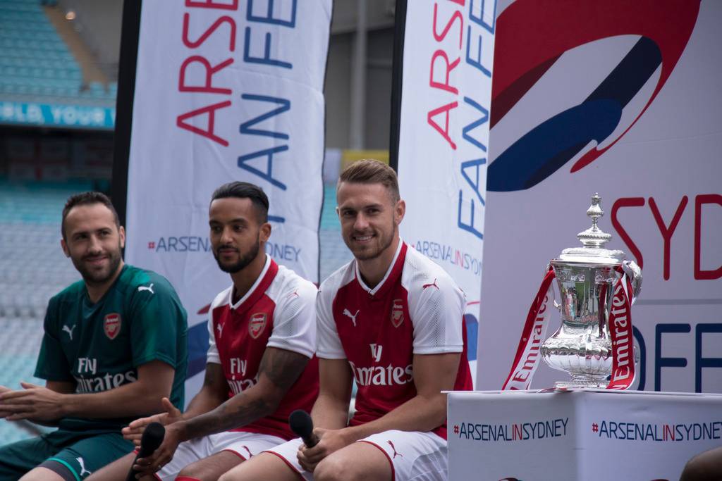
And the version for the extra large mascots out there (including a view of the Arsenal font)
DiamondGuy
Le goûter qui »BANG«
- Sep 25, 2013
- 972
- 2,265
- AFL Club
- Geelong
- Other Teams
- Norwich, St Kilda
And the third kit is always the worst
Brace yourself.
fancyscum
Radical Crommunist
Fully prepared for it to be a hot pink and teal kit with the face of Leo the LeoVegas Lion plastered on it. #webberlutionBrace yourself.
DiamondGuy
Le goûter qui »BANG«
- Sep 25, 2013
- 972
- 2,265
- AFL Club
- Geelong
- Other Teams
- Norwich, St Kilda
Errea somehow manages to get it right for other clubs. Sure, sponsor integration is not ideal but here are three recognisable, sellable, wearable, stylish kits
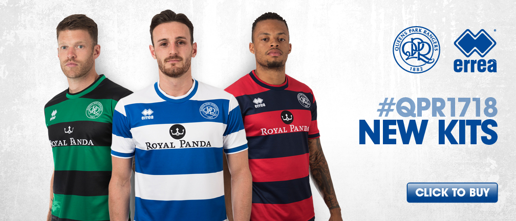
It's like Errea s**t themselves when they're trying to come up with designs for Norwich.Errea somehow manages to get it right for other clubs. Sure, sponsor integration is not ideal but here are three recognisable, sellable, wearable, stylish kits
- Status
- Not open for further replies.
Similar threads
- Replies
- 41
- Views
- 2K
- Replies
- 2
- Views
- 230
