Klim
Brownlow Medallist
- Sep 17, 2013
- 12,532
- 10,363
- AFL Club
- Sydney
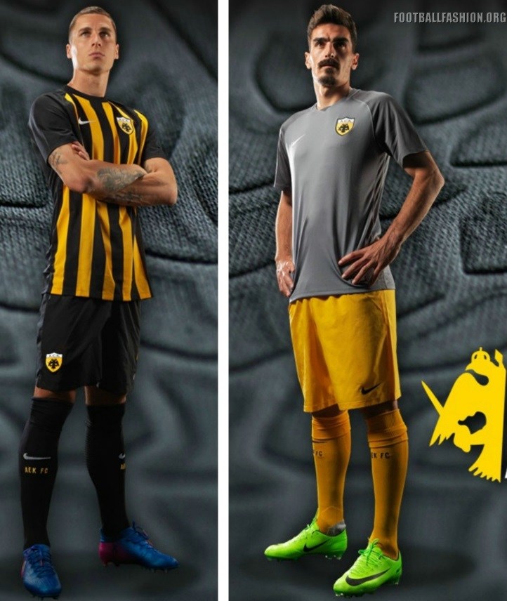
Stoke Third 17-18.

With that this would've been amazing as their sponsor.
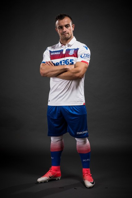
With that this would've been amazing as their sponsor.