Navigation
Install the app
How to install the app on iOS
Follow along with the video below to see how to install our site as a web app on your home screen.
Note: This feature may not be available in some browsers.
More options


You are using an out of date browser. It may not display this or other websites correctly.
You should upgrade or use an alternative browser.
You should upgrade or use an alternative browser.
Discussion Soccer/Association Football New Kits
- Thread starter Silent Alarm
- Start date
- Tagged users None
- Status
- Not open for further replies.


Victory drawing on their fans for the away kit, recognising they are all bogans with their southern cross tatts.
In all honesty though, it's all really close to being good but falling short once more for the Victory which for me should be up their with the best kits in the league. They still wont go back to the best chevron option they first adopted, and they can't quite get sponsors that look aesthetically pleasing...although not having a big red box like Adecco is a win of sorts.
I do love the away kit though, in a more slim fit it would look ace.
Badge definitely works as good on Victory as any team. Disappointing that they're still using that weak ass chevron though.
The way it should be!Oh and how good is the monochrome A-League badge!
- Aug 21, 2007
- 31,651
- 98,923
- AFL Club
- Port Adelaide
- Other Teams
- Aston Villa, San Antonio Spurs
Away is really nice. Home kit is trying it's hardest to minimalise the chevron and looks a bit weak, but overall pretty good.
- Sep 2, 2014
- 16,668
- 32,003
- AFL Club
- Hawthorn
- Other Teams
- Liverpool

Our 2017/18 home and away playing jerseys are available now to purchase from the Victory Shop.
Our new-look away jersey features a graphic interpretation of the southern hemisphere's night sky, featuring constellations as viewed from Australia.
Our dominance in Australian football is championed further through the placement of the Southern Cross alongside the club crest.
For the first time, the design features a new feature colour, “energy red”, in addition to our traditional navy and white. Our tradition is retained through the chevron device, synonymous with Melbourne Victory, while the iconic adidas three stripes are placed down the side of the jersey.
Both the home and away jerseys feature the new Hyundai A-League branding, uniquely coloured for Melbourne Victory.
A collaborative venture between Melbourne Victory and adidas, the refined fit of the jersey enables players to perform at their game day best on the pitch. Inclusion of the moisture wicking innovation of adidas Climalite technology within the new jersey ensures players remain cool and dry all season long.
Our home and away jerseys are available to purchase now from the Victory Shop, with a 10% discount applicable for 2017/18 Melbourne Victory members.
http://www.melbournevictory.com.au/...pyid7vjopqsk1uak7y8ykvy0j#1l2QptjVK6k05rGs.99
Home kit has too much going on, would have been better with a solid chevron instead of that fade thing.
Away kit would be good without the 80pt sponsor and the stars which make it look like you've got a bad case of dandruff.
Fizzler
BBTB
- Dec 26, 2013
- 12,756
- 16,343
- AFL Club
- Port Adelaide
- Other Teams
- OKC, Coburg, Werribee, Storm, QPR
Pretty perfect other than the home having two sponsor logos.
- May 23, 2016
- 713
- 836
- AFL Club
- St Kilda
- Other Teams
- Port Melbourne; Kalkee; Horsham Demons
Victory home kit is balls. Too many sponsors, and the chevrons are poorly designed. I do like the away kit, though.
- Aug 20, 2010
- 4,860
- 5,377
- AFL Club
- Collingwood

- Other Teams
- FC Bayern, Chelsea FC, Raiders
- Banned
- #6,684
Someone here able to Photoshop that home kit, move the A league logo to the sleeve, move adidas logo to where the A league logo was and move the chevron and sponsor further up the kit?
Sent from my SM-G930F using Tapatalk
Sent from my SM-G930F using Tapatalk
Klim
Brownlow Medallist
- Sep 17, 2013
- 12,532
- 10,363
- AFL Club
- Sydney
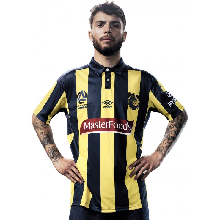
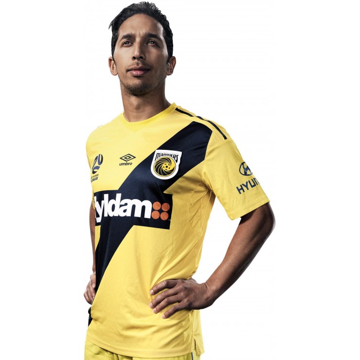
CCM kits 17/18.
Freight Train
Once hit the sign at the Mercantile Mutual Cup
- Moderator
- #6,686
- Jul 9, 2010
- 24,163
- 26,536
- AFL Club
- Fremantle
- Thread starter
- #6,687
Danny DeSilva is at Central Coast now?! Man what a waste of talent. Gotta love the tattoos though... up there with Messi in terms of tough stickers...CCM kits 17/18.
Nice shirts though.
The Victory one is s**t. Amazing how the Mariners have the same things to incorporate yet their shirt is so clean looking despite it having stripes.
On iPhone using BigFooty.com mobile app
- Jun 18, 2016
- 51,524
- 98,700
- AFL Club
- West Coast
- Other Teams
- Perth Scorchers
They look like they should be Wellington kits...
akkaps
Community Leader
- Mar 20, 2012
- 47,423
- 32,657
- AFL Club
- Carlton
- Moderator
- #6,689
Andonis1997 , thoughts??They look like they should be Wellington kits...
Just ruined by the sponsorshipCCM kits 17/18.
@CCM:
*us
Let's think about this for a second. Assuming for the Nix V CCM matchup in NZ, we wear OUR yellow and black stripey kit, black socks and shorts, with a yellow back... What will CCM wear? Their kits don't provide enough contrast for this match. Their home is probably like our home and their yellow away creates more issues whenever our players turn around.
Idiots. Prepare a third kit, Mariners.
Was never a big fan of the home shirt anyway, but the doubling-up of the sponsor has just made it even worse. The new away kit though... its like its so close, but yet so far. I really like the basic design of it, but the constellation, the gradients on the sleeves, and the random bit of red on the collar all conspire to bring the final product down. There is no need to be too clever, just a solid navy top section there and that would be a ripper.
Interestingly our home and away kits are now out of kilter with one another. We only used the 15/16 home shirt for one season, but kept that season's away kit for two. I wonder if this is a deliberate decision to ensure at least one new kit every season, or if they'll try and get them back together at some point.
fancyscum
Radical Crommunist
You sound like a Sydney fan complaining about city wearing blue, except these stripes will be gone next year.@CCM:
*us
Let's think about this for a second. Assuming for the Nix V CCM matchup in NZ, we wear OUR yellow and black stripey kit, black socks and shorts, with a yellow back... What will CCM wear? Their kits don't provide enough contrast for this match. Their home is probably like our home and their yellow away creates more issues whenever our players turn around.
Idiots. Prepare a third kit, Mariners.
I think I have a right to sound like that, don't I? I was fine with the thick stripes they had a few years ago, but the "3 stripe" thing is our thingYou sound like a Sydney fan complaining about city wearing blue, except these stripes will be gone next year.
fancyscum
Radical Crommunist
I'm not questioning your right to say it, but at the same time, I'm not sure CCM are looking to steal the Wellington brand.I think I have a right to sound like that, don't I? I was fine with the thick stripes they had a few years ago, but the "3 stripe" thing is our thing
Saint Mick
Senior List
- Sep 26, 2012
- 196
- 264
- AFL Club
- St Kilda
Crystal Palace have released their third kit - probably be worn away against Bournemouth and that's about it?


- Jul 9, 2010
- 24,163
- 26,536
- AFL Club
- Fremantle
- Thread starter
- #6,697
The Mariners had been around for three seasons and in a then eight team competition, the Phoenix decided to adopt essentially the same colours? They first wore black which was different enough but in a small competition if you choose the same colours as a different club then you can't really get huffy. Or, you know, you both inevitably bring out third strips.
Of course they're not stealing our brand, haha. But they definitely do need to "earn their stripes"I'm not questioning your right to say it, but at the same time, I'm not sure CCM are looking to steal the Wellington brand.
Fizzler
BBTB
- Dec 26, 2013
- 12,756
- 16,343
- AFL Club
- Port Adelaide
- Other Teams
- OKC, Coburg, Werribee, Storm, QPR
Fenerbahce called, they want their home kit back...CCM kits 17/18.
Klim
Brownlow Medallist
- Sep 17, 2013
- 12,532
- 10,363
- AFL Club
- Sydney
Roar 17-18 kits.

- Status
- Not open for further replies.
Similar threads
- Replies
- 41
- Views
- 2K
- Replies
- 2
- Views
- 185
- Replies
- 42
- Views
- 2K
