Discussion Soccer/Association Football New Kits

Remove this Banner Ad

Status
Not open for further replies.
I'll wear a footy jumper to a game if it's Freo playing. I have an old anchor that I've basically worn to every game I've seen them play, feels like I might as well keep doing it until I'm too old to.

I wouldn't buy a jumper now though; wearing the newest one past the age of about 15 feels a bit lame. There's no age for a jumper, just make sure there's a tee underneath. Generally a vibe. Once your guts gets too big it's probably time to retire it. I have a good early 2000s Adidas Freo jacket and if I was to grow out of my old one, I'd wear stuff like that to games.

Don't mind the old beanie in winter though, can be a good look. Wouldn't wear a Freo one in Perth but interstate/smaller club ones work a bit in Melbs. Generally works as an okay conversation starter in pubs or at uni.

I like just buying soccer strips, have a good collection, generally get one when I'm in a city I really like or it's cheap, or I've always wanted to add that club or side to my collection. I think if you're of a certain look it's okay but being an azn bro with Yeezys it probably doesn't work wearing a Ronaldo 7 strip you saw on FIFA. I like a retro shirt in summer, even though I really prefer wearing cotton and especially in the heat.

I think it's sort of one of those things, sort of about it being incongruous. If you're skinny and of a certain persuasion it's a bit unexpected. If it's retro or something it's got that factor. If you're doing sports science and wearing thongs and running shorts to a lecture, wearing an Eagles jumper is probably a good way to guarantee you look like a knob. If you constantly wear an item of sports merch it might be the same thing. Guess it's about balance.
 
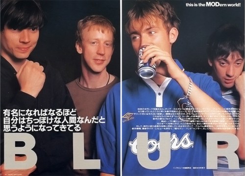
Better off to go the Damon Albarn look than the kid who camps out for sneakers at 11pm

Blur11.jpg
 
FB_IMG_1505188682103.jpg

I was close with my mock-up.

Going the Portugal 2014 gradient stripes tho - which is a bit disappointing. Would have preferred the hoops but overall not a bad design.
 

Log in to remove this ad.

Happy they've finally pissed off stripes of any sort (yeah yeah I know, sublimated ones are there) but it still isn't a good strip. It's better than the last few because it doesn't seem as cheap, but:

It's made by Macron so will inevitably all be sublimated and look tacky.

The collar is pretty bad, sits too far back, and sleeved designs always look better with a simple collar – a good deep, 80s v-neck would have been cool with a thick white.

And it isn't that hard but bring back the orange. It would elevate these strips so much more; I mean these just lack any sort of charisma and when you're a new franchise (not a hundred year old club) you need to latch onto that sort of thing. I still maintain if they had purple, white, and orange it would become some sort of 'known' shirt among people into soccer strips (ala Kaiser Chiefs, Boca, stuff like that). It is also ludicrous when the only orange is on the logos...

The big QBE looks cool though.

If you go on the New Balance website you can play around with some of their basic teamwear, and this can be mocked up...

MT61359_01_base


Come on!
 
Macron somehow make the best looking kits in the A League recently.

More orange for Perth would be rad. With orange the colour scheme is pretty loud and it suits zany 90s style designs.
They're okay but A-League shirts are pretty bad. Weird how I actually prefer the templates of the Reebok era to what's being churned out now: second rate templates from Adidas with overly complicated designs and every idea thrown on, Umbro making the Mariners wear highlighter yellow and fits like rolled up cardboard, Puma are okay, but Macron is dull to me... just doesn't really go here nor there. I don't really like their international stuff either.

What I hate about Macron is the material. It's *in awful. On some 55-year old Joondalup pom at NIB or under the lights at AAMI, the retail versions somehow have all the worst possible attributes for a soccer shirt – they look really thin, the material looks shiny, the stitching is always unravelling, it has that static-y appearance some polyester has, and with all the printed on ads it's a real travesty. I just ******* hate looking at them. It's like some opposite ASMR thing where just seeing them puts me in a s**t mood. The poxy *in things probably wouldn't even burn well.
 
Happy they've finally pissed off stripes of any sort (yeah yeah I know, sublimated ones are there) but it still isn't a good strip. It's better than the last few because it doesn't seem as cheap, but:

It's made by Macron so will inevitably all be sublimated and look tacky.

The collar is pretty bad, sits too far back, and sleeved designs always look better with a simple collar – a good deep, 80s v-neck would have been cool with a thick white.

And it isn't that hard but bring back the orange. It would elevate these strips so much more; I mean these just lack any sort of charisma and when you're a new franchise (not a hundred year old club) you need to latch onto that sort of thing. I still maintain if they had purple, white, and orange it would become some sort of 'known' shirt among people into soccer strips (ala Kaiser Chiefs, Boca, stuff like that). It is also ludicrous when the only orange is on the logos...

The big QBE looks cool though.

If you go on the New Balance website you can play around with some of their basic teamwear, and this can be mocked up...

MT61359_01_base


Come on!
Good thing I changed my NAFL design :-s
 
Another Image of the Newcastle kits.

The Away is the gold and the 3rd is the white.

upload_2017-9-12_17-1-1.jpeg

The designer of these kits is on CCSLC and he said that some of his intended design elements did not end up happening as he wanted. After asking what they were, he has said that the watermark on the gold away turned out too yellow for his liking and he wanted more gold on the home and 3rd.

I have now asked if he thought of using some of the 3rds elements on the home (the white stripes with the red centre) to tie the kits together more. Will let you know what he says in reply.
 

(Log in to remove this ad.)

Macron somehow make the best looking kits in the A League recently.

Villa have moved to Under Armour but the last few kits Macron did for us were very good.

Not a great company but they at least stay within their limits and produce nice looking kits
 
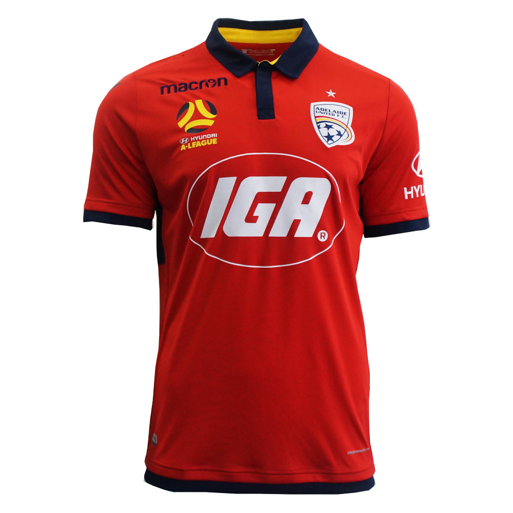
Obviously outside of the parts of the brief you can't do much about (navy and yellow as the secondary colours, enormous IGA logo), that's a terrific effort. I can't immediately think of a better Adelaide United kit
 
That's quite nice; really nice. Always thought Adelaide United should focus more on the whole SA thing – doubt West Adelaide are being promoted soon. Plus they already use the state colours. Nice simple top and the IGA is huge but still looks good.

What's annoying is the balance of colours... there's the red, yellow, and navy which looks really good and then the whole other side is basically white logos and parts. I get IGA won't change their colours but make the Hyundai logo yellow or navy, and have a properly coloured logo and it'll look great. Seriously why have a white logo (basically) when you don't have white? It's let it down.
 
At least make the star yellow – that'd integrate it a lot more, make it look less like a second thought.
 
Status
Not open for further replies.

Remove this Banner Ad

Back
Top