- Jul 9, 2010
- 24,163
- 26,536
- AFL Club
- Fremantle
- Thread starter
- #7,151
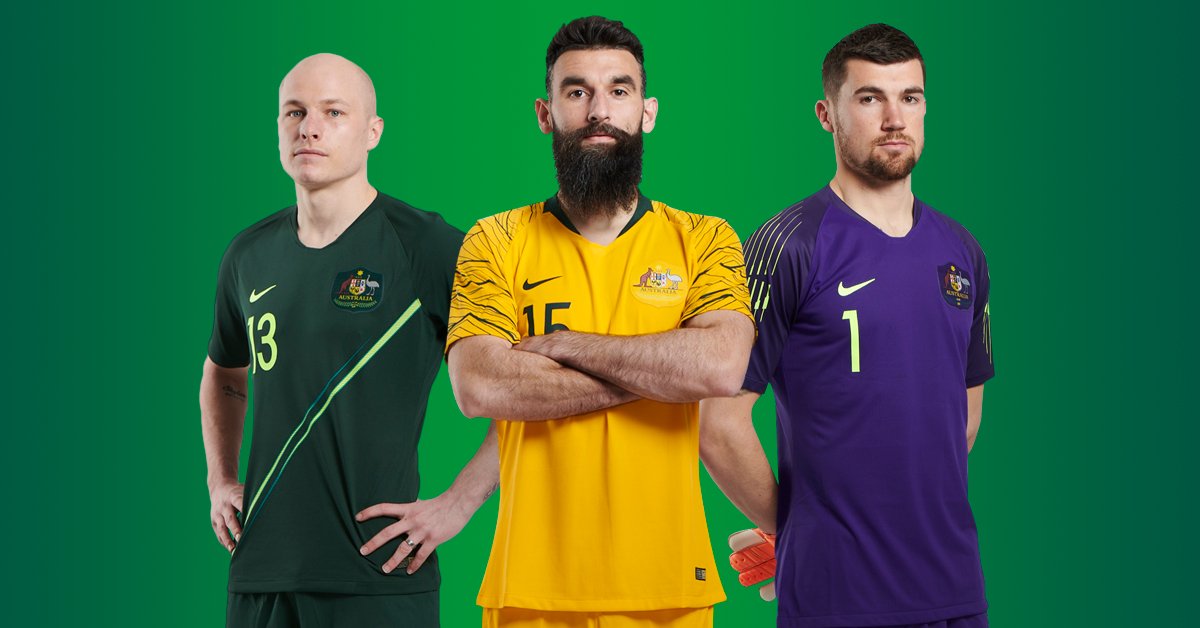
Is it though? The Nigeria works because of the colours and the history. A bunch of white boys who play for Sydney FC and lower table Belgian sides will look lame in that sort of print. It's like a kid just discovered 90s shirts and the spew kit and thought it was hilarious. Soccer shirts are designed two years before they appear and here it shows... it's just a bit... s**t. It's not unique or thoughtful and just a lol 90s! attempt. I *in hate it. Danny DaSilva too?That training (?) kit is a beauty. A real shame that the Caltex sponsor soils it. Would have made a great away strip, actually.
The home shirt is okay but eh, the yellow bottoms is appalling. The green is a great idea but everyone is saying how the sash is just a training kit look.
Awful as all up.