- Jul 9, 2010
- 24,163
- 26,536
- AFL Club
- Fremantle
- Thread starter
- #7,776
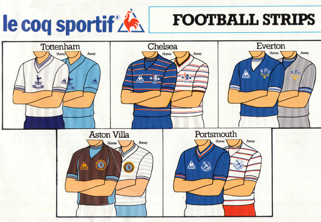
They actually have a lot of classic shirts, pretty underrated. Their home shirts were reserved and always focused on great collars but the alternate strips experimented with pin stripes, sashes, sleeves, and I can't remember them repeating colours... navy, mossy greens, royal blue, yellow, purple, sky blue and navy...This kit is so nice! Their stadium was "Reebok Stadium" too, Bolton and Reebok is such an iconic duo.
Plus that mid-2000s template is one of my favourites. The West Ham version and a few of the Man City ones from that period were great too.
Chuck in the uber tight, exposed stitching rashy-like Kappa, the angular then rounded Nike ones, plus the Umbro template with all the neck detail and it was actually a good time for templates.


.jpg")
.jpg")