Navigation
Install the app
How to install the app on iOS
Follow along with the video below to see how to install our site as a web app on your home screen.
Note: This feature may not be available in some browsers.
More options

You are using an out of date browser. It may not display this or other websites correctly.
You should upgrade or use an alternative browser.
You should upgrade or use an alternative browser.
Discussion Soccer/Association Football New Kits
- Thread starter Silent Alarm
- Start date
- Tagged users None
- Status
- Not open for further replies.
That first one is mint
The Central Coast kit looks like absolute trash. Can hardly read the name either.
- Jul 9, 2010
- 24,163
- 26,537
- AFL Club
- Fremantle
- Thread starter
- #7,804
That Victory shirt is better than the rest. Buries all the logos in a V and then doesn’t complicate itself with dumb trims or whatever. It’s actually one of their best.
The V needs to be thought about and used in a better way though.
On iPhone using BigFooty.com mobile app
The V needs to be thought about and used in a better way though.
On iPhone using BigFooty.com mobile app
Leaked by a former Nix kit supplier in Wellington.I might be wrong, rumour is that it's just the update of the application of the logo, having only the bird and text on the kit.

I very much prefer it
- Jul 9, 2010
- 24,163
- 26,537
- AFL Club
- Fremantle
- Thread starter
- #7,806
I haven't seen this sort of thing before. It's the exact same shirt (take away the crest use) but a totally different template.
So the stripes continue right to the top now and there's a sort of 'border' around the sleeves now. Which makes it look quite different.
But the collar is exactly the same, the width of the stripes, and even the blurred cuffs. Pretty weird.
This design is one of the greats, shame about the sponsor though.
And, you know, the fascists.
This design is one of the greats, shame about the sponsor though.
- Jul 9, 2010
- 24,163
- 26,537
- AFL Club
- Fremantle
- Thread starter
- #7,809
How weird is this?
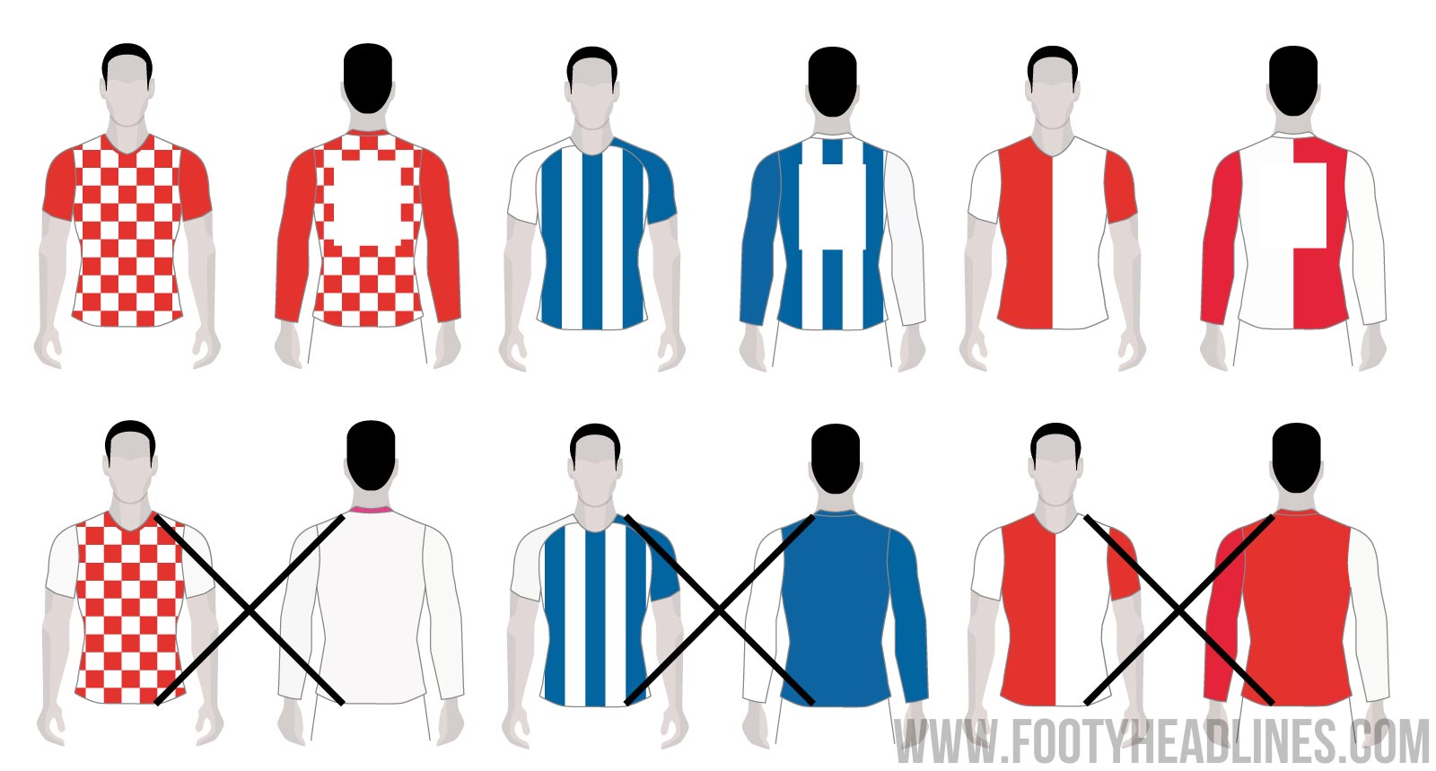
UEFA has mandated that all shirt patterns have to continue onto the back.
In an easier form:

https://www.footyheadlines.com/2018/09/uefa-bans-striped-shirts-with-solid-backs.html
Does anyone else find this weird? For a heap of reasons?
Firstly, I'm almost certain it was UEFA who said all clubs/nations had to have a blank back to both make the numbers clearer and so teams had a distinct colour. Then there's the issue of this coming out... now... when most seasons are underway and all qualified Champions League/Europe League teams have their strip suite released.
It's nicer to allow this because I just think it's a better look, but this'll inevitably just create a heap of issues/delays/clashes and UEFA'll do an AFL and revert it again in a season.
Odd s**t.
UEFA has mandated that all shirt patterns have to continue onto the back.
In an easier form:
https://www.footyheadlines.com/2018/09/uefa-bans-striped-shirts-with-solid-backs.html
Does anyone else find this weird? For a heap of reasons?
Firstly, I'm almost certain it was UEFA who said all clubs/nations had to have a blank back to both make the numbers clearer and so teams had a distinct colour. Then there's the issue of this coming out... now... when most seasons are underway and all qualified Champions League/Europe League teams have their strip suite released.
It's nicer to allow this because I just think it's a better look, but this'll inevitably just create a heap of issues/delays/clashes and UEFA'll do an AFL and revert it again in a season.
Odd s**t.
- Nov 15, 2010
- 2,408
- 2,154
- AFL Club
- Fremantle
- Other Teams
- WACA, Western Force, Arsenal, Glory
Yep, this is pretty odd, especially if the teams don't clash anyway.
Inter Milan (I hope this concept is accurate - looks mint as. Official launch Sept 12):
View attachment 552166
Inter third didn't really turn out quite the way I hoped..

Ruined it.
- Aug 4, 2013
- 1,004
- 2,066
- AFL Club
- West Coast
- Other Teams
- Perth Scorchers, Gladbach, Kyoto Sanga
Isn't their away kit white anyway? Another pointless Nike 3rd kit.
fancyscum
Radical Crommunist
It’s only pointless if you think the point of them is to avoid clashes and not to just boost merchandise sales.Isn't their away kit white anyway? Another pointless Nike 3rd kit.
- Nov 15, 2010
- 2,408
- 2,154
- AFL Club
- Fremantle
- Other Teams
- WACA, Western Force, Arsenal, Glory
Quite a classy Nürnberg kit from Umbro...


Last edited:
New pics of Chelsea third...


Surely not... A black back?! phoenixshop.co.nz


- Aug 4, 2013
- 1,004
- 2,066
- AFL Club
- West Coast
- Other Teams
- Perth Scorchers, Gladbach, Kyoto Sanga
Umbro have been knocking it out of the park this season, the diamonds on the cuffs just look so, so good.Quite a classy Nürnberg kit from Umbro...
View attachment 554742
Also another thing about that Chelsea kit...if you need a stroke around those silver logos, it's probably a sign not to use silver. The orange from the neck tape would look better
- Nov 15, 2010
- 2,408
- 2,154
- AFL Club
- Fremantle
- Other Teams
- WACA, Western Force, Arsenal, Glory
A bleck beck? Surely you jist?Surely not... A black back?! phoenixshop.co.nz
View attachment 555350
- Jul 9, 2010
- 24,163
- 26,537
- AFL Club
- Fremantle
- Thread starter
- #7,821
It’s a cool logo but give it six months and like every other MLS franchise, it’ll be stale.
On iPhone using BigFooty.com mobile app
On iPhone using BigFooty.com mobile app
fancyscum
Radical Crommunist
- Jul 9, 2010
- 24,163
- 26,537
- AFL Club
- Fremantle
- Thread starter
- #7,823
I get the idea of it but...
that little chevron looking thing on the "A" of miami is bugging me. i get it matches the angle of the "M" and probably the heron's legs, but it just seems pointless. is it used anywhere else on other club merch or at least used commonly in their typeface?

- Status
- Not open for further replies.
Similar threads
- Replies
- 41
- Views
- 2K
- Replies
- 1
- Views
- 88
- Replies
- 42
- Views
- 2K
