


When I first saw it I thought about the Serbian flag as well. Bit awkward, but maybe now they'll fix it...tad awkward

Russia football team ditch new Adidas kit after flag colour criticism
The Adidas-made kit for Russia's national football team has drawn criticism because of an apparently oversight on the design.www.euronews.com
Navigation
Install the app
How to install the app on iOS
Follow along with the video below to see how to install our site as a web app on your home screen.
Note: This feature may not be available in some browsers.
More options
You are using an out of date browser. It may not display this or other websites correctly.
You should upgrade or use an alternative browser.
You should upgrade or use an alternative browser.
Discussion Soccer/Association Football New Kits
- Thread starter Silent Alarm
- Start date
- Tagged users None
- Status
- Not open for further replies.
Freight Train
Once hit the sign at the Mercantile Mutual Cup
- Moderator
- #8,703
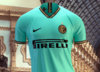
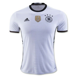
Top of my head, Germany away '16, Japan home '16, Liverpool home '17-18, Inter third '19-20, Barca home '14-15, whatever Nike was doing in 2014,
Every kit from the latest womens world cup
fancyscum
Radical Crommunist

Too hard to separate these two for me.
My inconspicuous pick
The Nigeria and Australia throw back kits are probably 2 of the best International kits. How does the McBarcelona kit end up in that thumbnail?

Germany 2019 womens kit

Arsenal away 2019 kit

Germany 2019 womens kit

Arsenal away 2019 kit
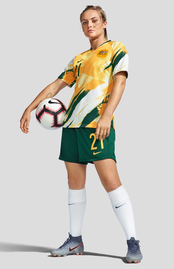
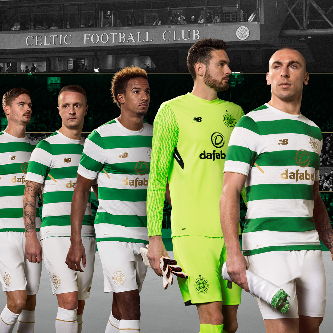
I own that Celtic shirt and that Matildas shirt. Good gear.
Fizzler
BBTB
- Dec 26, 2013
- 12,770
- 16,360
- AFL Club
- Port Adelaide
- Other Teams
- OKC, Coburg, Werribee, Storm, QPR
My slightly left of field pick is the France 2014 home. Just so clean.


- Nov 15, 2010
- 2,409
- 2,157
- AFL Club
- Fremantle
- Other Teams
- WACA, Western Force, Arsenal, Glory
Always thought the short-sleeves and dark shorts combo for this kit looked dynamic on-field


Rubber Arm
AFL Sucks
- Oct 10, 2018
- 1,642
- 3,572
- AFL Club
- North Melbourne
- Other Teams
- ^ I don't actually go for North.
Thoughts? Fair bit of backlash on fb


acm21
Club Legend
- May 7, 2019
- 2,694
- 1,395
- AFL Club
- Essendon
Very old school, similar to the newcastle kit. Feels better if the logos were placed on each breast rather than in the middle. The problem witht this sort of design and national kits are they are often one colour, mind you i dont think the newcastle kit was well recieved (maybe the 90s nostalgia isnt highon most peoples lists). I dont mind it, but it feels bland (but that is common with English kits across the board).Thoughts? Fair bit of backlash on fbView attachment 793259
That template would suit the US better. Not England.Thoughts? Fair bit of backlash on fbView attachment 793259
- Apr 19, 2008
- 18,094
- 27,533
- AFL Club
- Essendon
- Other Teams
- Melb Stars, Man U, USC, NY Mets

US club Charleston Battery with a “new” revised logo and kit for the upcoming season. The home kit is gross with red socks while the away doesn’t look too bad.
On iPhone using BigFooty.com mobile app
Gives me Puma's World Cup 2010 template vibes. Ish.View attachment 793664
US club Charleston Battery with a “new” revised logo and kit for the upcoming season. The home kit is gross with red socks while the away doesn’t look too bad.
On iPhone using BigFooty.com mobile app
.jpeg")
As a set of kits I’ll go Real Madrid from 2012/13. Particularly the forest green with silver trim, don’t know why but it’s one of my favourites of all time.

Home

Away

Third

Home

Away

Third

Thoughts? Fair bit of backlash on fbView attachment 793259
Looks like they're doing something similar with the Netherlands as well - https://www.footyheadlines.com/2019/11/nike-netherlands-euro-2020-home-kit.html

Rubber Arm
AFL Sucks
- Oct 10, 2018
- 1,642
- 3,572
- AFL Club
- North Melbourne
- Other Teams
- ^ I don't actually go for North.
Far too hard to just pick one for the best of the decade.
Attachments
-
 0_Leicester-City-away-kits.jpg32.4 KB · Views: 194
 -
 2a34408f00000578-3147756-image-a-37_1435938914413-1440138134-800.jpg106.9 KB · Views: 45
 -
 faebd83dadfe21d210dca78c44585f4a.jpg14.2 KB · Views: 172
 -
 https___hypebeast.com_image_2019_06_adidas-arsenal-home-kit-premier-league-2019-2020-official-...jpg125.3 KB · Views: 37
 -
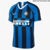 inter-19-20-home-kit-5.jpg76.6 KB · Views: 191
 -
 spal-110th-anniversary-shirt-3.jpg59.5 KB · Views: 192
 -
 Velez-Sarsfield-Umbro-Third-Jersey-2016.jpg71.7 KB · Views: 172
 -
 2019-20-fc-internazionale-milano-away-kit-3_rectangle_1600.jpg326.1 KB · Views: 43
Hot damn, that SPAL kit is sweetFar too hard to just pick one for the best of the decade.
Rubber Arm
AFL Sucks
- Oct 10, 2018
- 1,642
- 3,572
- AFL Club
- North Melbourne
- Other Teams
- ^ I don't actually go for North.
I think centred logos can look great when done right but they don't work well on national kits. I think a team like barca or Ajax could pull it off nicely. The Newcastle kit this year to me doenst work because the sponsor doesnt fit the style enough. A sponsor like Pirelli, Coca-Cola, Jeep or something like that would work perfectly in my opinion.Very old school, similar to the newcastle kit. Feels better if the logos were placed on each breast rather than in the middle. The problem witht this sort of design and national kits are they are often one colour, mind you i dont think the newcastle kit was well recieved (maybe the 90s nostalgia isnt highon most peoples lists). I dont mind it, but it feels bland (but that is common with English kits across the board).
- Aug 20, 2010
- 4,860
- 5,377
- AFL Club
- Collingwood

- Other Teams
- FC Bayern, Chelsea FC, Raiders
- Banned
- #8,723
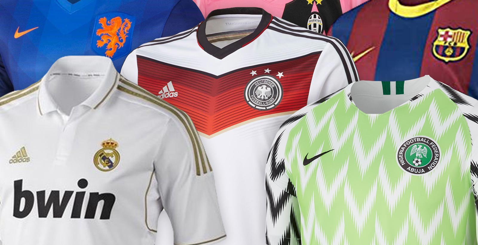
Our 10 Best Kits Of The Decade
Some weeks ago, Bleacher Report revealed what are their 10 best kits of the decade, choosing 10 iconic shirts from 2010 to 2019.
 www.footyheadlines.com

- Nov 15, 2010
- 2,409
- 2,157
- AFL Club
- Fremantle
- Other Teams
- WACA, Western Force, Arsenal, Glory
Dunno if this has been posted yet - Spectacular Adidas Arsenal Bruised Banana Kit Remake + Retro Collection Revealed


- Status
- Not open for further replies.
Similar threads
- Replies
- 41
- Views
- 2K
- Replies
- 2
- Views
- 237
