


- Apr 19, 2008
- 18,094
- 27,533
- AFL Club
- Essendon
- Other Teams
- Melb Stars, Man U, USC, NY Mets
How’s this beauty from Santa Tecla from El Salvador the amount of sponsors is crazy.
On iPhone using BigFooty.com mobile app
Follow along with the video below to see how to install our site as a web app on your home screen.
Note: This feature may not be available in some browsers.
 www.footyheadlines.com
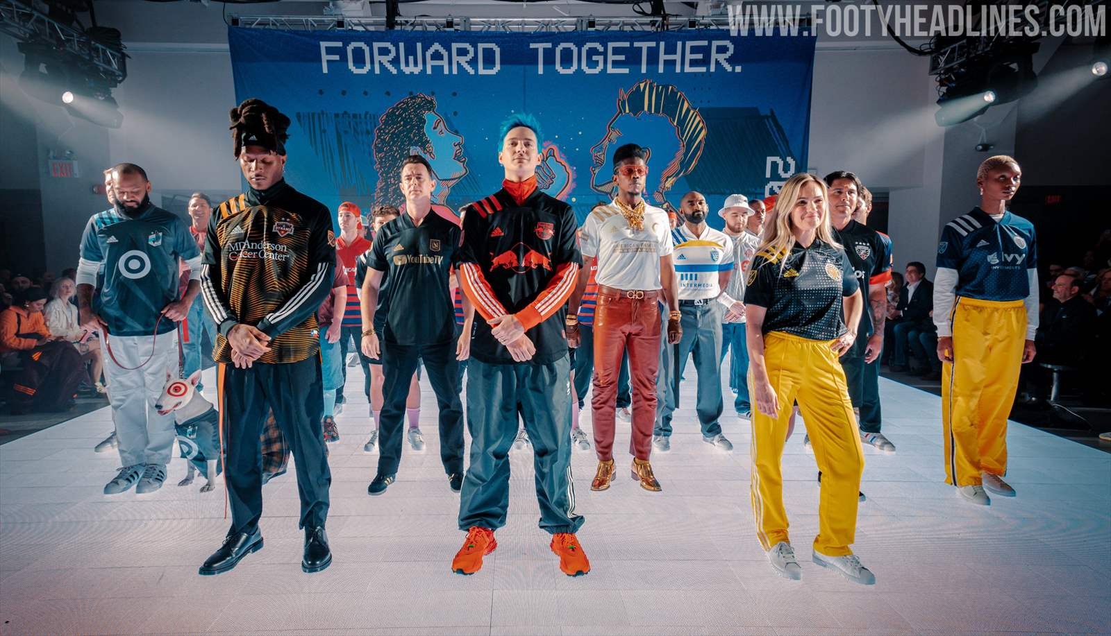
It looked nice on the Miami kit but on every other team it's overkillAdidas MLS 2020 Kits Released - Update With 30+ New Pictures
Update: We have added more than 30 new pictures of yesterday's MLS launch kit event as well as video of the launch.
It looked nice on the Miami kit but on every other team it's overkill
Really like LAFC, Miami, Atlanta, Cincinnati, both NY teams, Philly, Toronto and Vancouver.Adidas MLS 2020 Kits Released - Update With 30+ New Pictures
Update: We have added more than 30 new pictures of yesterday's MLS launch kit event as well as video of the launch.
Those would look great as rugby sevens kits. Especially in an Olympic yearAdidas MLS 2020 Kits Released - Update With 30+ New Pictures
Update: We have added more than 30 new pictures of yesterday's MLS launch kit event as well as video of the launch.


View attachment 821960
Perf’s ACL kits.
Home would look mint without the number planted in the middle of it, the white one looks like a training top.
Seems odd to have a number on the home but not the away.

Looks like they've racked Arsenal's 2014/15 number fontView attachment 821960
Perf’s ACL kits.
Home would look mint without the number planted in the middle of it, the white one looks like a training top.
Seems odd to have a number on the home but not the away.

Yeah I noticed that, seems odd that Macron would just rip pumas font. Sydney FC had it a couple of years ago as well.Looks like they've racked Arsenal's 2014/15 number font
View attachment 824016
I’ve ordered a clean home one. Without the numbers it’ll be beautiful.They'll both have to have a number on the front as per ACL rules

 www.footyheadlines.com
It’s the WA tourism board, makes sense given the international exposure.I personally think having a clean kit without a chest sponsor would be nicer than just slapping "PERTH" on it. I know it's probably the City of Perth or something, but it just looks naff.

Agreed. would have liked to see the swoosh centred into the black box, and the white toyota box centred down the same alignment.San Antonio FC new Home Shirt. Love the colours but guys put a little effort into getting the swoosh centered and Toyota oval is off also.


Is white the home for Greece or is it the blue?I like them.View attachment 833897View attachment 833898
Bit of a gradient on the white kit's sash, love it.
After Euro 2004 we swapped the white to be the home, but as of the last few years we switched it back to blue. So, bleIs white the home for Greece or is it the blue?
")

