Rubber Arm
AFL Sucks
Liverpool Away and Goal Keeper shirts


Follow along with the video below to see how to install our site as a web app on your home screen.
Note: This feature may not be available in some browsers.
The red looks better under that light. Another minor detail is bugging me, the teal and white should be swapped on the cuffs.And Liverpool player issue kit View attachment 866740
i love these two
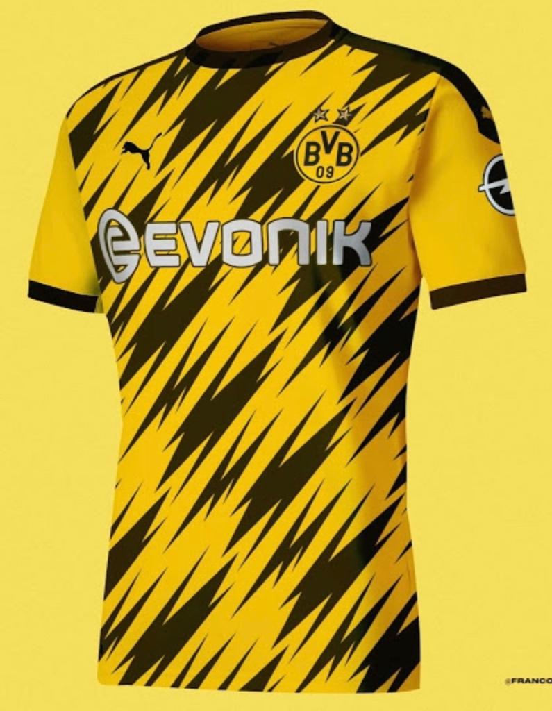
That's pretty funky! Hopefully it is just for Dortmund and not a template that will get used in white on a Milan away shirt or in hot pink for Newcastle or something.
That's pretty funky! Hopefully it is just for Dortmund and not a template that will get used in white on a Milan away shirt or in hot pink for Newcastle or something.
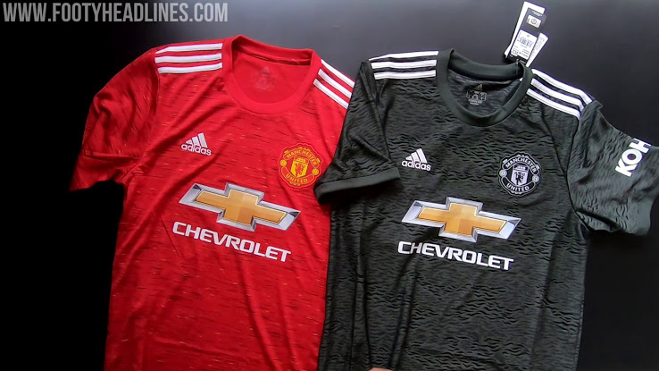
This kits broken.Bitta Man City View attachment 866749


The pattern is dogshit but the rest of it is great. Thick white round collar and red base with white sleeves. Can't * that up.Nice and clean. Not as good as this season's though but a hell of a lot better than most teams next season View attachment 875696View attachment 875697
 www.footyheadlines.com

Hamburg already had 'Fly Better' on their shirts this season, strange that all teams wouldn't move across at once.Fly better on real Madrid tooView attachment 879404
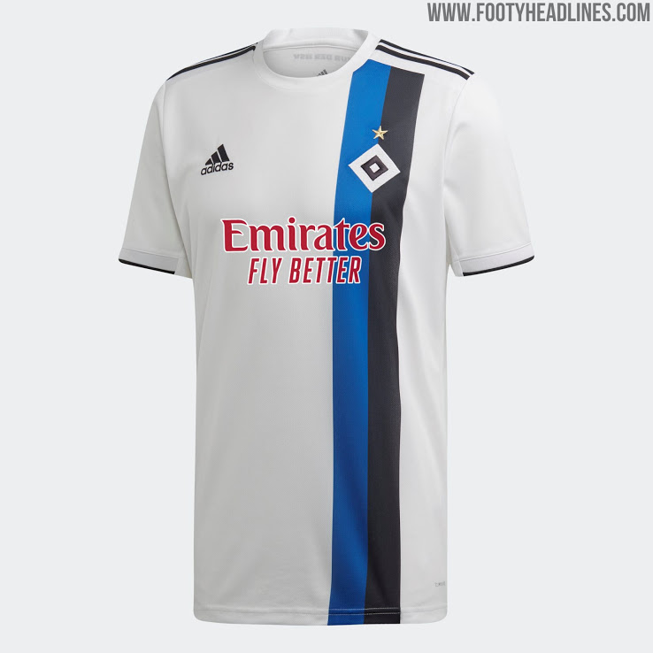
A few teams wore it every now and then. Arsenal played a few friendlies this season with "Fly Better"Hamburg already had 'Fly Better' on their shirts this season, strange that all teams wouldn't move across at once.

Found Liam Gallagher's bigfooty account.
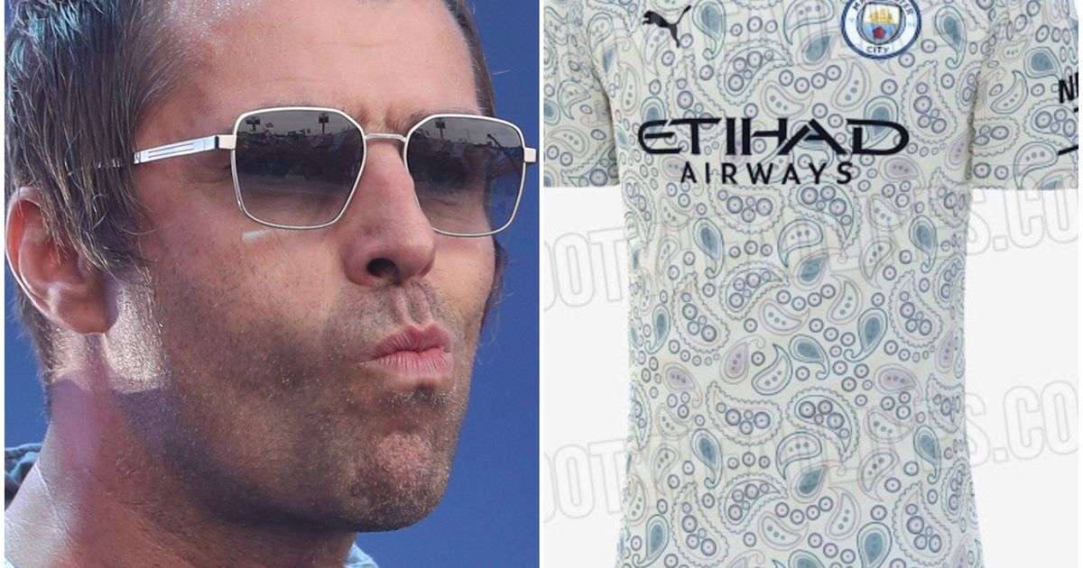

Bacteria?
Must be some Emirati design?There must be some weird s**t in the water in Manchester lately haha View attachment 881350

'Forward' is the motto of the state of Wisconsin.Great kit, worst club name though.