Discussion Soccer/Association Football New Kits

Remove this Banner Ad

Status
Not open for further replies.
I've seen really similar to this before a couple of years ago, might have even been an MLS logo release, but I can't recall the team. Does anyone remember?
Reminds me of Inter Miami.
Atlanta, Charlotte, Columbus, Miami, NY City and Philadelphia all have roundel logos in the MLS, with similar internal features.
 
Anyone have intel on why stanno didn't stick around? Seems strange to announce it and give all these members the jumpers (which was only a pre season kit). Might be something to do with the change of owners ??? There was an article earlier this yeat that stated a recommitment from the major partner.
 
Reminds me of Inter Miami.
Atlanta, Charlotte, Columbus, Miami, NY City and Philadelphia all have roundel logos in the MLS, with similar internal features.

Thanks, but I meant the piss-takey logo walkthrough. It's definitely not original. Just can't recall who did it first
 

Log in to remove this ad.

Anyone have intel on why stanno didn't stick around? Seems strange to announce it and give all these members the jumpers (which was only a pre season kit). Might be something to do with the change of owners ??? There was an article earlier this yeat that stated a recommitment from the major partner.

Could be an issue with supply, or perhaps with the current state of the world, Stanno are not doing too great.
 
Anybody else bought a Premier League kit recently?

I got this one delivered today. I know that technically its not accurate, as the gold badge won't actually appear till next season, but I wanted to get it more as a memento of our league winning season. Anywho, what struck me was the size of the PL patch. It looked smaller than usual, and sizing it up against my 17-18 kit confirmed it. I initially thought that they had cocked up and put a kids size on, but research tells me that this is actually the "adults" size, which is smaller than the "players" size. I must say I was pretty disappointed. They also managed to get a fold line right through the patch for good measure.

View attachment 917187View attachment 917188
The should have done what United did in 96 and go with the champions patch for the last game of the season. Funny thing was when United did that at Boro they still weren't actually champions, would have looked bad if they had lost that match!
 
They all do it these days.
No, not the clubs that make a mockery of all the marketing talk. They're always so serious and cliche. Lansing are one of only two clubs (like the one I vaguely remember, along with Gibbsy) to just put things on the logo and not explain it like a group of board members sat down and made tenuous connections for every element.

EDIT: Gibbsy was it Forward Madison? I don't remember seeing this one...
 
Last edited:
No, not the clubs that make a mockery of all the marketing talk. They're always so serious and cliche. Lansing are one of only two clubs (like the one I vaguely remember, along with Gibbsy) to just put things on the logo and not explain it like a group of board members sat down and made tenuous connections for every element.

EDIT: Gibbsy was it Forward Madison? I don't remember seeing this one...


It was! I knew it had pink in it somewhere. What a cool name.


The more I see this kit the less happy I am with it. Totally forgettable and the teal is too prominent. It's an okay colour scheme but gold works so much better as the third colour behind white and red. It also stinks a little of the club's rot in the 90s.


The more I see this kit the less happy I am with it. Totally forgettable and the teal is too prominent. It's an okay colour scheme but gold works so much better as the third colour behind white and red. It also stinks a little of the club's rot in the 90s.

Don't like the blue trim.


The more I see this kit the less happy I am with it. Totally forgettable and the teal is too prominent. It's an okay colour scheme but gold works so much better as the third colour behind white and red. It also stinks a little of the club's rot in the 90s.

That's horrible. Bring back New Balance who won't give us templates and actually care about us.
 
That's horrible. Bring back New Balance who won't give us templates and actually care about us.
Nike are doing some good stuff. I reckon they've both tried to make their mark with the unique trim colour and also tried to go conservative with the rest of it as to not accidentally alienate. Hopefully next season is a better effort. We'll be one of their flagship brands so, you know, it better be.
 

(Log in to remove this ad.)

Nike are doing some good stuff. I reckon they've both tried to make their mark with the unique trim colour and also tried to go conservative with the rest of it as to not accidentally alienate. Hopefully next season is a better effort. We'll be one of their flagship brands so, you know, it better be.
Yeah, I get what you're saying but... It's the little details they're not paying attention to which makes it seem rushed to me, like the trim on the cuffs not matching the collar, and apparently the logos aren't going to be stitched either so...

I like the teal trim, and the return to white logos. Just do it properly. And with a better collar.
 

Oh that is just, horrible.

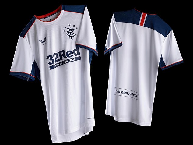
Meanwhile, a good away kit.

31441010-8582913-image-a-37_1596268725512.jpg
31440802-8582913-image-a-18_1596268041394.jpg
 
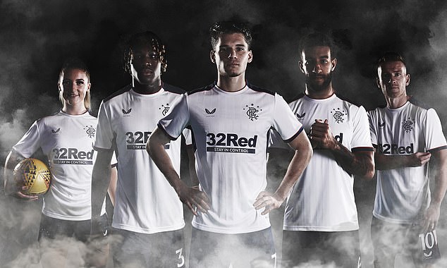
Preemptively getting in to say no Celtic v Rangers shitfighting. Judge each kit on its merits. Cheers.

Even if it isn't targeted at me, my reply to this is.

Oh, but I did. Celtics looks terrible. That green is just off, it isn't a nice colour. The Rangers one looks classy, a bit simple, but is a very nice looking kit.


The more I see this kit the less happy I am with it. Totally forgettable and the teal is too prominent. It's an okay colour scheme but gold works so much better as the third colour behind white and red. It also stinks a little of the club's rot in the 90s.


Reckon the teal would work better and make more sense if the full crest was being used rather than just the Liverbird. I do much prefer the simpler approach of recent seasons though.
 
Everton have released their latest keeper kit. I’m sure they were going more for rock and roll or something, but looks more like stress induced, erratic heart rates to me. The pink will contrast nicely with the royal blue though. CC15BCB6-05FF-4995-8BFF-641A48440423.jpeg
 
Status
Not open for further replies.

Remove this Banner Ad

Back
Top