Discussion Soccer/Association Football New Kits

Remove this Banner Ad

Status
Not open for further replies.
That is not flamboyant or vibrant. That's halfway to beige.
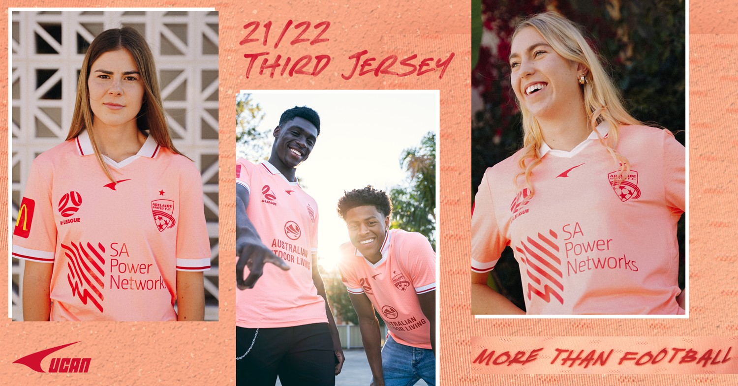
If you want flamboyant, go see Penrith's away jersey.
I feel like some sort of logo would make it flamboyant. Something like a Hawaiian shirt inspired design or something.
It's a nice kit though, just plain and not flamboyant/vibrant.
 

Log in to remove this ad.

I've always longed for a pink Palermo style kit back when Heart did those 3rd kit comps, I wanna like this one but I can't help but link it to those pink 50's diner dresses with that collar and the checkerboard aesthetic at the start of the video
 
Here is the kit that the CCM FFA cup kit is based on (from a previous promotion of their 2019 FFA cup kit).

View attachment 1263602
fef51fdfcac9dd8e92fd21c853994ece.jpg
 
Isuzu really wrecks it - it’s all about money hey
Well yeah, money is key in sponsorship.

But I actually like how it's placed on both kits, in both positions. It's not intrusive and it fits within the stripes on the sleeve. The speed kills logo is more intrusive but is alright imo.
 
Well yeah, money is key in sponsorship.

But I actually like how it's placed on both kits, in both positions. It's not intrusive and it fits within the stripes on the sleeve. The speed kills logo is more intrusive but is alright imo.
I think he's talking about the Isuzu sponsor on the A league logo
 

(Log in to remove this ad.)

It absolutely is needed if the league wants any future financial viability. They weren't going to last without a naming rights sponsor for much longer. It's not the Premier League.

How are you so attached to a logo that's only a few weeks old anyway?
It absolutely is needed if the league wants any future financial viability. They weren't going to last without a naming rights sponsor for much longer. It's not the Premier League.

How are you so attached to a logo that's only a few weeks old anyway?
I get the financial bit about it and have no problem, it is a must, however not needed on the playing kits, a simple logo would and should have been enough, also can not be attached to this logo which is only now a few days old with the shitty “izusu” being now added champ
 
I get the financial bit about it and have no problem, it is a must, however not needed on the playing kits, a simple logo would and should have been enough, also can not be attached to this logo which is only now a few days old with the shitty “izusu” being now added champ

With the amount that Isuzu is spending, their logo was always going to be attached to the .\ League logo.

It could be far worse, this is really inoffensive with just the text compared to a company with an image for their logo, or another logo that they want along side the text, which would then give us a logo within a logo.

Like we could have had

1634882891564.png

or

1634883025054.png

Don't get me wrong, I hate the .\ League logo as a logo, but the Isuzu Utes text doesn't make it worse.
 
 
Wanderers 3rd

1635068106917.png

Inspired by the pathways from the Wanderers Academy to the first team.

---------------------

Bold.

Pre-order the 2021/22 Western Sydney Wanderers Third Jersey!

Our Third jersey celebrates our club colours, and adds a touch of Tin to commemorate our 10th season!

The radical new design completes our jersey line up for season 2021/22, with replica jerseys including the new Isuzu UTE A-League logo within the design for the first time!

Season 10 Badge

The new Season 10 silicon badge sits proudly on the chest

Season X

A Season X motif sits on the back of the neck as a reminder of what we've done, and what's to come

Replica vs Players

Our Third jersey will bear the new Isuzu UTE A-League logo across players and replica kits!

The 2021/22 Kappa jerseys are a slim fit with many Wanderers supporters choosing to go up a size from what they would normally order.
 
Just looking at Bayern's kit, a bit rugba-leeg, and I've always been a fan of two-tone kits. Maybe a dark two-blue version would make for a nice Arsenal away? Either that or we get the green and blue back...

fc-bayern-home-shirt-2021-22_ss4_p-12053263+u-28icb9lu27ayhkuyfpwb+v-7a3e5a80e7244a66b738cdeaa...jpg fc-bayern-home-shirt-2021-22-long-sleeve_ss4_p-12053256+u-xquz2rgsvjabmd9r9bp0+v-7feea87ddc714...jpg
 
This partnership will see Macron produce new apparel for Basketball Australia’s national teams and supporting staff, including the Boomers, Opals, Rollers, and Gliders, adding to Macron’s growing sponsorship portfolio across Australian sport which includes Football Australia, Port Adelaide Football Club, Melbourne Victory, and Perth Glory.

 
Status
Not open for further replies.

Remove this Banner Ad

Back
Top