Discussion Soccer/Association Football New Kits

Remove this Banner Ad

Status
Not open for further replies.
Love the concept however I think it will appear fairly illegible from a distance. Hope I'm wrong. I reckon the white outline could have been a bit thicker.
It’s like Melbourne’s AFLW Pride jumper which was great except the numbers were always going to be tough to read.
 

AVvXsEgGL3qqMDUxZy86H5h66brCnIaVLYQ2akWsMltcg18HDmCtNdqx-ioygIrba7UymUqCFQBc3L0SsyZ8hYGJHhmhIcd9HzWIlZ9BAcw3VelrkGrLWo3pL3E7WHBBn4PyY3DgXsPaGzBfqFXBnvXaCszWLucdS-QHaU0F7hkzm3oUhrFaqQicv6CK3L8xtw=s1000
 

Log in to remove this ad.

why can't the A-League make kits like these. Most have good clean designs with minimal sponsors.
Unfortunately the A league needs all the sponsorship and money it can get for its clubs. It’s why the kits look like billboards.
 
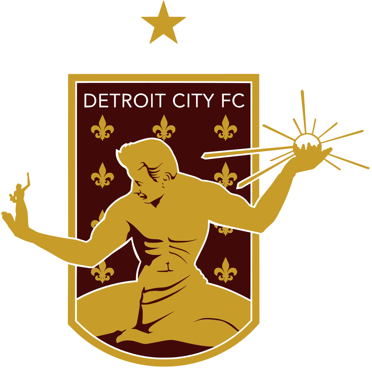
What ah.. what exactly is Detroit fc's logo?


Detroit City FC - Wikipedia
The Spirit of Detroit statue. The city often dresses it up in one of their sporting team’s jerseys if they get to play offs and stuff. Shame NYC don’t do it and get Lady Liberty in a Giants beanie etc.
 

Attachments

  • 27A2A945-8E4A-491C-A800-648DCE9377C0.jpeg
    27A2A945-8E4A-491C-A800-648DCE9377C0.jpeg
    669.7 KB · Views: 63
Last edited:

(Log in to remove this ad.)

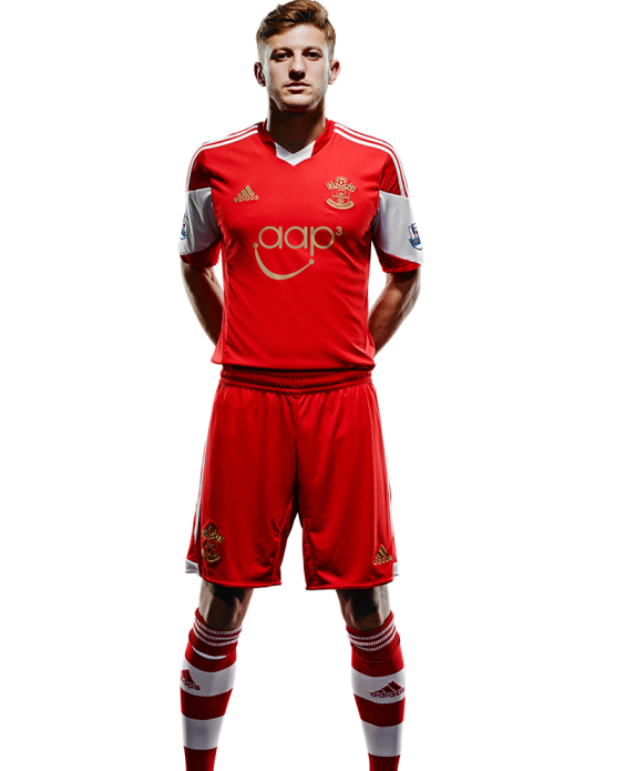
Arsenal worse red shorts and socks with the home shirt. Generating a lot of talk online.


View attachment 1341792


Nope, f*** off. Arsenal is and should forever be white shorts.

In the entire clubs history it has been white shorts in all but 8 years in the late 1800's when they wore blue shorts (1889-1893 - but wore white as well, and 1894-1897), but that was before the current club came into being (in the Royal/Woolwich Arsenal days).
 
Not into the red shorts, but I like the red socks, reminds me of the George Graham years. But even our jersey is s**t this season too, so low-rent and amateurish, like a local side
 
Last edited:

Normally clubs sign with smaller manufacturers to get more bespoke designs, not teamwear with the shittest graphic imaginable printed on, the materials used by macron are pretty amateur too, like something off DHGate. The away is particularly terrible, the V is not showing up at all and the navy on the bastardised badge is not even the same as the navy on the macron logo or the shoulders.
 
Normally clubs sign with smaller manufacturers to get more bespoke designs, not teamwear with the shittest graphic imaginable printed on, the materials used by macron are pretty amateur too, like something off DHGate. The away is particularly terrible, the V is not showing up at all and the navy on the bastardised badge is not even the same as the navy on the macron logo or the shoulders.
Feels very rushed, I'm also suprised they haven't lined up a sponsor. I know it was a late entry but these should of really been something that was being prepared as soon as they made the semis, if not as part of the regular designs as a just in case (they didn't even have a fa cup kit ready)
 
Status
Not open for further replies.

Remove this Banner Ad

Back
Top