

- May 8, 2001
- 5,667
- 818
- AFL Club
- Adelaide
- Other Teams
- CDFC (SANFL), Port Melb (VFL)
Haven't seen anything on the SFC site... I'm interested that's for sure.
Follow along with the video below to see how to install our site as a web app on your home screen.
Note: This feature may not be available in some browsers.

Great kit but god I still hate that 100 years logo.Bays 2021 away guernsey. Thowback to their 1927-1948 style.

Great kit but god I still hate that 100 years logo.
Hmm... Tough callMore than the Gliderol word mark ruining the jumper?
Sent from my iPhone using BigFooty.com


More than the Gliderol word mark ruining the jumper?
Sent from my iPhone using BigFooty.com
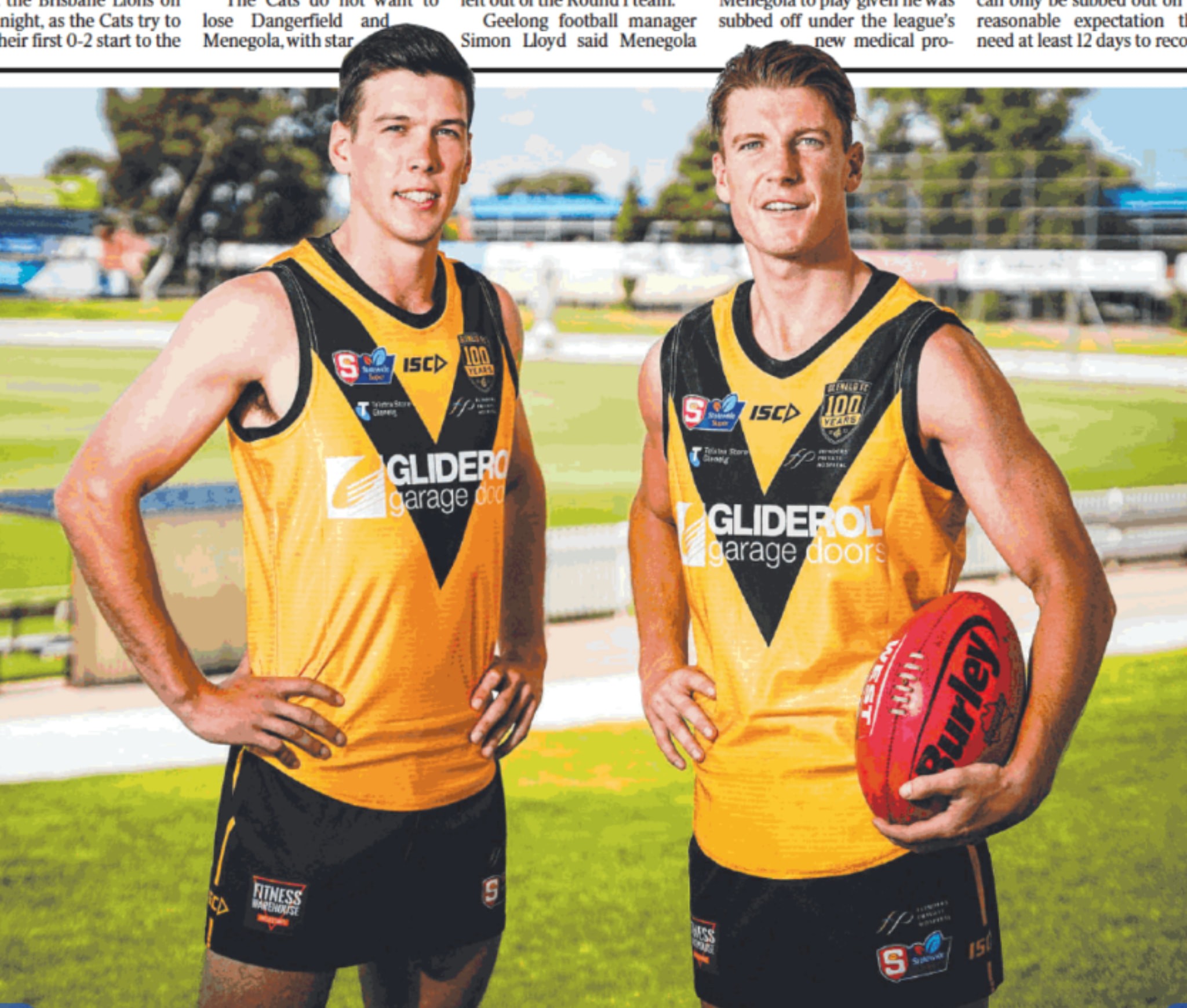
I would rather have that across the jumper than the abomination that my club has presented. Are we the Central District Football Club od the Peter Page Hyundai Football Club?
I mentioned this last year to the President and raised it at the AGM and this year with the new sponsor they go and make it even bigger and encroached onto both hoops. They have ruined the jumper design. The President doesn't see anything wrong with it.

what NTFL teams?JS and New Balance have partnered together for some teams in the SANFL and NTFL so I'm not surprised
On SM-G991B using BigFooty.com mobile app
what NTFL teams?JS and New Balance have partnered together for some teams in the SANFL and NTFL so I'm not surprised
On SM-G991B using BigFooty.com mobile app
Not sure if that’s the jumper though because when the fixture was released, the VFL had no sponsor (not continuing the TWW/HY VFLView attachment 1084071
Port Melbourne jumper presentation. That’s the way a footy jumper should look clean and sleek. Bravo Boroughs!
Sent from my iPhone using BigFooty.com
Not sure if that’s the jumper though because when the fixture was released, the VFL had no sponsor (not continuing the TWW/HY VFL
And then CFMEU had to go an screw it all upView attachment 1084115
This was from Sunday’s praccy v Willy so I’m pretty sure they’re the jumpers. And also I was talking about how the sponsors/ numbers fit within the stripes. That’s what I was talking about clean and sleek. Unlike the Central jumpers sponsor which looks like it was applied by local kindergartners.
Sent from my iPhone using BigFooty.com
My biggest gripe with that is the stripe being broken for the number. Utterly pointless, white on red would be perfectly legible.View attachment 1084071
Port Melbourne jumper presentation. That’s the way a footy jumper should look clean and sleek. Bravo Boroughs!
Sent from my iPhone using BigFooty.com
That could almost be a Kernahan on the left!Bays 2021 away guernsey. Thowback to their 1927-1948 style.
Seems they're still waiting on their ISC kits. They did promo pics in CGR guernseys so if they somehow can't get a hold of ISC jumpers soon I wouldn't be surprised if they start running out in CGR kits with the ISC logo on them.That's so weird. No Bullants guernseys made up yet then?


GarnWhen will they update their logo??? When I made my Wembley Bullants NAFL entry it initially began with me trying to update the Northern Bullants logo so that it isn't just a vectorisation of a drawing from the 1960s that has been photocopied hundreds of times. Here's a mockup with an updated Bullant, I might actually send this to the club.
View attachment 1086165
Ngl, I have xero idea what you mean by this
The bullant looks the exact same as the old logoWhen will they update their logo??? When I made my Wembley Bullants NAFL entry it initially began with me trying to update the Northern Bullants logo so that it isn't just a vectorisation of a drawing from the 1960s that has been photocopied hundreds of times. Here's a mockup with an updated Bullant, I might actually send this to the club.
View attachment 1086165

I dunno, I feel like there is something charming about the imperfections of a logo like the Bullants', similar to the Fitzroy Lion.When will they update their logo??? When I made my Wembley Bullants NAFL entry it initially began with me trying to update the Northern Bullants logo so that it isn't just a vectorisation of a drawing from the 1960s that has been photocopied hundreds of times. Here's a mockup with an updated Bullant, I might actually send this to the club.
View attachment 1086165
Ahh ok, I see
I mean, that's kind of the point though. I wanted it to be as close to the original while also being as high quality as possible. Seems I've achieved that.The bullant looks the exact same as the old logo
I personally disagree on both counts and would love to see the Lions update it to something like Scorch's lion here but it just comes down to personal preference there.I dunno, I feel like there is something charming about the imperfections of a logo like the Bullants', similar to the Fitzroy Lion.

