BlackWing
Debutant
- Apr 28, 2013
- 116
- 135
- AFL Club
- Adelaide
- Other Teams
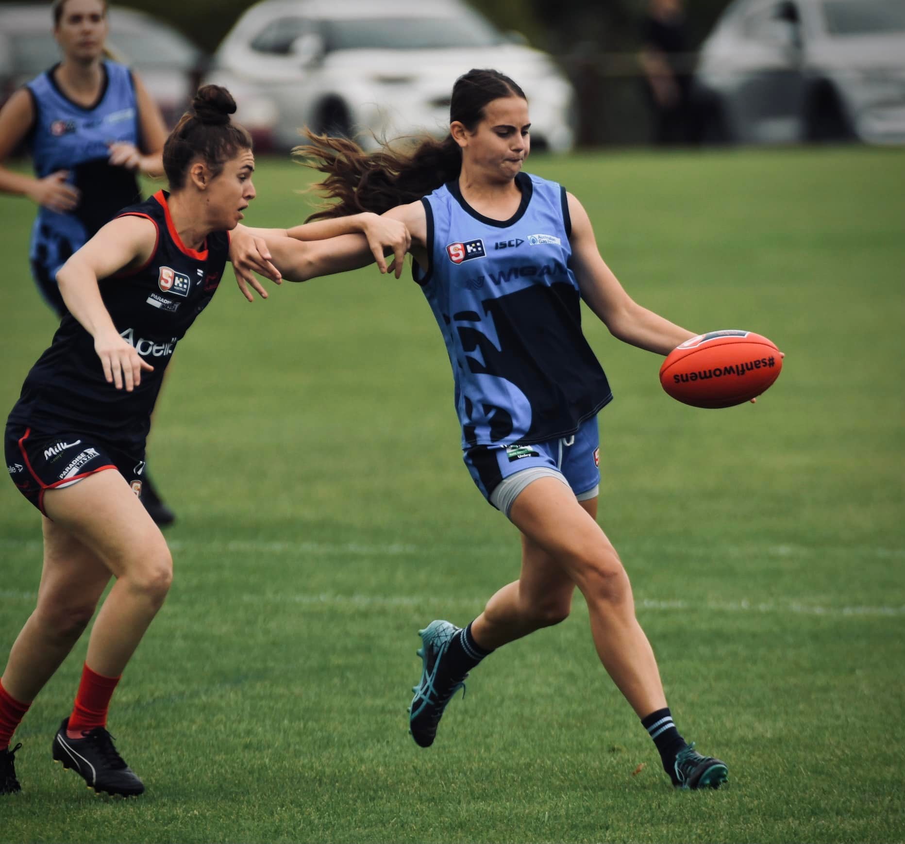
- Centrals
Interesting about the black shorts - I did not know that. Re the shorts, you're the Centrals fan so what you say goes. My preference though would be for blue shorts home and white shorts away (perhaps blue v NA). I'd be partial to the odd use of red shorts too - against Sturt & WWT perhaps!
I don't mind the blue shorts but prefer the white shorts. My feeling is that blue shorts will be reintroduced, if so blue away against NA.
I like your point about occasional red shorts. There isn't a clash as such against Sturt but it is difficult to distinguish the teams. There needs to be more of a contrast and red shorts would really help separate the teams. Possibly against WWT as well but not necessary.