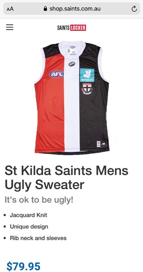
Discussion State of our jumper

Remove this Banner Ad

Let’s all just calm down a bit.

I’ve checked the official Saints sight and it seems we may have jumped the gun a bot

YlBMEFr.jpg
 

Log in to remove this ad.

View attachment 1023056
Feel free to spread this image far and wide for those motivated enough with social media.

Spot on.
From the moment we saw the first Deliveroo panel I suggested it would look much better reversed out of the black. Better for the guernsey, and actually better for their brand as the logo stands out so much more against the black.
 
I reckon somebody has said wouldn’t it be lovely if our girls and guys both had the same jumper. Yes let’s go with the lady’s it’s ver popular. BRRRTTT wrong answer. It’s crap.
 

(Log in to remove this ad.)

A dogs breakfast.
The club is stunned at the response from social media.
Probably the worst jumpers I’ve seen the club put out.

I agree. I love the club and I love our jumper. I’d revert the crest and the font to pre 1997, but apart from that our guernsey is incredible.

The current offerings are appalling. Awful. I’m incredibly disappointed that this stuff has been ticked off.

I won’t be buying any of it.
 
I agree. I love the club and I love our jumper. I’d revert the crest and the font to pre 1997, but apart from that our guernsey is incredible.

The current offerings are appalling. Awful. I’m incredibly disappointed that this stuff has been ticked off.

I won’t be buying any of it.

I missed Moorabbin Ghost ’s post but you are both spot on.
The design is horrible and the colour worse.
What a shame they’ve produced this, in contrast to the excitement that the club has been generating over the past year
 
Geez, people need some hobbies....

Of course the deliveroo logo stands out like dogs balls - companies don't pay $$$ to a club like us to "blend in".

The main concern seems to be 2 inches of black material that probably should be red....quick, grab your pitchforks, this cannot stand....

I say we build a bridge, get over it, and look forward to seeing the red, white and black jumper run around on our home deck again, rather than nitpick every millimetre of something we've only seen in images on a screen.
The jumper is at the core of a clubs identity, it shouldn't be too hard to make it aesthetically pleasing.

If the jumper truly doesn't matter, why bother having it at all? Lets wear an assless skin tight purple and acid green body stocking and write St Kilda on the front and call it a day.
 
Geez, people need some hobbies....

Of course the deliveroo logo stands out like dogs balls - companies don't pay $$$ to a club like us to "blend in".

The main concern seems to be 2 inches of black material that probably should be red....quick, grab your pitchforks, this cannot stand....

I say we build a bridge, get over it, and look forward to seeing the red, white and black jumper run around on our home deck again, rather than nitpick every millimetre of something we've only seen in images on a screen.

You opened a thread about the jumper and aren't happy that the jumper is being discussed in detail....:drunk:
 
I was sort of expecting for some reason that 2020 might've given some people some perspective and yet people are still losing their sh*t over the new jumper. Relax everyone, it could be much worse.
Win or lose i want us to damn sexy when doing so.
 
[/QUOTE]
The jumper is at the core of a clubs identity, it shouldn't be too hard to make it aesthetically pleasing.

If the jumper truly doesn't matter, why bother having it at all? Lets wear an assless skin tight purple and acid green body stocking and write St Kilda on the front and call it a day.
Saint Kilda in black texta. If it doesn't matter, why not go full nuffie?
 
I reckon somebody has said wouldn’t it be lovely if our girls and guys both had the same jumper. Yes let’s go with the lady’s it’s ver popular. BRRRTTT wrong answer. It’s crap.
It’s the NB template, look at Melbourne’s guernsey - the red yoke overlaps onto the back top portion of the guernsey on both sides so it’s easy to do. ISC did something similar one year when they had shoulder panels, this is how manufacturers and clubs sell more guernseys but changing the template every so often

It’s annoying sure but I’d be more outraged that the club crest is not the actual club crest but in monotone on the training apparel and club polo shirt.

What kind of disrespect is that??
This is not soccer ffs!
 
I’m with jwikked we should go full nuffie.

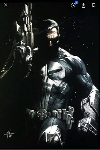
Main body in blood red. With a punisher style keyhole white cutout in the chest that has three diminishing stripes that taper and tuck into the navel. St Kilda logo dead centre like the god dam iron man reactor unit with black cross shoulder straps and side strip like a hidden carry holster.

Designed to be worn with a Covid19 mask in the same punisher style and optional full knuckle to elbow arm sleeves and ammunition style belts designed for player badges sold separately.

8893f2eaa9de97c60e362924b52f6fd4.jpg
 

Remove this Banner Ad

Back
Top