- Mar 5, 2016
- 791
- 2,442
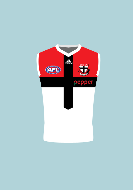
- AFL Club
- St Kilda
Now that youve mentioned the dreaded black cuff Vs white cuffs again.
Its looks like most peeps arent gonna be 100% happy again.
We either had a great colored jumper but most werent happy with cuff color.
Now weve got fantastic cuffs but peeps not 100% happy with brightness of jumper color.
Ok so the jumper aint 100% perfect, who cares its still a Saints jumper peeps so lets embrace it
Yeah for sure.
No point complaining here anyway, I'll just write a letter to the club