Navigation
Install the app
How to install the app on iOS
Follow along with the video below to see how to install our site as a web app on your home screen.
Note: This feature may not be available in some browsers.
More options


You are using an out of date browser. It may not display this or other websites correctly.
You should upgrade or use an alternative browser.
You should upgrade or use an alternative browser.
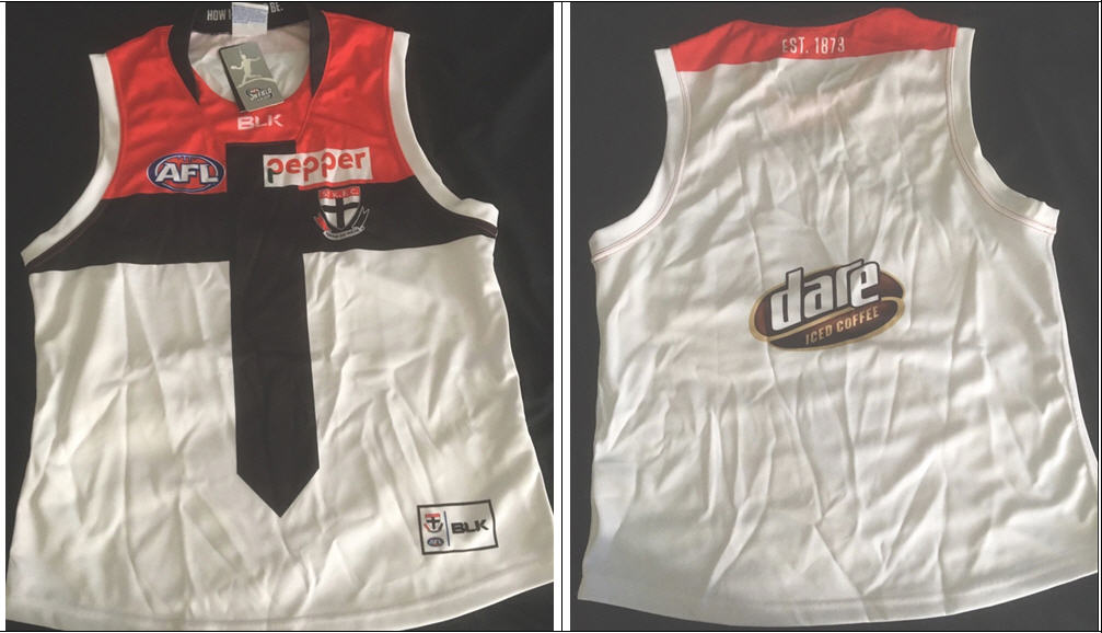
Discussion State of our jumper
- Thread starter Murraj1966
- Start date
- Tagged users None
Persevering Saint
Brownlow Medallist
Gee, and we wonder why they went out of business? Given the quality of their products, and their clear lack of understanding of established branding, it's really not surprising.
majortinkle
Premiership Player
- Jul 21, 2015
- 3,028
- 4,120
- AFL Club
- St Kilda
And as for their ironing.......Gee, and we wonder why they went out of business? Given the quality of their products, and their clear lack of understanding of established branding, it's really not surprising.
Saintos The ITK
Premium Platinum
Who are Richmont with now? they look like they've gone from black and yellow to black and lemon??
- Aug 29, 2014
- 1,098
- 2,903
- AFL Club
- St Kilda
Who are Richmont with now? they look like they've gone from black and yellow to black and lemon??
I think they've been a lemon for a while now....
")
Persevering Saint
Brownlow Medallist
They've certainly been lemontable...I think they've been a lemon for a while now....
Persevering Saint
Brownlow Medallist
That pun worked so much better in my head.
- Sep 28, 2016
- 6,628
- 21,673
- AFL Club
- St Kilda
That pun worked so much better in my head.
It should have stayed there.
Persevering Saint
Brownlow Medallist
Yes. Yes it should.It should have stayed there.
- Nov 30, 2016
- 3,304
- 6,863
- AFL Club
- St Kilda
PumaWho are Richmont with now? they look like they've gone from black and yellow to black and lemon??
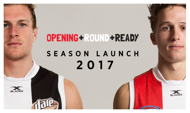
This is disgusting! It looks pre 90s. Yuck!Here's the BLK clash as well, looks rotten but X-Blades version will look much better.
Barrels
Often Imitated, Never Bettered.
- Apr 25, 2013
- 20,686
- 56,898
- AFL Club
- St Kilda
- Other Teams
- Cleveland Guardians, Cleveland Cavs
We left the fat candy behind for this?!This is disgusting! It looks pre 90s. Yuck!
I don't mind it.
Just needs the tie going around the back aswell, looks to plain otherwise
Just needs the tie going around the back aswell, looks to plain otherwise
NarrowMind
Attempting Normal
- Feb 11, 2013
- 967
- 1,624
- AFL Club
- St Kilda
- Other Teams
- Assorted Perennial Failures
If the 'tie' was to go around the back it would elimate any space for the numbers.I don't mind it.
Just needs the tie going around the back aswell, looks to plain otherwise
The Pepper Money badge looks absolutely shocking jammed into the position it is.
Overall, it's not a completely horrendous design, but it has been murdered by poor templating and badge placement. Hopefully something XBlades address.
- Jul 29, 2007
- 4,359
- 10,974
- AFL Club
- St Kilda
I admit it Could be done a bit better. But I actually don't mind the design.
George
Premium Platinum
- Aug 17, 2015
- 45,306
- 127,287
- AFL Club
- St Kilda
- Other Teams
- Phi Eagles & Phillies, Liverpool, PAO FC
Don't mind the design at all, could definitely get used to it. Is that on eBay or something?
blktreacle
Club Legend
I don't mind the clash, hate the blk collar though. Any chance we will see xblades soon?
On E5823 using BigFooty.com mobile app
On E5823 using BigFooty.com mobile app
i agree the clash jumper they wore the other day was totally lemon colored. It was a shocker.Who are Richmont with now? they look like they've gone from black and yellow to black and lemon??
- Jun 17, 2015
- 1,768
- 4,025
- AFL Club
- St Kilda
Glad to hear I'm not the only one who doesn't mind the design. Our new collar in black should connect with the cross instead of cutting off like the BLK one and the red mid-section would be a lot smaller (as pictured below). Black numbers on the back would tie it all in nicely.
so you found your nikes.Link?
Bloody glad we're not wearing it in games, but would be fun to have. I can wear it for training.
EDIT: never mind, found it. I'm not as skinny as I was, but I don't think I'm an XXL just yet!

Barrels
Often Imitated, Never Bettered.
- Apr 25, 2013
- 20,686
- 56,898
- AFL Club
- St Kilda
- Other Teams
- Cleveland Guardians, Cleveland Cavs
Adidas, but the point remains the same. I am indeed a fat mess.so you found your nikes.
View attachment 341317
Have to echo the thoughts of some posters above. The clash design is fine, but the implementation is horrendous.
The top of the cross ends way too abruptly in relation to the midsection, and to then cut into red again just makes it look worse, needs to go all the way to the top IMO.
That collar is horrendous,t he XBlades one in full black should look much better.
Terrible placing, shaping and scaling of the sponsors on the front and back. (Would look a lot better with the sponsor positions reversed, but I daresay that it out of the question due to sponsorship agreements).
What will let that strip down as much as anything is the fact that it will be like 90% white once you include the shorts, would look great with black shorts IMO.
PoppedCorn
Saints
- Dec 29, 2009
- 19,600
- 37,717
- AFL Club
- St Kilda
Nope
Crap as well
Bullet well dodged imo
Crap as well
Bullet well dodged imo
AFLOnline
Norm Smith Medallist
TBH I don't mind it. Would be much much better if they swapped the saints logo and the pepper sponsor around so the sponsor fit in the cross and saints logo was centred the red panel.Here's the BLK clash as well, looks rotten but X-Blades version will look much better.
But that would make too much sense. blk didn't do sense.
Similar threads
- Replies
- 10
- Views
- 831
- Replies
- 22
- Views
- 1K
- Replies
- 130
- Views
- 6K
