
By a Point
All Australian
simple, classy
Follow along with the video below to see how to install our site as a web app on your home screen.
Note: This feature may not be available in some browsers.
simple, classy
I reckon our colours would look even more boss if we used yellow-white instead of white.
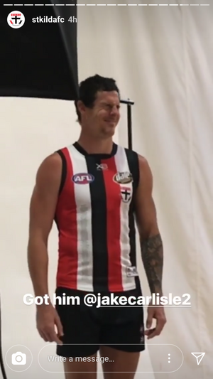
Black red and white - boss
Black red and yellow - mo' boss
Black red and yellow/white - hyperbosssss
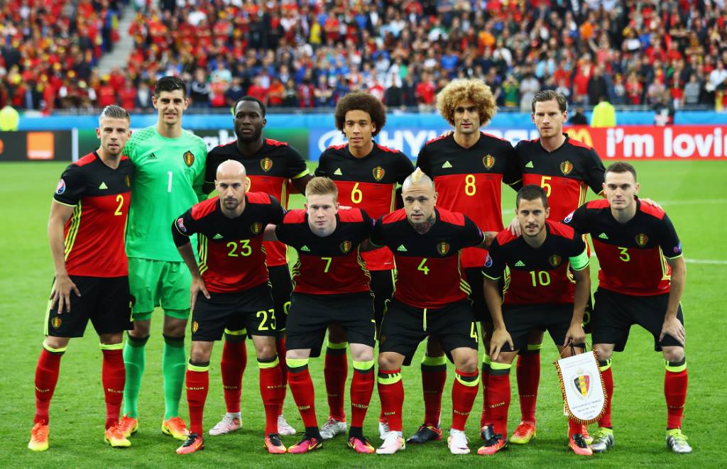
The black version of the current Belgian national soccer strip would suit us as a training top.

That’s incorrect. Our colours were always red white and black. We changed our colours during WW1 to yellow due to the German empire’s colours being red white and black. We changed to the yellow to support the Belgians.Something you might not know: up to 1914 our colours were red, yellow and black. Unfortunately the same as Germany’s.
Guess what?
After the Rape of Belgium we replaced the yellow with white.
Which seems a bit pointless if Belgium’s colours were also red, yellow and black......
As for: boss, mo’ boss and hyperbosssss.
Na.

Yup.Here’s the flag of the then German empire...
View attachment 442384
Problems with the Pura milk tops:Don't you guys remember tge pura milk jumpers?
Sent from my F8331 using Tapatalk
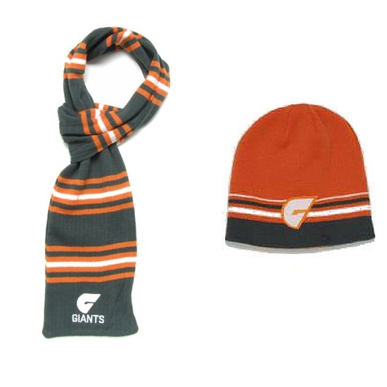
i like the beanies ... i just wish they would bring out the oversize beanie given the shape and size of my head and my reluctance in winter to shave whin i wear the standard size beanie i have a tendancy to look like a mugger... but with the oversized beanie i look more like a St Kilda hipster


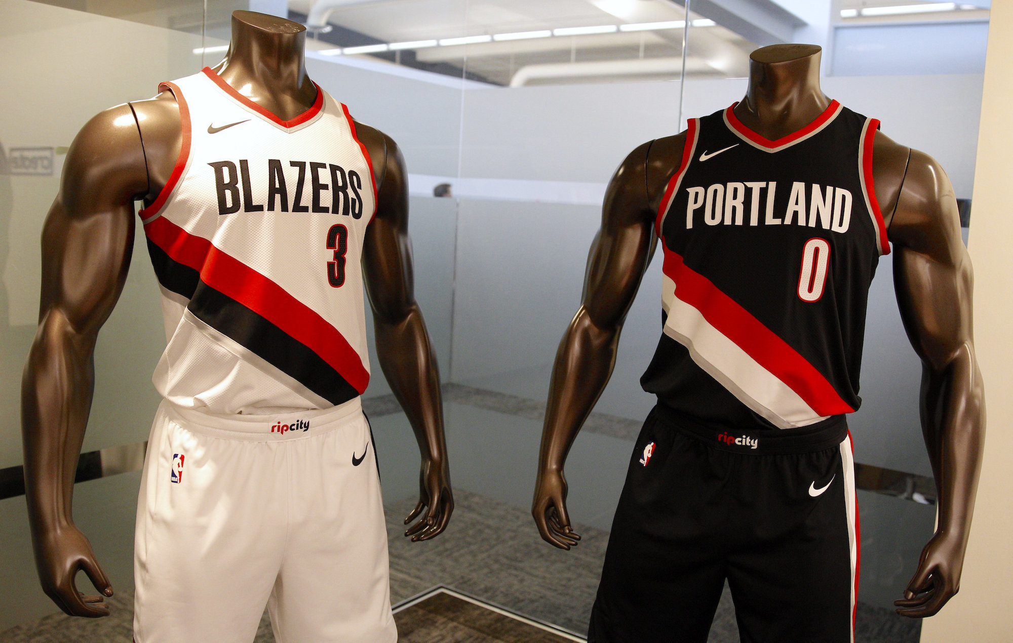
They look awesome. Love the cuffus.Blazers do it well;
I don't like the red in the Emirates logo on the Collingwood jumper. Emirates has red writing on a white background, not white writing on a red background.Whether it's off white or just plain old white, it's important to be super vigilant to avoid too much white or grey or cream or even yellow creeping into the Essendon colour scheme, just as it is important that we keep any red out of Collingwood's colours and any black out of Sydney's. It's also very important to keep an eye on the Bulldogs blue and make sure it's not too dark.

This thread from the Footy Jumpers and Graphic Design board might interest you:Don't you guys remember tge pura milk jumpers?
Sent from my F8331 using Tapatalk
BarrelsOur Moorabbin jumper is looking pretty sweet.
