Discussion State of our jumper

Remove this Banner Ad

I actually do prefer the PWB tricolour they've used up until now though.

By far the classiest jumper so far. The panels just like ours with the obvious colour change. Simple. Hope it stays that way.

Would also like to go back to the candy stripe away jumper. Always thought that was the best one.
 

Log in to remove this ad.

I love the Saints colours and the traditional Red, White, Black panels. The problem we have had in recent years has been the diminished prominence of our club crest on the left breast. I know this has come about as a result of AFL imposed "rules" around the size and positioning of logos and advertising. However I think being "a good citizen" has come at a cost, and we should push back on this issue. Unlike other traditional clubs we have worn that shield over our hearts (figuratively) since the 1930's, and hence we are the only club negatively impacted by this guernsey standardization. We need to make a bit of noise at AFL level and stand up for our unique culture and heritage.
 
I love the Saints colours and the traditional Red, White, Black panels. The problem we have had in recent years has been the diminished prominence of our club crest on the left breast. I know this has come about as a result of AFL imposed "rules" around the size and positioning of logos and advertising. However I think being "a good citizen" has come at a cost, and we should push back on this issue. Unlike other traditional clubs we have worn that shield over our hearts (figuratively) since the 1930's, and hence we are the only club negatively impacted by this guernsey standardization. We need to make a bit of noise at AFL level and stand up for our unique culture and heritage.
I think when you've had the crest for as long as we have, there's a good argument to say it's part of the jumper design rather than a "logo". And as such, it should not be restrained by any rules in regards to size.

In that respect, it should be treated no differently to the Carlton "CFC" for example (which as we can see is as large as their egos)

902593426_Carlton-Blues-2018-Mens-Replica-Home-Guernsey_1__1204127715.jpg


C'mon Saints :mad: #MakeCrestGreatAgain
 
With the current form of the club and the recent talk of our vanilla-ness as an organisation, I thought I might have a crack at recreating the old patch crest.

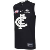
A few clubs have taken this route, using different versions of logos on different applications. Carlton springs to mind immediately of course. The NY Yankees also do this, using a different NY logo on their hats, jerseys and digital applications.

Any who, her she is.
View attachment 495569

If we could add SF Giants badge to the new jumper it'd be perfect
 

(Log in to remove this ad.)

We need to get this to the club like we did the white collars so they might get it done for next year.

Clubs listen eventually look at the eagles and the wings
 

Never been a fan of the pinstripes but LOVE the patch crest. Looks incredible. Could you do a design with no pinstripes/stickman on jumper and no St.K on socks that I could show a couple of people? I just want them to focus solely on how the patch works on our current home uniform.
 
Last edited:
I'm the opposite, like the pinstripes, not a fan of the simplified crest at all.

  1. The black part of the banner is invisible, unbalancing the whole design.
  2. The words in the banner should be there or there should be no banner at all IMO
  3. The shape of the crest has been simplified but it looks like an inferior knock off somehow. I appreciate that it's closer to the original but something there doesn't work for me.
I'm usually I big fan of your work, but I like the other crest you did a few months back more. I think for the patch, we should go forwards not backwards. I'm all for simplifying and modernising though.

I know this won't be popular with anyone, but I've been pondering how to simplify and modernise the logo ever since I saw your efforts SFgiant. I'm not a graphic designer, and don't really have the time these days to sit down and do hours and hours of tinkering. Regardless, I might post my effort just so I can say that I'm able to put my nuts on the line and not just criticise.

Here I've enclosed a patch version with a black background, though personally, I think it looks better as a black cross on a lighter background. I've enclosed one on a green background here, just 'cause. I've removed the shield base altogether and have it implied only by the curves on the sides of the horizontals, likewise I ditched the banner and just had the text directly on the background. I just used Word, so I wasn't able to make it look like anything great, but the banner is a bit of a puzzle. I personally would rethink it totally, but I appreciate that you've got to go softly with change.
 

Attachments

  • StK new shield white on black.pdf
    97.6 KB · Views: 253
  • StK new shield.pdf
    97.8 KB · Views: 221
If anyone happened to see there were a few more items listed on the XBlades website before the page was taken down, a hoodie, a 1/4 zip technical hoodie, jacket and long sleeve media shirt, probably a few more I can’t remeber.

Very disappointed that the singlets are not available to purchase now, on x blades website the smallest size is M....no good if you are a smurf
 
This would be the second year in a row we would be the only club without a sponsor on the sleeve of our polos. Surprising as I was under the impression we were going really strong in regards to sponsorships
 
Has anyone purchased one of the new media polo's?? They look great, but they also look skin tight.
I'm just wondering if the sizing is snug or regular so that I don't end up looking like a walrus in a wetsuit.

saints polo.jpg
 
My blood red training tee arrived in the post the other day - boy does it look fantastic! Would've taken a snap in the gym but don't want to be one of 'those' guys.

I'd say for the XBlades stuff, if you're a solidly built guy then I'd go with XL and up. I'm 91KG at the minute, and XL fits me nicely.
 

Remove this Banner Ad

Back
Top