Diehard Saint
Brownlow Medallist
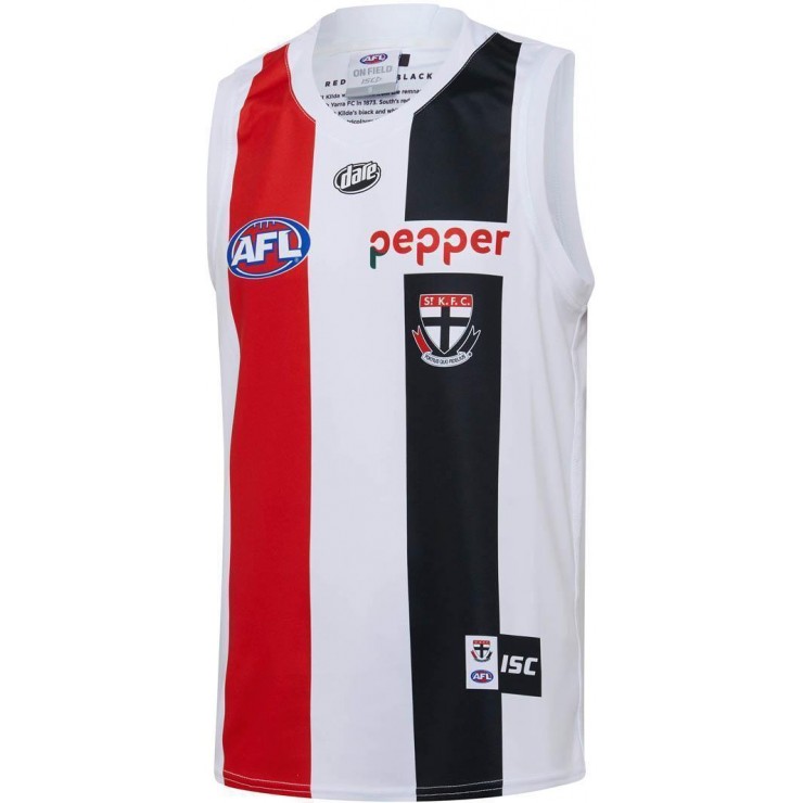
Agreed. Heaps better.
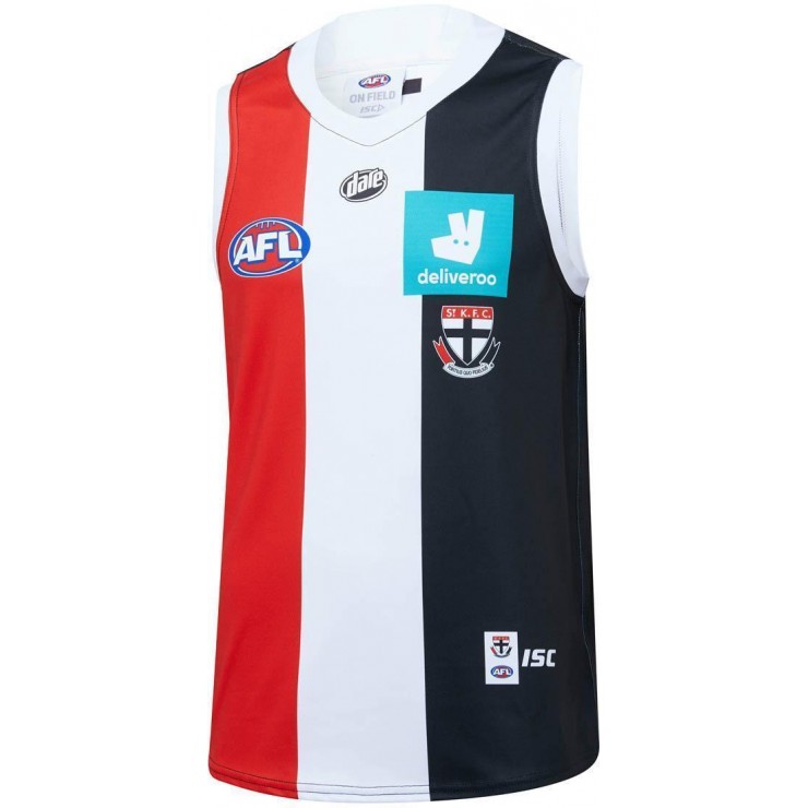
as supporters we want a sponsor logo that is unobtrusive and blends in.
But as a sponsor who throws in big dollars they want it to look as close to the original logo as possible. And hopefully for them it stands out like dogs balls.
Despite the green square not looking great I think the actual jumper itself is pretty good.
I actually think the word Deliveroo is much more legible green on black than white out of green.
But what do I know, I only worked as an art director in advertising for 12 years?