

- Oct 2, 2010
- 19,720
- 70,627
- AFL Club
- St Kilda
There are so many great things you can do with our colour scheme yet they have gone with the most boring, low effort design possible.
Disappointing.
Disappointing.
Follow along with the video below to see how to install our site as a web app on your home screen.
Note: This feature may not be available in some browsers.
LIVE: Richmond v Melbourne - 7:25PM Wed
Squiggle tips Demons at 77% chance -- What's your tip? -- Team line-ups »
There are so many great things you can do with our colour scheme yet they have gone with the most boring, low effort design possible.
Disappointing.
While I totally agree with you globally - and think the same about all AFL gurnseys, home and away, irrespective of club - contextually the away strip is pretty good and I would totally buy it if that were my thing.There are so many great things you can do with our colour scheme yet they have gone with the most boring, low effort design possible.
Disappointing.
I'm happy with both of those jumpers.Smooth Criminal posted it on the FJGD board:
View attachment 788204View attachment 788205
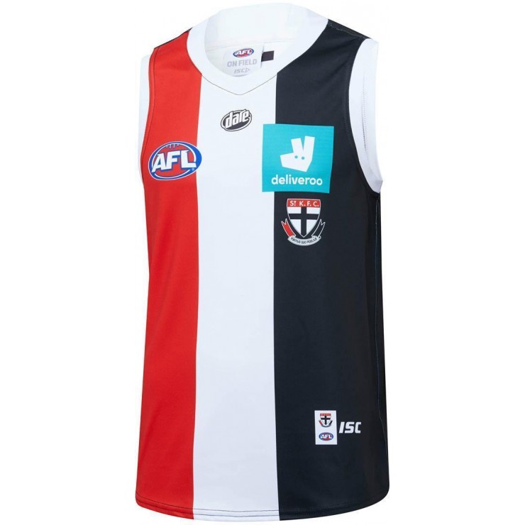
St Kilda Saints 2020 Men’s Home Guernsey
Rep your AFL team this season when wearing this St Kilda Saints 2020 Men's Home Guernsey. This is a replica Guernsey which will be worn by your players at their home ground Docklands Stadium. ISC has integrated AXIS fabrication within the fabric, which aids in keeping you cool through its...shop.afl.com.au

True, I haven't upgraded mine in 4 years and thought it was a right time to for a new one. But if that's how it's going to look, I might hold of for another year as that is one ugly looking logo.I never understood buying the home strip year in year out anyway. Most Saints supporters that have a guernsey have the home strip.
I usually just purchase the 'once off' guernseys or any clash strips that look nice because obviously they aren't available forever.
Why are the jumpers on the AFL site but not the Saints ?
The club technically hasn’t released them yet.Why are the jumpers on the AFL site but not the Saints ?
Have never been a fan of the hot cross bun on any jumper.

Saints logo should be above the sponsors, on line with the afl logo.
Looks weird with the sponsors above
Looks weird with the sponsors above
Just had a look back and you are rightIt’s been this way for 2 decades

Pretty sure this is AFL mandated. Club crest must be below sponsor, which must be in line with AFL logo.
That link has some "collectable" related products on it that's for sure.I'm happy with both of those jumpers.
Yeah green is a s**t color to try to blend in with r,w&b but it's deliveroos colors and they are throwing in the cash so fair enough.
Clash looks old school and a nod to the past so I like it .
And I like white cuffs/collar so I like home jumper.
Now let's just try and win a few games in the bloody thing

Collingwood only moved their logo above the sponsor last season, but it sits pretty higher and is very small. On both designs, the sponsor sits directly in line with the AFL logo, which is AFL mandated.Someone tell Collingwood. They have their logo(rightly) above the sponsor, although it is smaller.
Say what you will about the Pies, but at least they treat their club colors and brandings with the respect they deserve. I wish we would do the same.
The Saints logo is the most important part of the Guernsey. Having it shoved under a s**t looking logo is poor.
Anyway, as expected the Deliveroo logo is totally s**t with horrid colors. Don’t like the Dare logo below the neck there, but it’s somewhat fitting as I often spill my Dare Ice Coffee on that spot anyway.


