Discussion Strange or Interesting AFL Photos

Remove this Banner Ad

I hear everyone’s arguments about logo shadowing and inverting and reject the argument entirely as the solid blue logo works better in the overall context of the guernsey design, and in the context of the clubs history, heritage and when shown in conjunction with the royal blue guernsey.

Edwards’ guernsey yesterday and seeing it in real life only solidifies my position further.
 

Log in to remove this ad.

What he's trying to say is with the current Weagles logo, the inverse looks horrid, and it does. Because the logo relies on a darker colour (blue) to be the shadow, it doesn't work when you inverse it because it goes against a lighter colour.

View attachment 1213057View attachment 1213058

The difference is night and day.
Then modify slightly, make the gaps less larger, small fix. The yellow Eagle on yellow is unfaithful to the original guernsey it's imitating, nor does it stand out.
 
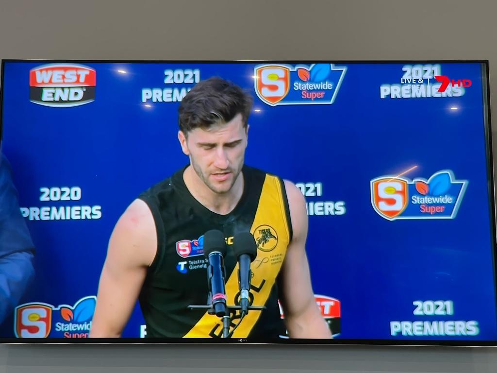
The back collar section of one of Taylor Walker's indigenous guernseys was sewn inside out so the message was on the outside.

gettyimages-1326745615-2048x2048.jpg
 
I hear everyone’s arguments about logo shadowing and inverting and reject the argument entirely as the solid blue logo works better in the overall context of the guernsey design, and in the context of the clubs history, heritage and when shown in conjunction with the royal blue guernsey.

Edwards’ guernsey yesterday and seeing it in real life only solidifies my position further.
I concur with all of this. Furthermore, in the middle of a game of footy, nobody can see the finer details of the inverted logo anyway, so the shadowing issue is irrelevant.
 
I hear everyone’s arguments about logo shadowing and inverting and reject the argument entirely as the solid blue logo works better in the overall context of the guernsey design, and in the context of the clubs history, heritage and when shown in conjunction with the royal blue guernsey.

Edwards’ guernsey yesterday and seeing it in real life only solidifies my position further.
That's what I think was thinking, very articulate explanation from you. The nitpicking from others here I don't get, because just the idea behind the blue Eagle on yellow is what I mean is best. Modifying it so it works better seems so easy to do, too.
 
I’m not saying what Edwards wore is perfect, I just think it’s the better of the two that we saw on Sunday.

What really should have happened is the Eagles should have briefed the designers to design a logo that could be inverted easily as even contemplating a yellow guernsey with a yellow eagle head should never have occurred.
 

(Log in to remove this ad.)

27724.jpg


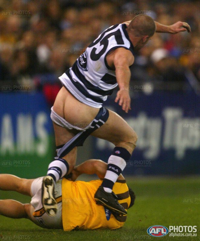
One club logo gone AWOL.
 
didn’t happen for Richmond / Jeep, and I don’t think the AFL would let such an omission happen again now tbh

I reckon it'll be because Ford has sponsored Geelong since before Toyota came on board with the AFL. I think they get a few extra benefits that other clubs who have signed with car companies since Toyota's deal started don't get. Most interesting would be to see if North get the same benefits if they win a flag, seeing as they also had Mazda prior to Toyota's league sponsorship.

I haven't taken enough notice to see if its still the case, but when Toyota started sponsoring the league in 2004, the only logos at Cats home games were the two ground logos and the goalposts. There was no boundary advertising for Toyota. Geelong actually tried to buy out all the Toyota advertising space including ground logos, but were obviously unsuccessful.
 
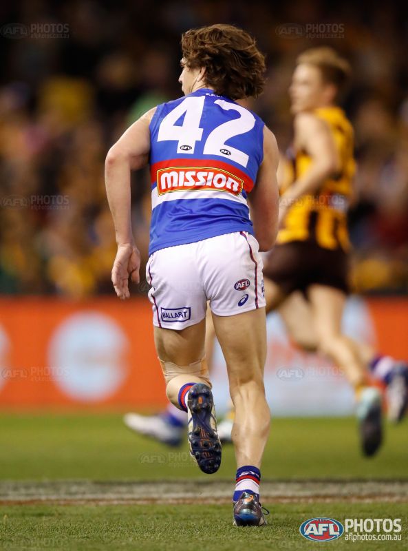
Liam Picken wearing his shorts backwards

544452.jpg
 

Remove this Banner Ad

Back
Top