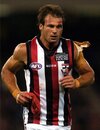
Assuming the dark green as the basis of the home jumper I would suggest something like the Matildas away jumper as the basis for the away/clash jumper. Avoid white, go light green. Australia Football Shirts & Tops 2023. Nike UK
Navigation
Install the app
How to install the app on iOS
Follow along with the video below to see how to install our site as a web app on your home screen.
Note: This feature may not be available in some browsers.
More options
-
Mobile App Discontinued
Due to a number of factors, support for the current BigFooty mobile app has been discontinued. Your BigFooty login will no longer work on the Tapatalk or the BigFooty App - which is based on Tapatalk.
Apologies for any inconvenience. We will try to find a replacement.
You are using an out of date browser. It may not display this or other websites correctly.
You should upgrade or use an alternative browser.
You should upgrade or use an alternative browser.
Opinion Team Jumper
- Thread starter Tassie_Tiger
- Start date
- Tagged users None
🥰 Love BigFooty? Join now for free.
- Jun 27, 2004
- 22,908
- 30,485
- AFL Club
- Richmond
- Other Teams
- Tasmania Devils
- Moderator
- #127
Not a bad ideaAssuming the dark green as the basis of the home jumper I would suggest something like the Matildas away jumper as the basis for the away/clash jumper. Avoid white, go light green. Australia Football Shirts & Tops 2023. Nike UK

Gold, Green and Red tricolours will look the best.
The mascot should be something powerful like
Dragons
Panthers
Vultures
Wolves
Warriors
The mascot should be something powerful like
Dragons
Panthers
Vultures
Wolves
Warriors
Warriors, hmmm, not bad.Gold, Green and Red tricolours will look the best.
The mascot should be something powerful like
Dragons
Panthers
Vultures
Wolves
Warriors
Titans? (bit too close to giants I think)
Log in to remove this Banner Ad
CrazyJoeFevola
Setanta Ó hAilpín’s official bigfooty butler 2007
- Apr 14, 2013
- 2,753
- 5,262
- AFL Club
- Carlton
- Other Teams
- Preston, WIndies, Armagh GAA
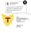
Presumably just pre emptive to keep options open. Also probably makes sense for AFL (or at least AFL Tas) to own the trademark if anyone has to. I wonder if any of the other state jumpers have trademarks on them?
- Jun 27, 2004
- 22,908
- 30,485
- AFL Club
- Richmond
- Other Teams
- Tasmania Devils
- Moderator
- #132
What about a green/black colourGold, Green and Red tricolours will look the best.
The mascot should be something powerful like
Dragons
Panthers
Vultures
Wolves
Warriors
Carlos Tilt
Draftee
- Oct 4, 2023
- 6
- 4
- AFL Club
- Tasmania
- Banned
- #134
Don't want the state jumper but happy to have the map of Tas on there somewhere, like a patch on the breast or on the back collar.
- Jun 27, 2004
- 22,908
- 30,485
- AFL Club
- Richmond
- Other Teams
- Tasmania Devils
- Moderator
- #135
In a world of Photoshop and advanced 21st century digital editing skills, none of which I'm any good at, there's still room for your daughter's pencils...imagine all of it with a much darker green, as much as what Carlton and Freo's jumpers bring to blue and purple respectively...bub didn't have a pencil that dark...!
I always liked the notion of the Devil stripe that appeared on the 2007 jumper - in the shape of the south of Tassie: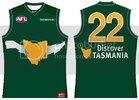
The first drawing does that with straighter edges and also includes the north on the back. Once I saw it on paper, I was over it, but it still looks good in my head! However, black is the new black...we need that because it's cool and brings out the gold and red. The second one looks a little more Wolverhampton, and third one combines the two. I'm kinda leaning towards the second, third might be a bit wank level ambitious and abstract (which is why the WA coast Eagles jumper fizzed) but a better artistic rendering could get me onto the third, as well as better stylistic deviation for both of them so that Wolves as well as Warner Bros aren't filing lawsuits...
I don't want the map as our jumper (sacred), but it could end up as a St Kilda style badge. We should be on the front chest V category of jumper, not panels, stripes or sashes, so I was thinking Freo and 1990's Bears here. We should be making green the synonymous colour, so the second lot of shorts are green and not black...getting the colour arrangement to not look like Germany is key here. Also, rose and primrose...if they show up as better looking colours under lights which most of our games will be if we get a roofed stadium, then that's what we should go for. Again, waaaay darker green...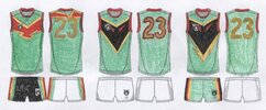
I always liked the notion of the Devil stripe that appeared on the 2007 jumper - in the shape of the south of Tassie:

The first drawing does that with straighter edges and also includes the north on the back. Once I saw it on paper, I was over it, but it still looks good in my head! However, black is the new black...we need that because it's cool and brings out the gold and red. The second one looks a little more Wolverhampton, and third one combines the two. I'm kinda leaning towards the second, third might be a bit wank level ambitious and abstract (which is why the WA coast Eagles jumper fizzed) but a better artistic rendering could get me onto the third, as well as better stylistic deviation for both of them so that Wolves as well as Warner Bros aren't filing lawsuits...
I don't want the map as our jumper (sacred), but it could end up as a St Kilda style badge. We should be on the front chest V category of jumper, not panels, stripes or sashes, so I was thinking Freo and 1990's Bears here. We should be making green the synonymous colour, so the second lot of shorts are green and not black...getting the colour arrangement to not look like Germany is key here. Also, rose and primrose...if they show up as better looking colours under lights which most of our games will be if we get a roofed stadium, then that's what we should go for. Again, waaaay darker green...

Cunnington Cartel
All Australian
- Nov 18, 2022
- 830
- 1,323
- AFL Club
- North Melbourne
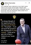
Good work, they look cool and they are definitely distinguishable from Germany. The map has a role to play. I like your idea of using it as a St Kilda-style badge, it could work on the back of the neck as well. I sense that there’s growing momentum for selecting the map guernsey. Rob Shaw and Jack Riewoldt have advocated for this during recent interviews. Shawry articulated how the jumper is sacred, but emphasised that for such an iconic jumper, it’s totally under-utilised. He said that it deserves to be put on show in the national competition instead of only making an appearance for state representative games at amateur and junior level. It’s a reasonable point and I won’t be devastated if it gets the nod, although I can definitely appreciate the counter view as well.In a world of Photoshop and advanced 21st century digital editing skills, none of which I'm any good at, there's still room for your daughter's pencils...imagine all of it with a much darker green, as much as what Carlton and Freo's jumpers bring to blue and purple respectively...bub didn't have a pencil that dark...!
I always liked the notion of the Devil stripe that appeared on the 2007 jumper - in the shape of the south of Tassie:View attachment 1861043
The first drawing does that with straighter edges and also includes the north on the back. Once I saw it on paper, I was over it, but it still looks good in my head! However, black is the new black...we need that because it's cool and brings out the gold and red. The second one looks a little more Wolverhampton, and third one combines the two. I'm kinda leaning towards the second, third might be a bit wank level ambitious and abstract (which is why the WA coast Eagles jumper fizzed) but a better artistic rendering could get me onto the third, as well as better stylistic deviation for both of them so that Wolves as well as Warner Bros aren't filing lawsuits...
I don't want the map as our jumper (sacred), but it could end up as a St Kilda style badge. We should be on the front chest V category of jumper, not panels, stripes or sashes, so I was thinking Freo and 1990's Bears here. We should be making green the synonymous colour, so the second lot of shorts are green and not black...getting the colour arrangement to not look like Germany is key here. Also, rose and primrose...if they show up as better looking colours under lights which most of our games will be if we get a roofed stadium, then that's what we should go for. Again, waaaay darker green...View attachment 1861041
- Sep 8, 2011
- 11,841
- 12,828
- AFL Club
- West Coast
As a non Tasmanian, I would feel weird playing in the tassie state jumper if it became the new clubs uniform.
And as a Sandgroper I also didn’t like it when West Coast wore the state guernsey WA beat the Vics in for SOO during a heritage round
And as a Sandgroper I also didn’t like it when West Coast wore the state guernsey WA beat the Vics in for SOO during a heritage round
This. I recall the reaction when WC did that...I think it was against the Lions in Perth who'd run out in a proper Fitzroy jumper?As a non Tasmanian, I would feel weird playing in the tassie state jumper if it became the new clubs uniform.
And as a Sandgroper I also didn’t like it when West Coast wore the state guernsey WA beat the Vics in for SOO during a heritage round
They have their place, and it's sacred! When non-Tasmanians ran out in the state jumper, which is the argument being used to justify it being used for an AFL side which would be almost entirely made up of interstaters, at least they were there for the benefit of Tasmanian footy, playing for a local side usually as a CC, and sometimes in for the long haul by playing most of their non-mainland big league career there. They weren't in danger of being traded either!
And once we've got this team up and running, what does the state rep team wear when we play a state game? They won't stop, as evidenced by the regular SANFL, WAFL and VFL games, and I'd imagine the public would love to see a run of state matches again like the one we had v Qld this year...
Dark green, but not the Map...it will move my hand from my testicles to my heart, but please don't make me feel conflicted while I do it...
Cunnington Cartel
All Australian
- Nov 18, 2022
- 830
- 1,323
- AFL Club
- North Melbourne
There’s only 3 more months until the guernsey, colours and nickname will be revealed (along with foundational memberships).
Strongly agree. It shouldn't be that hard to come up with a concept that evokes the history, uses some of the traditional colours (forest Green a must) without just adopting our SoO guernsey wholesale. The Crows and the original Bears are great examples of this.This. I recall the reaction when WC did that...I think it was against the Lions in Perth who'd run out in a proper Fitzroy jumper?
They have their place, and it's sacred! When non-Tasmanians ran out in the state jumper, which is the argument being used to justify it being used for an AFL side which would be almost entirely made up of interstaters, at least they were there for the benefit of Tasmanian footy, playing for a local side usually as a CC, and sometimes in for the long haul by playing most of their non-mainland big league career there. They weren't in danger of being traded either!
And once we've got this team up and running, what does the state rep team wear when we play a state game? They won't stop, as evidenced by the regular SANFL, WAFL and VFL games, and I'd imagine the public would love to see a run of state matches again like the one we had v Qld this year...
Dark green, but not the Map...it will move my hand from my testicles to my heart, but please don't make me feel conflicted while I do it...
- Jun 27, 2004
- 22,908
- 30,485
- AFL Club
- Richmond
- Other Teams
- Tasmania Devils
- Moderator
- #142
Interesting to see how many members, inside the first month.There’s only 3 more months until the guernsey, colours and nickname will be revealed (along with foundational memberships).
Mr Taswegian
Roo Man
- May 25, 2019
- 3,049
- 1,441
- AFL Club
- North Melbourne
Hopefully we can get as many as possible to prove some of these no believers wrong. I know of plenty that believe we will never fill the stadium so I think people are going to be surprised.Interesting to see how many members, inside the first month.
- Sep 8, 2011
- 11,841
- 12,828
- AFL Club
- West Coast
Navy and pink would be a great colour combo for something different
🥰 Love BigFooty? Join now for free.
- Jun 27, 2004
- 22,908
- 30,485
- AFL Club
- Richmond
- Other Teams
- Tasmania Devils
- Moderator
- #145
Spot on, well them doubters will look out of place. Tasmanian people will turn up. Will be hard to get tickets game 1 as well.Hopefully we can get as many as possible to prove some of these no believers wrong. I know of plenty that believe we will never fill the stadium so I think people are going to be surprised.
Forrest Green and Black
Tandy
Brownlow Medallist
Sorry, No.Would love to see a St Kilda 'candy stripe' guernsey done up for Tasmania. The 3 colours would work well in that design. Actually like it over the basic vertical thicker stripes of North, hawks and Collingwood. So even though it's vertical, it's still a unique design I think.
View attachment 1890496View attachment 1890497
People here (& me
The Tassie state jumper of 1977 had some vertical panels but was soon forgotten.
We want to start with some tradition.
- Jun 27, 2004
- 22,908
- 30,485
- AFL Club
- Richmond
- Other Teams
- Tasmania Devils
- Moderator
- #149
How about a really nice green with black?Sorry, No.
People here (& me) expect a predominantly green jumper & shorts. Add some red & yellow. Thats it.
The Tassie state jumper of 1977 had some vertical panels but was soon forgotten.
We want to start with some tradition.
How about a really nice green with black?
Predominantly green with black would be fine with me. I still think the Green with some red & yellow would be more colourful & give better options for designs of jumper & apparel for members/supporters.


