Portfolio The A-League by Nike - Also featuring NPL, Australia, and EPL International Clubs

Remove this Banner Ad

And finally...

Portfolio%20header%203_zpskfizxtrv.png


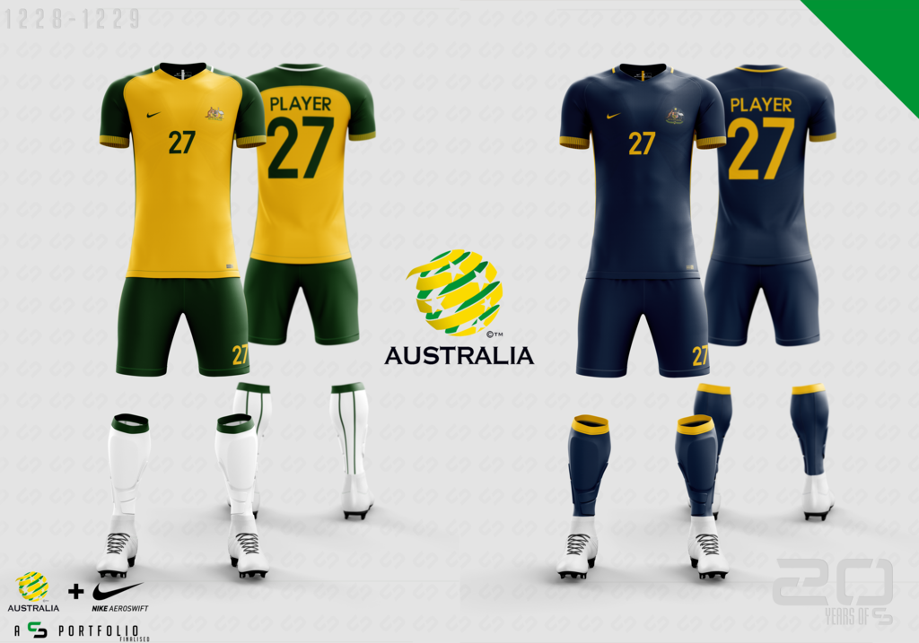
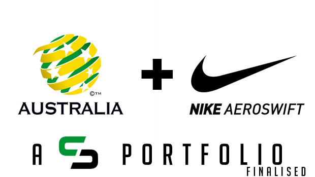
This portfolio has covered the A-league, then the former NSL clubs in the NPL division 1, now for the finale we take it to the highest level, the international game.

Nike already has the contract for the Socceroos so this will be a less of a what if, and more of a please do this for the next kits.

There will only be one post to close out this portfolio, but after 18 teams and 36 designs this feels like it is the right place to end.​
 

Log in to remove this ad.

That Melbourne City away strip is s**t, What mad you think that this would look good?

Simple, Melbourne City fans want a red striped kit, and Manchester City have historically worn either Maroon or Red and Black striped kits, so I merged the two and came up with a dark red and Black striped away kit which is a link to both clubs.

Oh and I never said that all the kits in the portfolio would look good, all I said was this is what I think Nike would do, so some kits are not what everyone would like, but what could actually happen.
Ok, firstly, I don't really care if City has a Red/White stripped jersey, that doesn't phase me, I wore my old heart jersey to all games up until 16/17 season, Plus I do see where you are going with the Grey/Red/Black Strip, Personally I would think that would be Goalkeeper jersey If anything, I do apologise if what I said was over the line, but i was just being honest
 
So after a new portfolio was created by another designer, I started to think about new designs for some football kits. Add to that my being off work for a week recuperating from surgery and we now have this:

21kfmvr.jpg

Several clubs from countries that currently do not have links to the Premier League have been accepted into the league. Jumping on the opportunity Nike has snapped up these clubs or continued their association and have designed new kits for their first season in the league. Some of the clubs featured are fairly obvious and have been mentioned in the past, some were chosen based on current events and subsequent talk from media, and others are just pure fantasy.

First designs to follow soon...
 
Good luck with the recovery!

Cheers, already feeling so much better than before the surgery (had a herniated disc pressing on a nerve). Just need to take it easy now, which is quite hard as I want to be far more active as I am free of any discomfort now.

But getting back to the topic that this portfolio is about...

The first team moving across is from the north and one that has been spoken about in relation to a move to the English game for a couple of decades as the competition in Scotland is too weak for their level of performance. After a few years of recovery from financial issues Rangers have made the move across and will wear the following in their first season;

Rangers%20FC_zpsrffvyjvd.png


The home kit is based on the clubs first Nike kit from 1997-99 but unlike that kit this one features the clubs logo as a base pattern as well as subtle thin stripes on the front of the lower body and shoulders. The socks also feature thin stripes which did not feature on the original kit.

The away kit is based on several former kits from the clubs history including a slightly modified shirt from 1949-52, shorts from many different away/3rd kits, and socks from the clubs 1959-61 away kit.

*Note: images location will relocate at some point in the future, so any replies may end up with broken links within them.
 
Last edited:
Cheers, already feeling so much better than before the surgery (had a herniated disc pressing on a nerve). Just need to take it easy now, which is quite hard as I want to be far more active as I am free of any discomfort now.

But getting back to the topic that this portfolio is about...

The first team moving across is from the north and one that has been spoken about in relation to a move to the English game for a couple of decades as the competition in Scotland is too weak for their level of performance. After a few years of recovery from financial issues Rangers have made the move across and will wear the following in their first season;

2hgbll5.jpg


The home kit is based on the clubs first Nike kit from 1997-99 but unlike that kit this one features the clubs logo as a base pattern as well as subtle thin stripes on the front of the lower body and shoulders. The socks also feature thin stripes which did not feature on the original kit.

The away kit is based on several former kits from the clubs history including a slightly modified shirt from 1949-52, shorts from many different away/3rd kits, and socks from the clubs 1959-61 away kit.

*Note: images location will relocate at some point in the future, so any replies may end up with broken links within them.

Not easy to make nationalist zombies look good but you managed it
 
Wow. I mean, I'll never walk alone but you certainly will.

We may walk alone, but it seems to win us more titles.

And with that being said the rivalry will continue in the Premier League as Celtic also left the Scottish Premier League to join the English version.

Unlike Rangers, Celtic's home kit was a step away from tradition with a unique twist on their traditional hoops. Instead of equal sized green and white hoops, in this kit green dominated the design with thicker hoops and white took a back seat with thinner hoops and horizontal pinstripes through the middle of the larger green hoops. The sleeves also stepped away from tradition with for the first time in the clubs history, stripes did not appear. Instead the sleeves were split with one being green and the other white, but both featured green and white cuffs. The shorts and socks remained fairly recognisable though with simple white with small amounts of green designs.

The away kit returned a simple yellow shirt with subtle vertical stripes, to go with green shorts and socks.

Celtic%20FC_zpsla7thhao.png


*Note: images location will relocate at some point in the future, so any replies may end up with broken links within them.
 
Last edited:

(Log in to remove this ad.)

Next to make the move was a major shock to the worlds footballing community. A team that is a perennial title challenger in their normal league AS Monaco FC decided that as Monaco is not part of France that they were free to move to a new league to try a new challenge. They also took their leave after another club from a region that is no longer part of their leagues country moved to the Premier League.

With this move Monaco retained their traditional diagonal red and white design, but returned to a more traditional vertical angle. They decided to go with divided sleeves with one red and one white with reversed cuffs. The design also featured a subtle vertical striping design which resembled the clubs original uniform. The shorts remained white and the socks were red with white tops.

The away kit featured dark blue and tan stripes, with tan shoulders and dark blue and tan striped cuffs. Dark blue shorts and tan with dark blue topped socks finished off the design. The clubs badge was also turned to monochrome dark blue for the shirt and tan for the shorts.


AS%20Monaco_zpse9i0otja.png
 
Last edited:
And with that yes Barcelona is the next team to move to the Premier League. With Catalonia gaining independence and Spain not being happy about it Barcelona were left in a position where they may not be able to participate in La Liga. So when given the chance to move to the Premier League they jumped at it.

The home kit was a traditional Barcelona kit with red and blue vertical stripes, but to make it slightly different the design featured subtle gradient stripes within those stripes, the kit features simple plain blue sleeves. The Catalan flag was placed on the back of the kit just under the collar, and the club chose to wear red numbers on the kit. Blue shorts and socks accompanied the shirt.

The Away kit left nothing to imagination. It was the Catalan flag placed across the chest and back. The kit was based on a one from the 1920's but unlike that kit that had 3 red stripes, the new one added the flags 4th red stripe. A subtle stripe pattern accompanied the main design with yellow sleeves and yellow and red striped cuffs. The names, numbers, and sponsors were blue. The Catalan flag again also sat below the collar on the back. Red short with yellow numbers and yellow socks with red tops accompanied the kit.

Barcelona_zps3geocdt0.png
 
Last edited:
How many other Catalan clubs will join them, I wonder? And what of the Basques?

Secondly, playing devil's advocate for the sake of seeing a new design; what would happen if Crystal Palace did a Collingwood on Barça and say that their home kit would have to change as it was too similar to the Palace? Yes, I know they have away kits in soccer, but I just thought I'd put that one out there. As a matter of point, that could be an issue for any team joining the new league?
 
Last edited:
How many other Catalan clubs will join them, I wonder? And what of the Basques?

Secondly, playing devil's advocate for the sake of seeing a new design; what would happen if Crystal Palace did a Collingwood on Barça and say that their home kit would have to change as it was too similar to the Palace. Yes, I know they have away kits in soccer, but I just thought I'd put that one out there. As a matter of point, that could be an issue for any team joining the new league?
Can't imagine it being a problem if CPFC aren't in the prem.
 
Can't imagine it being a problem if CPFC aren't in the prem.
I had a feeling someone would say that. It's a hypothetical proposition concerning the idea of re-designing jerseys. Although I admit, Craegus has enough on his plate with the overall portfolio.

On that Barcelona away kit, have you considered making the senyera stripes bigger so as to give a clearer space for the Rakuten logo?
 
Last edited:
Can't imagine it being a problem if CPFC aren't in the prem.

I had a feeling someone would say that. It's a hypothetical proposition concerning the idea of re-designing jerseys. Although I admit, Craegus has enough on his plate with the overall portfolio.

On that Barcelona away kit, have you considered making the senyera stripes bigger so as to give a clearer space for the Rakuten logo?

To the Crystal Palace argument I respond with the words Chelsea/Leicester, Man U/Liverpool. Or in other words, it happens all the times in football, no one would pull that.

On the design element, in this case the sponsor came second, patriotism and a middle finger to Spain came first.
 

Remove this Banner Ad

Back
Top