Contested Marx
Schrodinkley's Cat
- Jun 21, 2014
- 11,629
- 25,868
- AFL Club
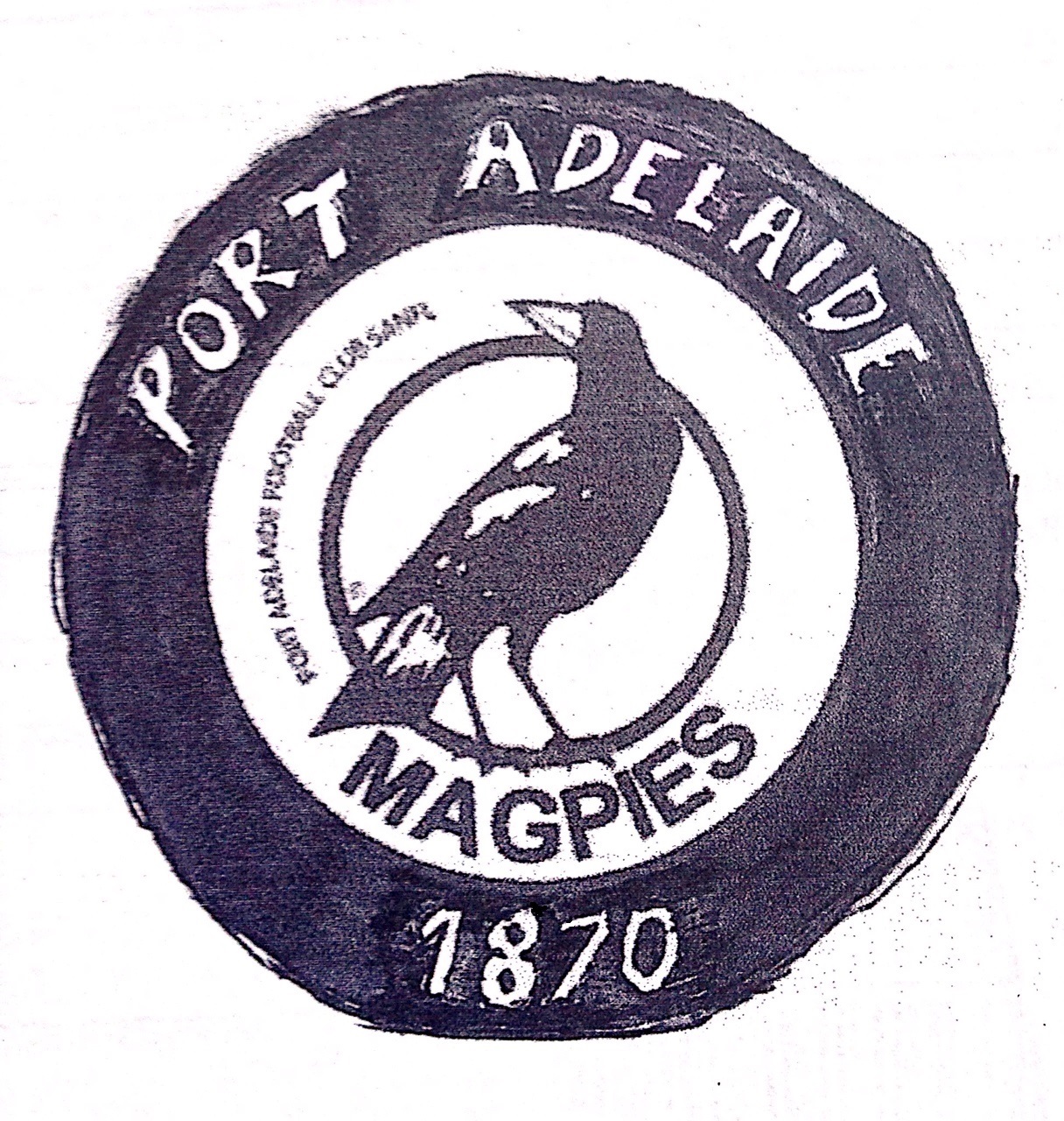
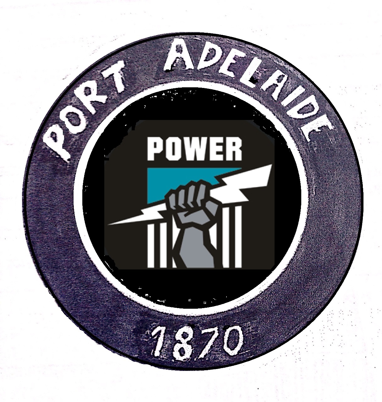
- Port Adelaide
- Other Teams
- Maggies, Spurs, Raiders?
MaggiesAre port the pies though? Always thought that was a collingwood thing
Sent from mTalk
Pies is Collingwood
Pirates is ok but I'd have gone Raiders and this is a repeated discussion so
PS yes to Zeus as mascot