Jones2ByrneJones
Hour of Pessimism
- Jul 27, 2012
- 15,816
- 27,971
- AFL Club
- Port Adelaide
In life, the words we use and the language we speak affects how we see the world. A simple example of this would be our use of the word ‘blue’, which we define as the colours between violet and green on the colour spectrum.

We have a whole host of colours within this range. From cyan to cerulean blue, from ‘pure’ to navy blue. While hyponyms exist for ‘blue’, using the word ‘blue’ without a specific adjective can cause misunderstandings. As with most things, we can illustrate this using The Simpsons.
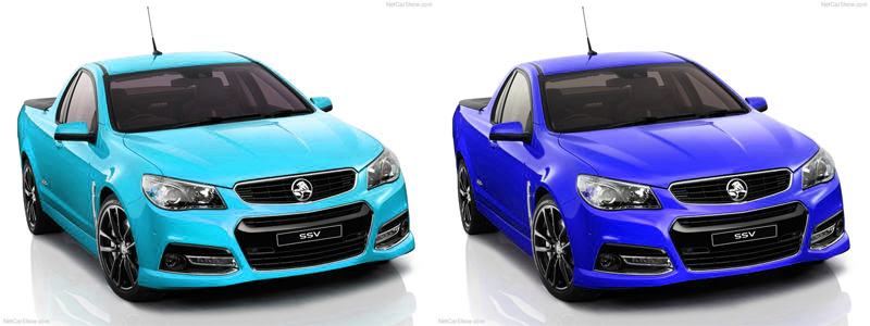
Homer states that he “is not easily impressed” before promptly being wowed by “a blue car!” What does he mean by a blue car? Does he mean the car on the left or the car on the right?

Quite clearly, they’re different colours, yet we use the same word to describe them. One of the quirks of critical thinking means we can, if we think about it, be more specific to avoid confusion and ambiguity. Which is exactly what we need to do when discussing clash jumpers and their purpose in the AFL.
The fundamental purpose of clash jumpers, as it stands, is to reduce a clash. I propose that this definition is flawed. The difference between “clash reduction” and “contrast maximisation” is pivotal and something we need to address with our use of terminology.
I’ve created a spectrum below. Clash and contrast are basically opposites.

As you can see, it travels from clash (red) to contrast (green). You can place any jumper matchup on this spectrum somewhere.
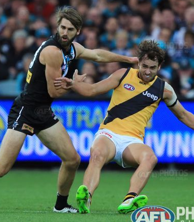
For example, when Port played Richmond earlier in the year, there is a very big contrast between the teams and the teams are clearly distinguishable.

I would place it on the very far right side of the spectrum, like this.

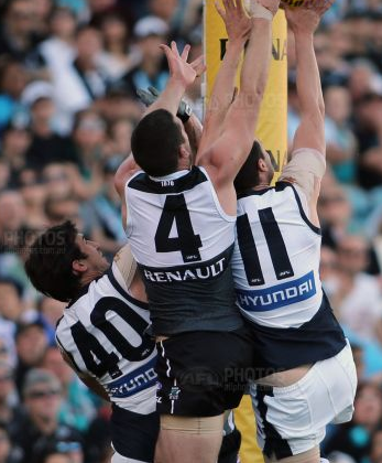
On the other hand, in 2013 we experienced a huge clash in jumpers when Port played Carlton in their heritage strip. A huge oversight by those in charge.

I’d place this matchup on the very left side of the spectrum, like this.

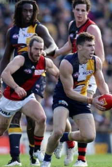
Lastly, just the other week, Essendon played West Coast. While the teams are distinguishable in a still picture, on a video it is much harder.

I can agree that there is no clash, but, importantly and just as equally, there is no contrast.

So why am I pointing this out? Because what I’ve observed recently is that people are using the same words to mean different things. Just like we do when we say ‘a blue car’. There is a need to be specific to avoid confusion and ambiguity.
People will say “Essendon clash with Collingwood” and there are rightfully told they are wrong, because they don’t clash. But what they should say is “Essendon don’t contrast with Collingwood”, which is entirely correct, and can form the basis of a terminologically correct argument in support of clash jumpers.
With this in mind, we can also state that the use of the term ‘clash jumper’ is biased. Using the example above, the implication is that we don’t need jumpers to contrast, we simply need them to not clash.
I stated earlier that I believe the purpose of clash jumpers should be to maximise contrast rather than reduce clash, and, personally, I think the term ‘contrast jumper’ would be much more appropriate for my arguments.
So, in conclusion, we need to recognize that our use of the word ‘clash’ implies there is no need for a contrast, and, thus, our argument can fall short. The merit of whether we need totally contrasting jumper matchups is another topic, however. But one thing is certain - no matter which side of the fence we are on, we need to get our terminology straight.

We have a whole host of colours within this range. From cyan to cerulean blue, from ‘pure’ to navy blue. While hyponyms exist for ‘blue’, using the word ‘blue’ without a specific adjective can cause misunderstandings. As with most things, we can illustrate this using The Simpsons.
Homer states that he “is not easily impressed” before promptly being wowed by “a blue car!” What does he mean by a blue car? Does he mean the car on the left or the car on the right?

Quite clearly, they’re different colours, yet we use the same word to describe them. One of the quirks of critical thinking means we can, if we think about it, be more specific to avoid confusion and ambiguity. Which is exactly what we need to do when discussing clash jumpers and their purpose in the AFL.
The fundamental purpose of clash jumpers, as it stands, is to reduce a clash. I propose that this definition is flawed. The difference between “clash reduction” and “contrast maximisation” is pivotal and something we need to address with our use of terminology.
I’ve created a spectrum below. Clash and contrast are basically opposites.

As you can see, it travels from clash (red) to contrast (green). You can place any jumper matchup on this spectrum somewhere.
For example, when Port played Richmond earlier in the year, there is a very big contrast between the teams and the teams are clearly distinguishable.

I would place it on the very far right side of the spectrum, like this.

On the other hand, in 2013 we experienced a huge clash in jumpers when Port played Carlton in their heritage strip. A huge oversight by those in charge.

I’d place this matchup on the very left side of the spectrum, like this.

Lastly, just the other week, Essendon played West Coast. While the teams are distinguishable in a still picture, on a video it is much harder.

I can agree that there is no clash, but, importantly and just as equally, there is no contrast.

So why am I pointing this out? Because what I’ve observed recently is that people are using the same words to mean different things. Just like we do when we say ‘a blue car’. There is a need to be specific to avoid confusion and ambiguity.
People will say “Essendon clash with Collingwood” and there are rightfully told they are wrong, because they don’t clash. But what they should say is “Essendon don’t contrast with Collingwood”, which is entirely correct, and can form the basis of a terminologically correct argument in support of clash jumpers.
With this in mind, we can also state that the use of the term ‘clash jumper’ is biased. Using the example above, the implication is that we don’t need jumpers to contrast, we simply need them to not clash.
I stated earlier that I believe the purpose of clash jumpers should be to maximise contrast rather than reduce clash, and, personally, I think the term ‘contrast jumper’ would be much more appropriate for my arguments.
So, in conclusion, we need to recognize that our use of the word ‘clash’ implies there is no need for a contrast, and, thus, our argument can fall short. The merit of whether we need totally contrasting jumper matchups is another topic, however. But one thing is certain - no matter which side of the fence we are on, we need to get our terminology straight.
Last edited:


