


You shouldnope
Navigation
Install the app
How to install the app on iOS
Follow along with the video below to see how to install our site as a web app on your home screen.
Note: This feature may not be available in some browsers.
More options
Style variation
-
 Soccer Notice Image
Premier League - Matchday 38
Champions League - FINAL - PSG v Arsenal ⚽ Europa Semis ⚽ 2026 FIFA Series A - Socceroos friendlies ⚽ The Matildas x 2026 Womens Asia Cup ⚽ Conference League - SEMIS! ⚽ Conference League - Rd of 16 ⚽ Socceroos Internat'l Friendlies ⚽ FA Cup - Man City Win
-
 Fantasy Footy Notice Image Round 11
SuperCoach Rd 11 Rd 11 Talk - Trades - VC/C - Pendlebury Comp – Win A Badge - Fight MND Comp Returns ,//, AFL Fantasy Rd 11 Rd 11 Talk - Trades - The VC/C Thread
You are using an out of date browser. It may not display this or other websites correctly.
You should upgrade or use an alternative browser.
You should upgrade or use an alternative browser.
The Crows Logo Thread
- Thread starter Kerleys Ghost
- Start date
- Tagged users None
🥰 Love BigFooty? Join now for free.
Pdub
Norm Smith Medallist
You should
I'd be happy to but I don't think they would pay me enough to cover my mortgage.
- Joined
- May 25, 2009
- Posts
- 6,905
- Reaction score
- 12,300
- Location
- Back in S.A.
- AFL Club
- Adelaide
- Other Teams
- Sporting Clube de Portugal
I don't mind the logo itself, I think if they got rid of the cartoony font and used a professional looking font, it would make the logo look much better.
Quick and dirty but you get the picture.
I doubt there are many people who dislike our current logo solely because of the font. My impression is that the hate is for the most part directed at the head, with barely an afterthought spared for the font.
Last edited:
I don't mind the logo itself, I think if they got rid of the cartoony font and used a professional looking font, it would make the logo look much better.
Quick and dirty but you get the picture.
Vomitous: (Adj.) Of or pertaining to vomit; tending to make one vomit; inducive of vomit; not up to scratch.
Sorry, but this logo, even if it wasn't an amateurish floating head of not a crow in not AFC colours is just symbolic of a shit era and needs to be lost and forgotten. It says Trigg in so many forgettable ways
Log in to remove this Banner Ad
Red mist
Reynholm Industries
- Joined
- Jun 30, 2014
- Posts
- 29,193
- Reaction score
- 34,128
- Location
- The Winchester
- AFL Club
- Adelaide
- Other Teams
- Tottenham Hotspur, East Side Hawks
Shutup gooseThat is bloody awful. LOL!
Canberra Based Crow
Senior List
- Joined
- Oct 15, 2012
- Posts
- 229
- Reaction score
- 119
- Location
- Melbourne
- AFL Club
- Adelaide
- Other Teams
- Manchester City, Melbourne City
Thanks Red.Shutup goose
Slammer, people who live in a glasshouse shouldn't throw stones.....
- Joined
- Sep 27, 2006
- Posts
- 1,522
- Reaction score
- 912
- Location
- South Australia
- AFL Club
- Port Adelaide
- Other Teams
- Newcastle Unt. UK, Seattle Seahawks
Thanks Red.
Slammer, people who live in a glasshouse shouldn't throw stones.....
WTF? Anyway it's still bloody awful! LOL.
Canberra Based Crow
Senior List
- Joined
- Oct 15, 2012
- Posts
- 229
- Reaction score
- 119
- Location
- Melbourne
- AFL Club
- Adelaide
- Other Teams
- Manchester City, Melbourne City
OK...thanks for your opinion that appears to be part of the minority.WTF? Anyway it's still bloody awful! LOL.
19thDan
Debutant
I received my membership renewal in the post today. The logo from the orange training guernsey was watermarked on the envelope and letter. Looks a lot better than the raptor head.
Updated: Here it is.View attachment 95377
My problem with this (and other Club documentation of late) is the way in which they use three different Crows on the same page - the 1991 crest in the 25 years logo, the Raven, and the new 'training guernsey' one. It reeks of indecision. Pick one and stick with it, and it exclusively.
- Joined
- Sep 20, 2011
- Posts
- 6,434
- Reaction score
- 11,562
- AFL Club
- Adelaide
I think the new Crow graphic is really just something for the season. Not a second/third logo. I wouldn't be surprised if their intention was for it to be a full body version of our current logo a bit like the Hawks have got, just it happens to be better done than the current logo. It's not actually that different, the shape of the beak is pretty much the same with the big curve which a lot of people complain about on the current logo but hasn't been mentioned with the new graphic.
19thDan
Debutant
I think the new Crow graphic is really just something for the season. Not a second/third logo. I wouldn't be surprised if their intention was for it to be a full body version of our current logo a bit like the Hawks have got, just it happens to be better done than the current logo. It's not actually that different, the shape of the beak is pretty much the same with the big curve which a lot of people complain about on the current logo but hasn't been mentioned with the new graphic.
Given its appearance on training guernseys I doubt the new Crow will disappear entirely at season's end - I gather those sorts of apparel tend to stick around at least 2 seasons
- Joined
- May 23, 2013
- Posts
- 2,204
- Reaction score
- 3,447
- AFL Club
- Adelaide
- Thread starter
- #187
Improvement on our current design.
At least it looks a little irritated. Or maybe it just looks glum, I don't know.
- Joined
- Sep 27, 2006
- Posts
- 1,522
- Reaction score
- 912
- Location
- South Australia
- AFL Club
- Port Adelaide
- Other Teams
- Newcastle Unt. UK, Seattle Seahawks
Improvement on our current design.
At least it looks a little irritated. Or maybe it just looks glum, I don't know.

At least the Baltimore logo looks like a bird, not a blue dinosaur!
Red mist
Reynholm Industries
- Joined
- Jun 30, 2014
- Posts
- 29,193
- Reaction score
- 34,128
- Location
- The Winchester
- AFL Club
- Adelaide
- Other Teams
- Tottenham Hotspur, East Side Hawks
What's a Power?
- Joined
- Sep 27, 2006
- Posts
- 1,522
- Reaction score
- 912
- Location
- South Australia
- AFL Club
- Port Adelaide
- Other Teams
- Newcastle Unt. UK, Seattle Seahawks
What's a Power?
What's a Red Mist?
Red mist
Reynholm Industries
- Joined
- Jun 30, 2014
- Posts
- 29,193
- Reaction score
- 34,128
- Location
- The Winchester
- AFL Club
- Adelaide
- Other Teams
- Tottenham Hotspur, East Side Hawks
What's a Slammer?What's a Red Mist?
I always see this
Improvement on our current design.
At least it looks a little irritated. Or maybe it just looks glum, I don't know.
- Joined
- Sep 27, 2006
- Posts
- 1,522
- Reaction score
- 912
- Location
- South Australia
- AFL Club
- Port Adelaide
- Other Teams
- Newcastle Unt. UK, Seattle Seahawks
Red mist
Reynholm Industries
- Joined
- Jun 30, 2014
- Posts
- 29,193
- Reaction score
- 34,128
- Location
- The Winchester
- AFL Club
- Adelaide
- Other Teams
- Tottenham Hotspur, East Side Hawks
Foiled!

🥰 Love BigFooty? Join now for free.
- Joined
- May 25, 2009
- Posts
- 6,905
- Reaction score
- 12,300
- Location
- Back in S.A.
- AFL Club
- Adelaide
- Other Teams
- Sporting Clube de Portugal
There are so many cool ways a crow can be drawn. I think there needs to be an extensive search by our marketing team.
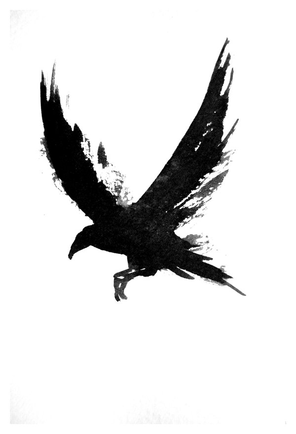
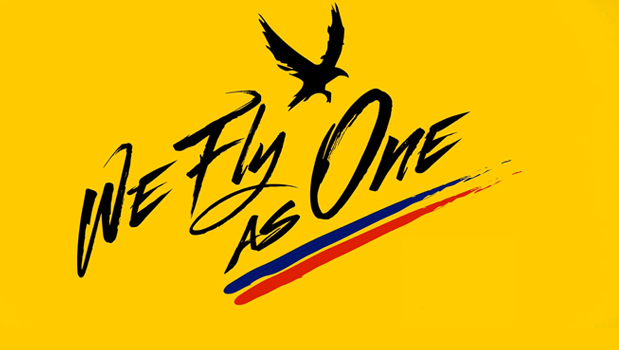
Looks like the club went with something very similar.
- Joined
- Mar 7, 2012
- Posts
- 18,690
- Reaction score
- 16,793
- AFL Club
- Adelaide
Looks like the club went with something very similar.
Looks like someone is keep tabs of the discussion and taking notes!
bomberclifford
Importer/Exporter
- Joined
- Sep 2, 2005
- Posts
- 43,863
- Reaction score
- 140,735
- Location
- Cerebral Cortex
- AFL Club
- Port Adelaide
- Other Teams
- Port Adelaide Magpies
Looks like the club went with something very similar.
It's pretty clear that's the exact same crow image, the WFAO version just been converted to a vector path.
Iron
Norm Smith Medallist
- Joined
- May 26, 2014
- Posts
- 7,170
- Reaction score
- 15,280
- AFL Club
- Adelaide
More than just very similar...
Looks like the club went with something very similar.
- Joined
- May 25, 2009
- Posts
- 6,905
- Reaction score
- 12,300
- Location
- Back in S.A.
- AFL Club
- Adelaide
- Other Teams
- Sporting Clube de Portugal
It's pretty clear that's the exact same crow image, the WFAO version just been converted to a vector path.
More than just very similar...
I'm aware that the crow with the slogan is based on the other, otherwise I wouldn't have made that post. The reason I wrote "very similar" is because there were changes made.
Yeah, it's the exact image, they just vectored it up a bit. Wowee
Similar threads

- Replies
- 559
- Views
- 8K


- Replies
- 982
- Views
- 11K
