Portfolio The NRL Dynasty

Remove this Banner Ad

Aug 8, 2008
7,947
8,641
Campbelltown
AFL Club
Sydney
Other Teams
Arsenal, Macarthur FC
0tFwZw3.png

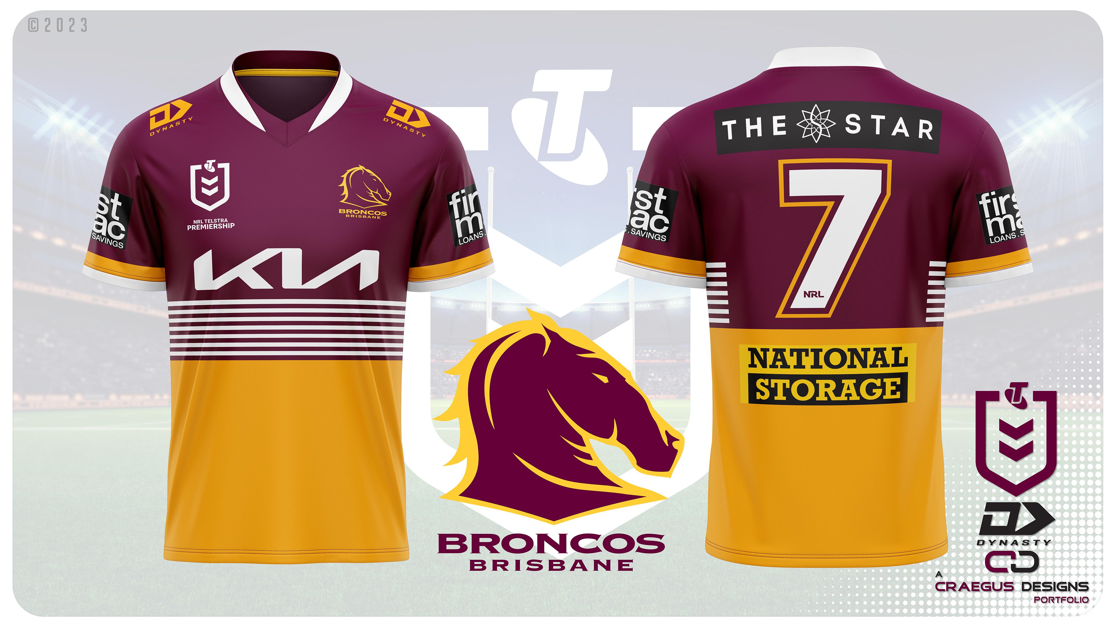
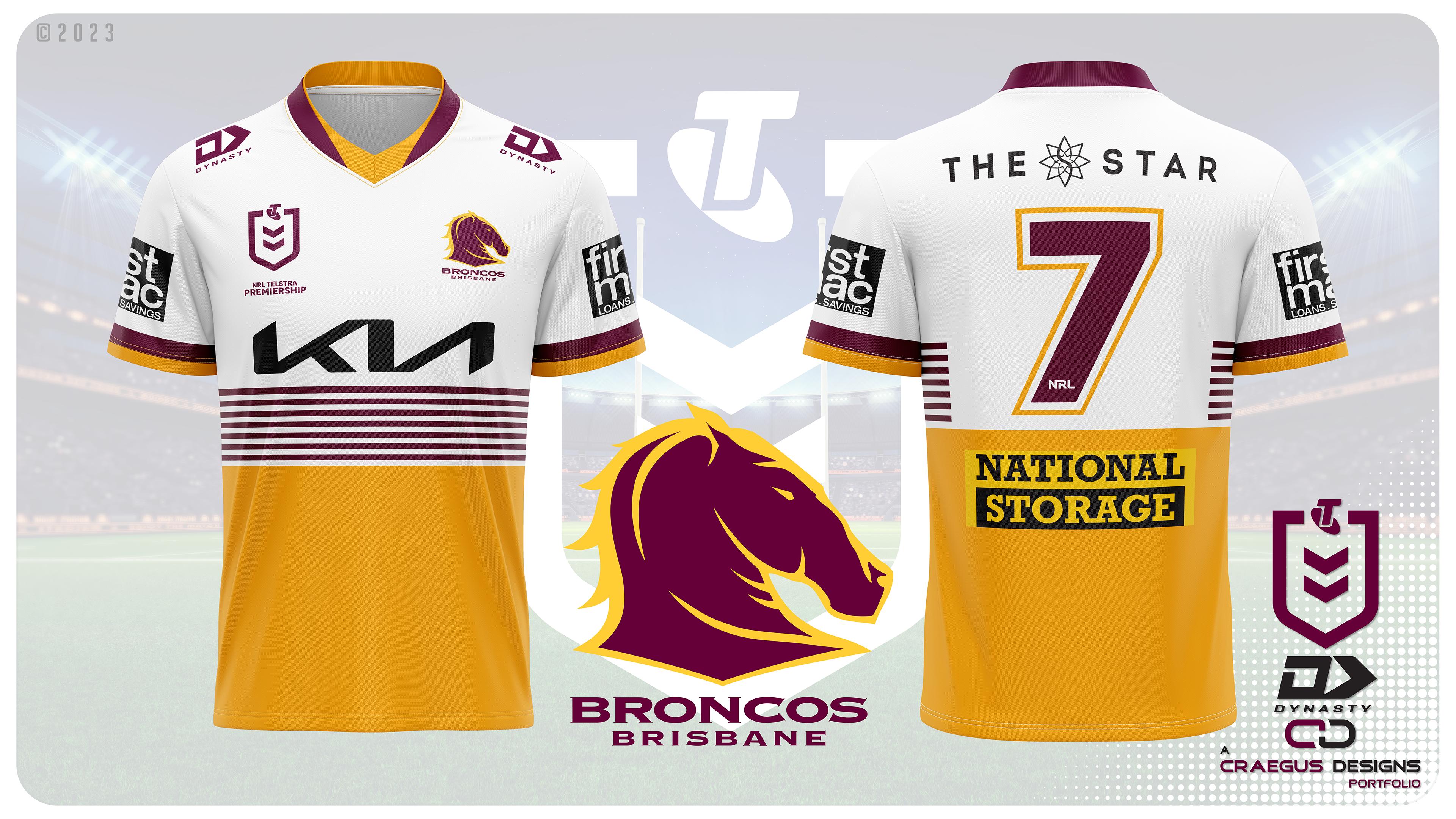
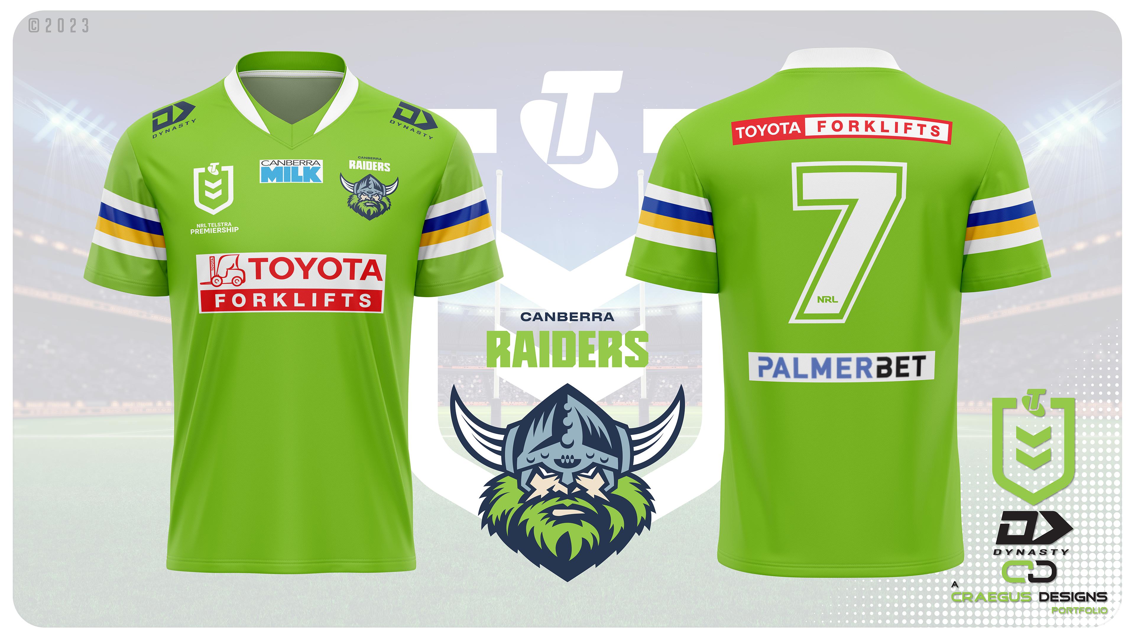
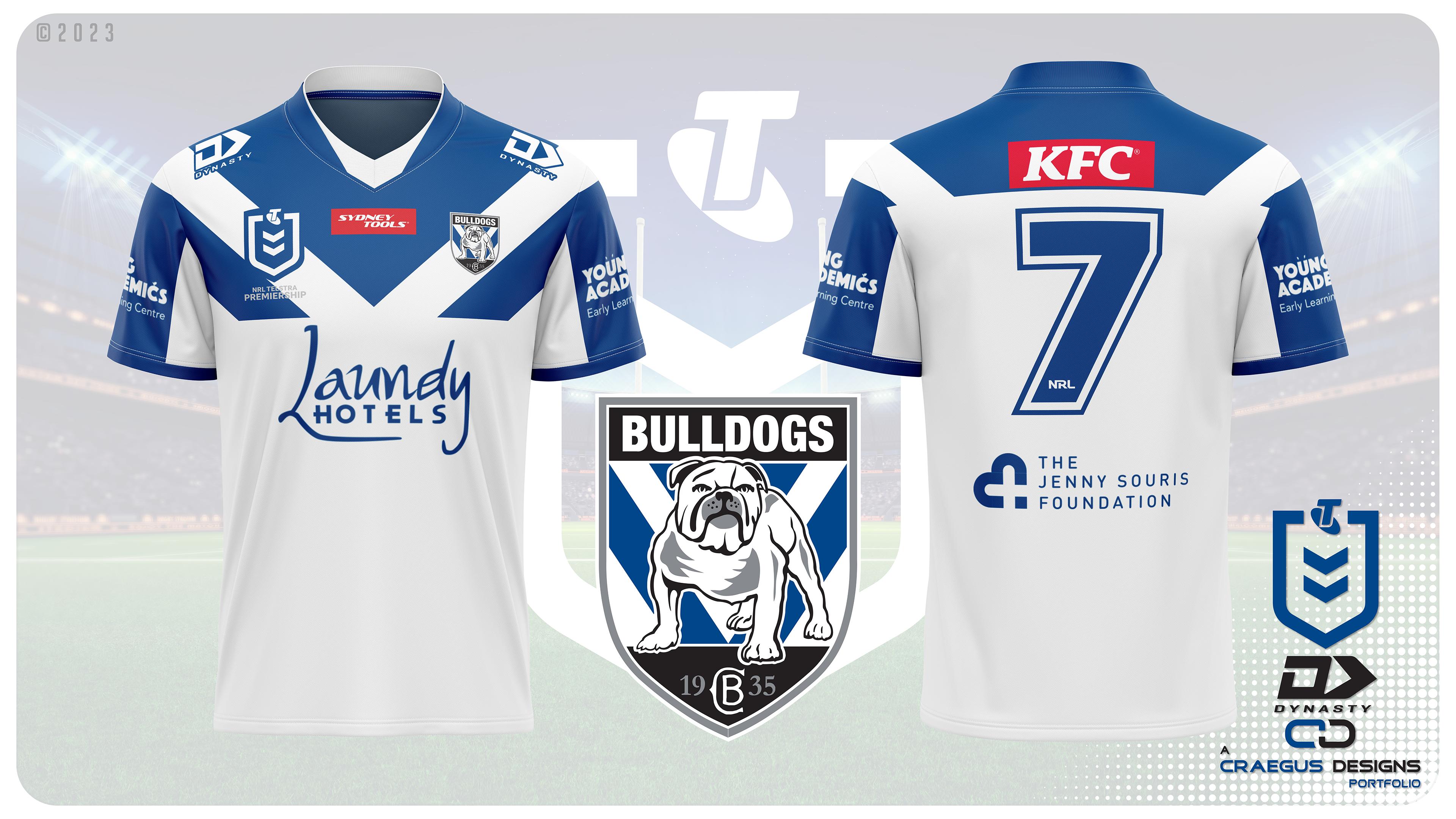
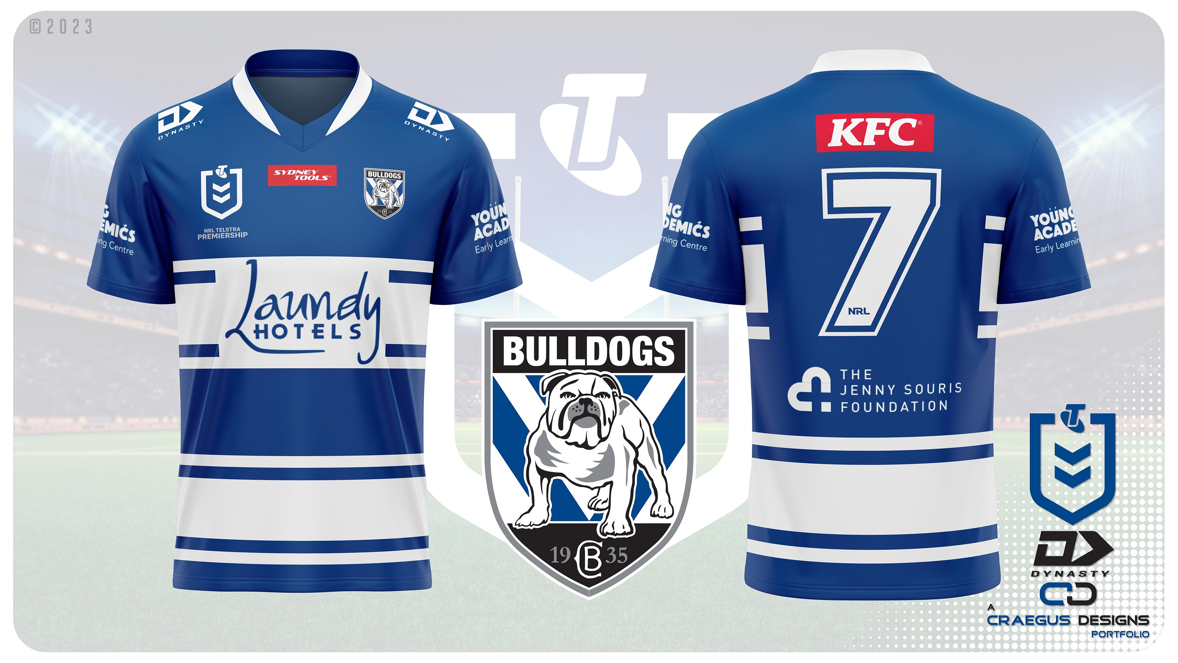
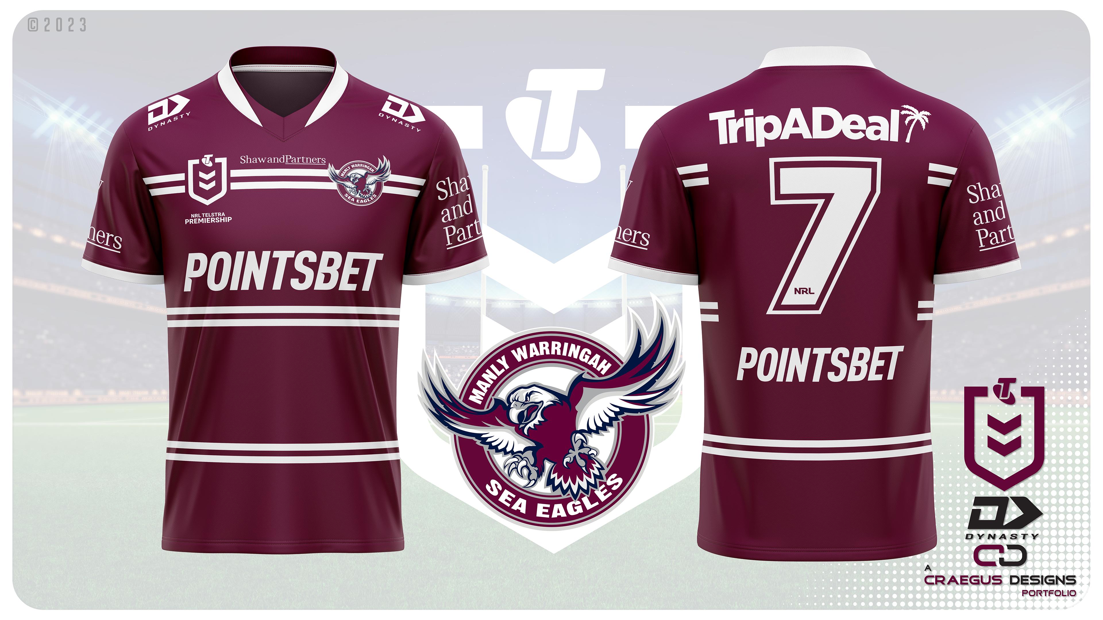
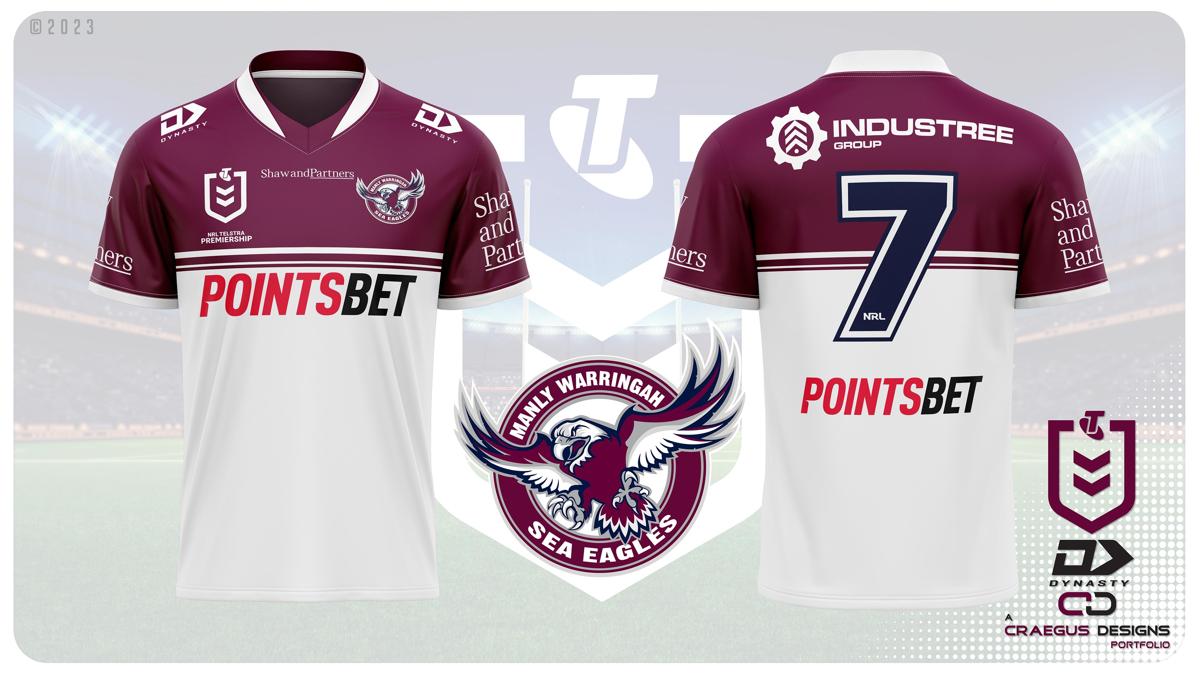
This is the sequel of the 2018 portfilio The NRL By ISC. As with the previous portfolio and with the current NRL, the league is currently outfitted by multiple companies, however Dynasty has been designing some of the better team designs in recent years. This portfolio makes Dynasty the sole supplier of all 17 NRL teams. Just like the previous NRL by ISC portfolio, I am going to present not what I think Dynasty might produce, but rather what I would like to see them produce. Each team will have a home and away jersey and for each team I will try and make sure that with either design no clashes would occur across the league. Many designs will be recognisable as either remakes of previous designs or variations on them, but there will also be new designs. Sponsors will also be presented as they are currently, with the only time changes occur will be if the jersey background colour causes a clash, and no reference for how the logo would look is available.

Teams will be released in alphabetical order, and will have each jersey released in separate posts (to add some suspense about the looks).

Oh and one more thing, just like the last series, there will be NO side panels, they are still gone, and never to return.

So with that, lets begin...
 

Log in to remove this ad.

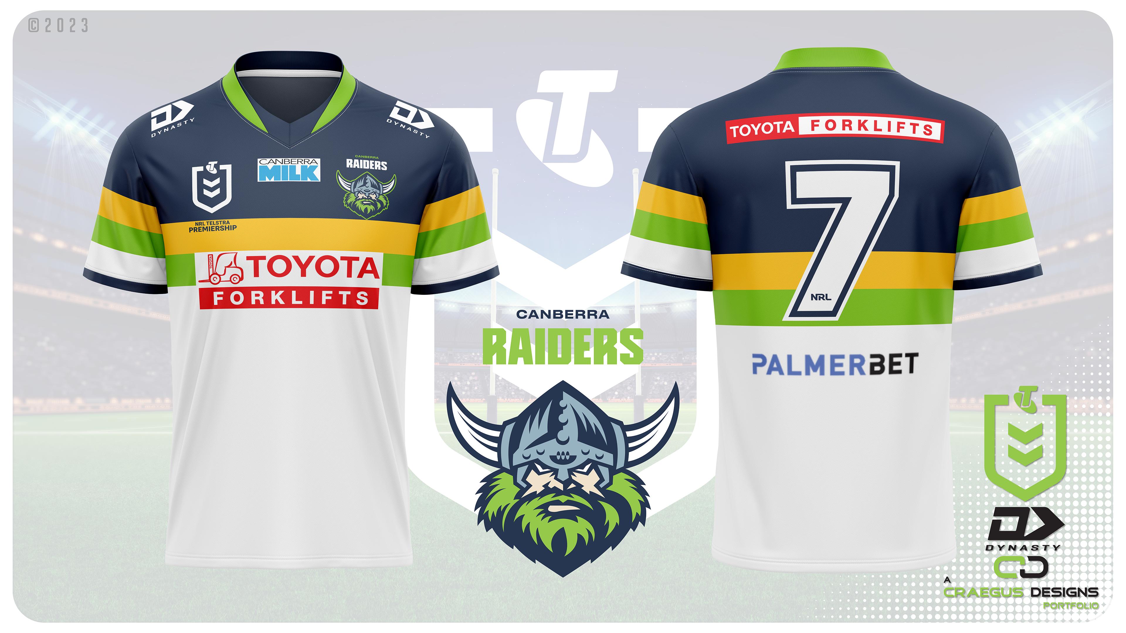
Canberra's current away jersey is good, better than what they have had recently, but I thought that a better solution would be the other design from the period that the current design is based on, especially one that allows for the majority of the design to be seen rather than one that has to be cut off completely due to sponsors. So a modern coloured take on a classic alternate jersey from 1992 is the way that I went.

Oi1gh0A.jpg
I don't think this was an alt, pretty sure they wore it for a tour game when GB came over (not that it matters).

A few years ago (around their GF run IIRC) they remade the cotton version as a retro and some T-shirts - was super popular.
 
I don't think this was an alt, pretty sure they wore it for a tour game when GB came over (not that it matters).

A few years ago (around their GF run IIRC) they remade the cotton version as a retro and some T-shirts - was super popular.

Still counts as an alternate design from that year. Doesn't matter how often it was worn :tongueclosed:
 
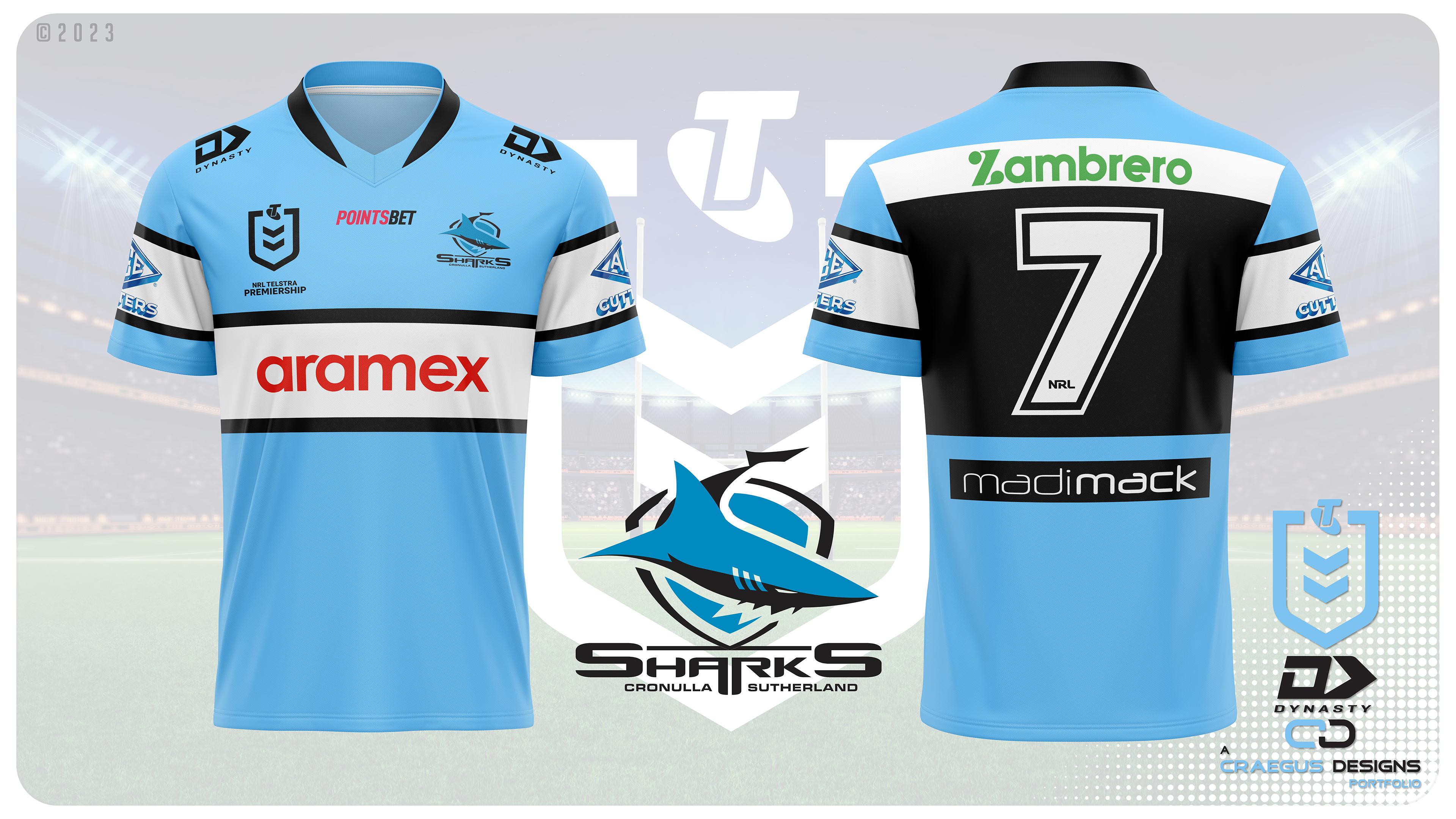
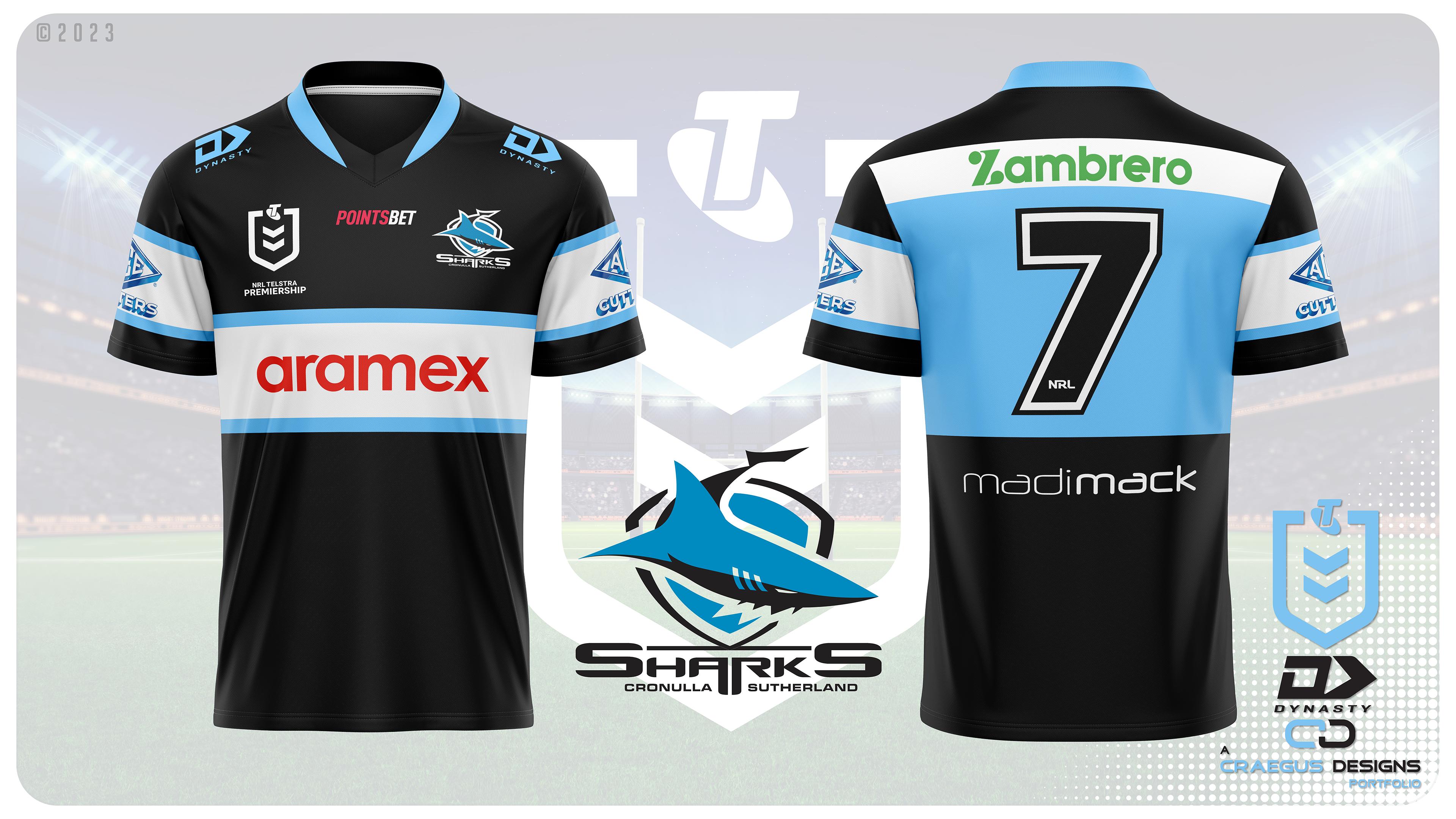
Time for the Cronulla-Sutherland Sharks alternate. Plenty to choose from in regards to designs for this one. I did consider a different design, but when recolouring it, I hated the look. So I have gone with.....

The inverse of the home. It just works.

hBtpivv.jpg
 
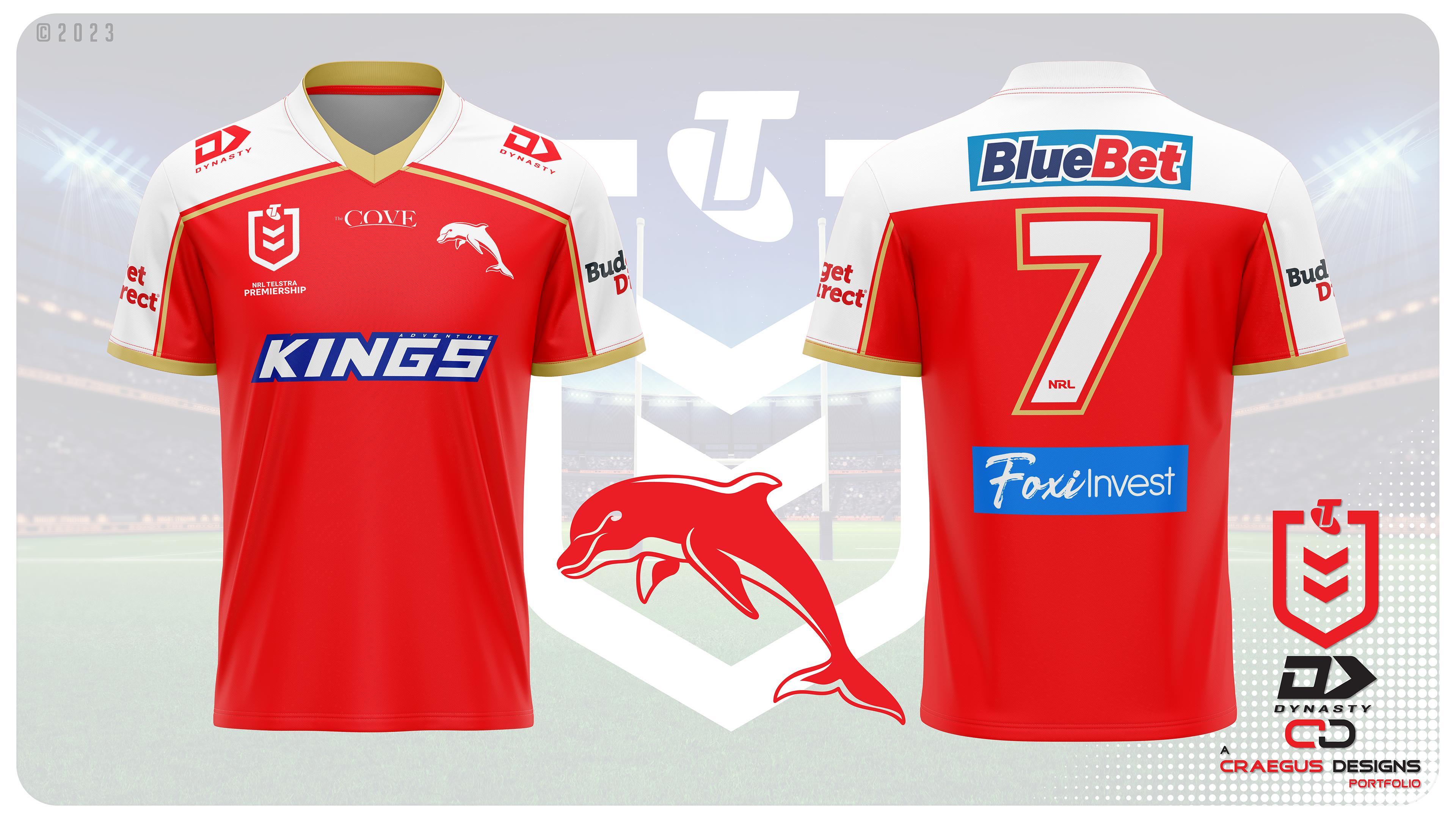
Up next is the {just give yourself a location name, it is horrible to not be able to use Redcliffe} Dolphins.

Did I keep something similar to their current home design?

Not a chance.

Is it similar to the heritage, but with a modernisation.

Absolutely.

iA3gvuD.jpg


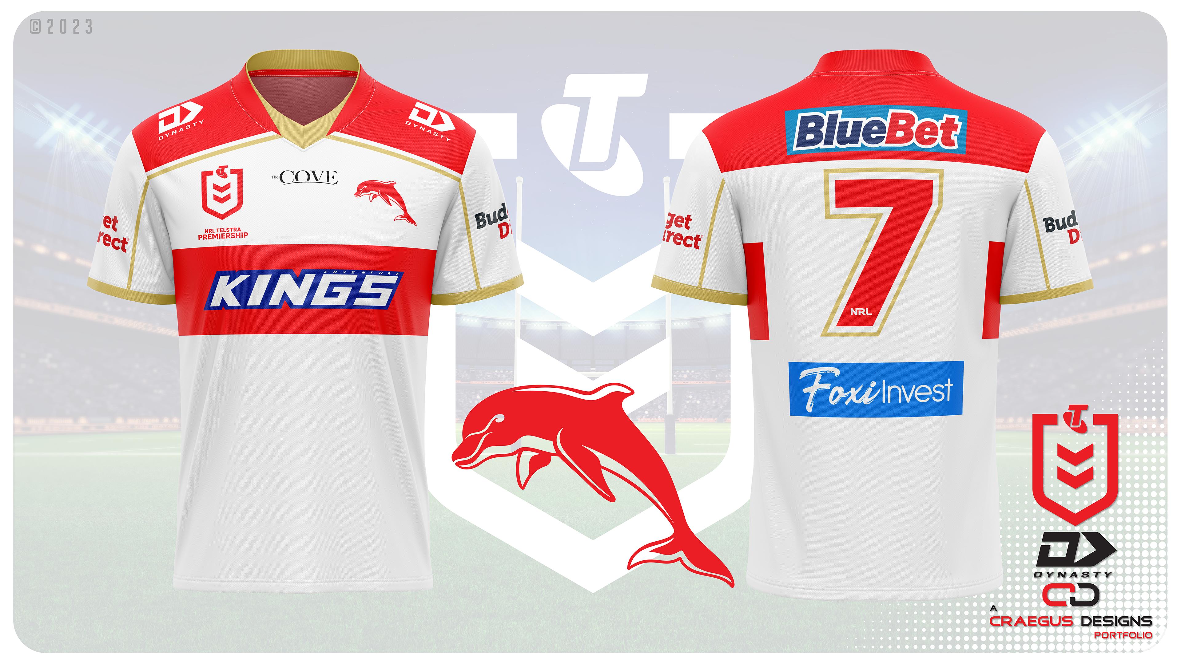
So I can safely say that everyone will know which direction I didn't go with the alternate, but which way did I go?
 

(Log in to remove this ad.)

Up next is the {just give yourself a location name, it is horrible to not be able to use Redcliffe} Dolphins.

Did I keep something similar to their current home design?

Not a chance.

Is it similar to the heritage, but with a modernisation.

Absolutely.

iA3gvuD.jpg


So I can safely say that everyone will know which direction I didn't go with the alternate, but which way did I go?
I don't know if its because I'm from SA and haven't had anything to do with rugby league, and thus don't know the history behind the league or the sport and its teams but I really like the jersey that the Dolphins chose, especially compared with the gold coast suns which use the same colours with a terrible design.

With that being said I still don't mind your design.

Everyone is fully entitled to their opinions, and if the Dolphins didn't have such a history within the sport, then maybe the design wouldn't have been hated on so much. But they have tried to push forward with a brand that just doesn't work when everyone that knows league knows about the club that came before.

But it is what it is.
 
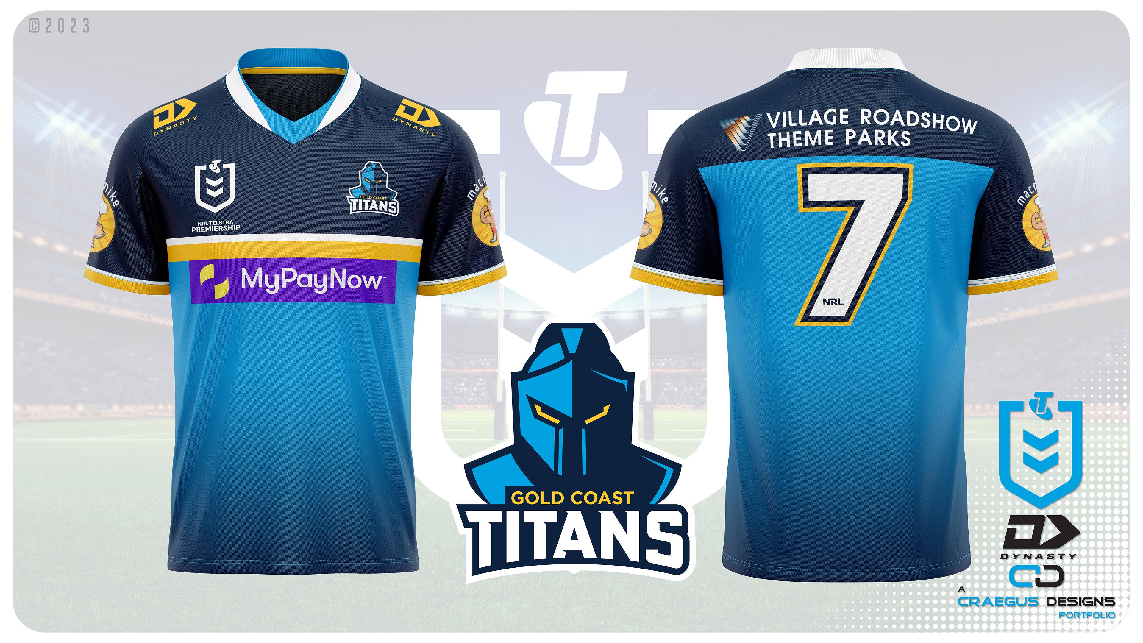
The Gold Coast Titans are up. The design doesn't deviate too much from their recent designs, though I moved the gold an white bar down, and made the shoulder dark blue.

6ry9dca.jpg


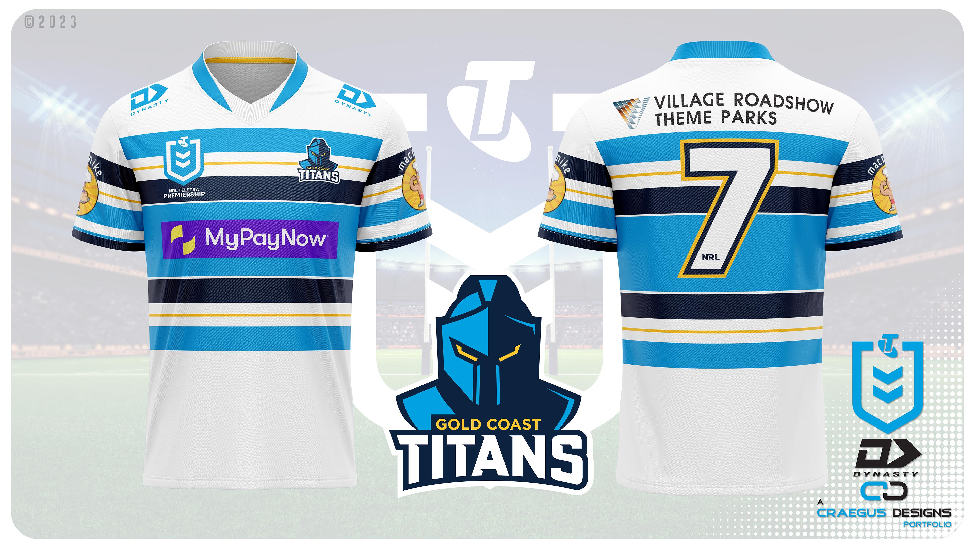
The alternate I can guarantee is not an inverse, and had some history to it.
 
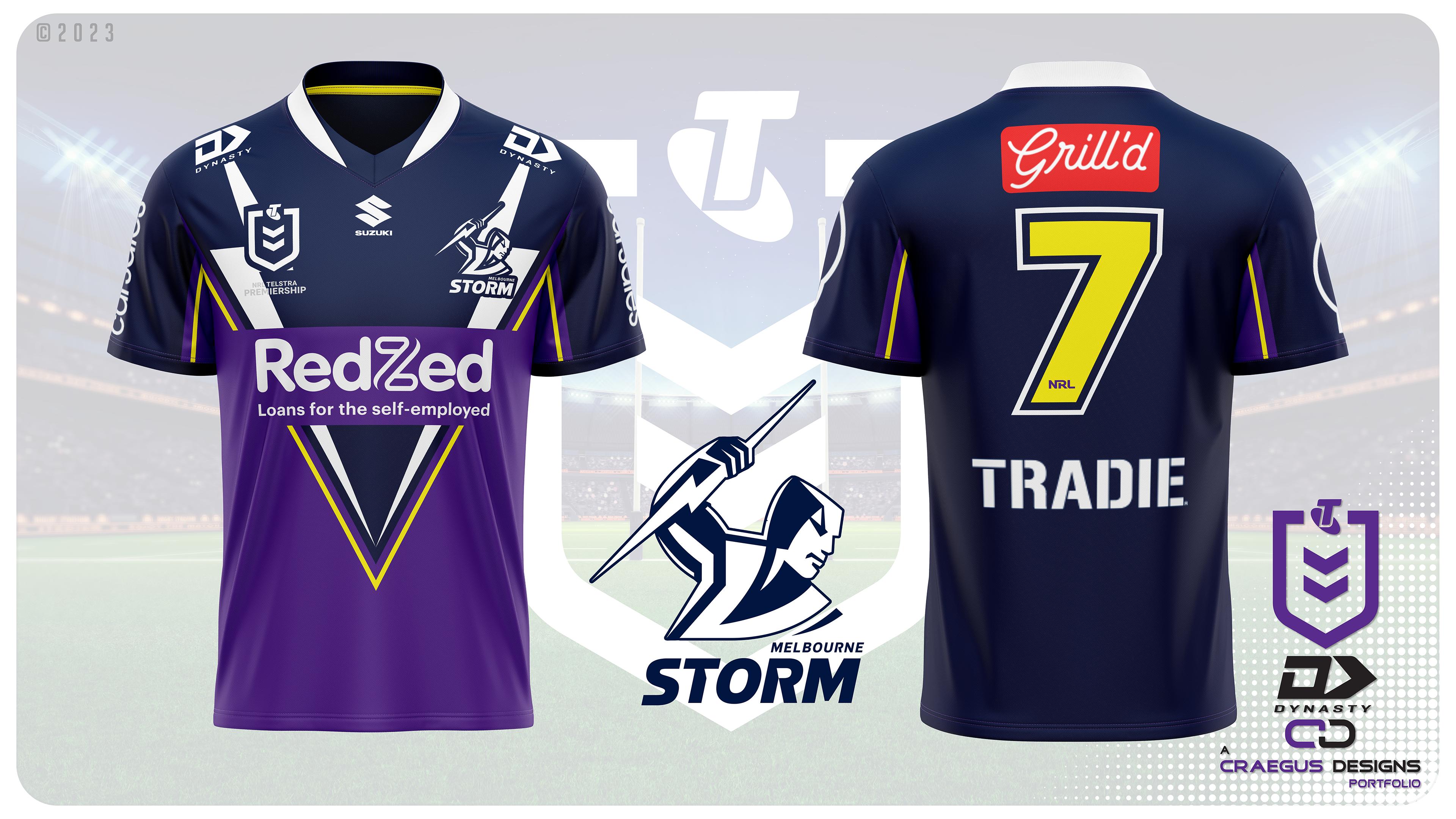
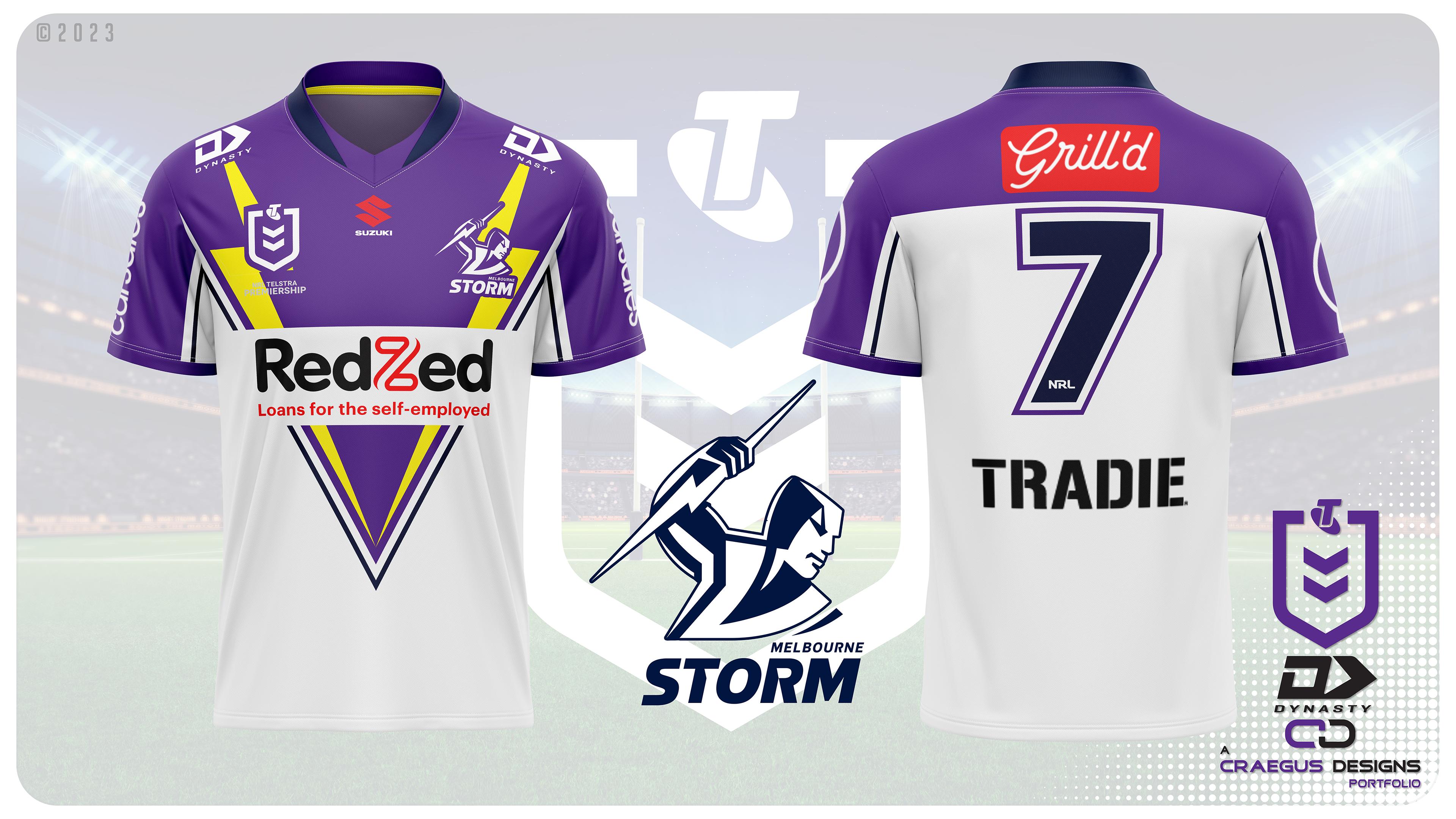
And now for the Melbourne Storm. Back are the bolts, the old style, things that Castore have not done. Classic Melbourne, and what they should be wearing.

SP39W25.jpg

Such a nice jumper. I always liked the bolts.
 
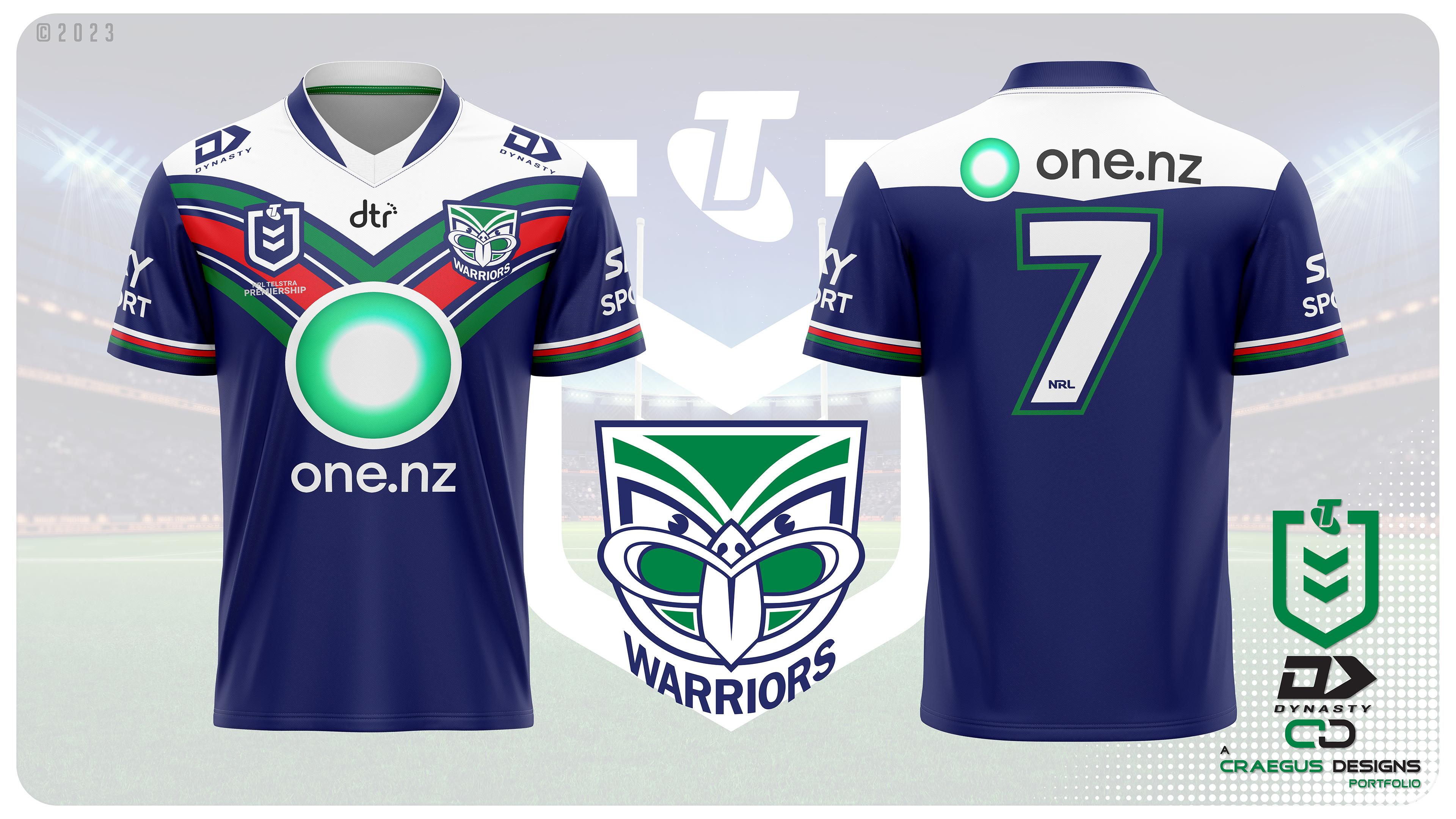
The New Zealand Warriors are up. The current V remains, but with a retro curve added to it to make it unique to the Warriors, and the return of the white at the top. The back also features the curved V but at a far more shallow angle.

J0qW2ze.jpg


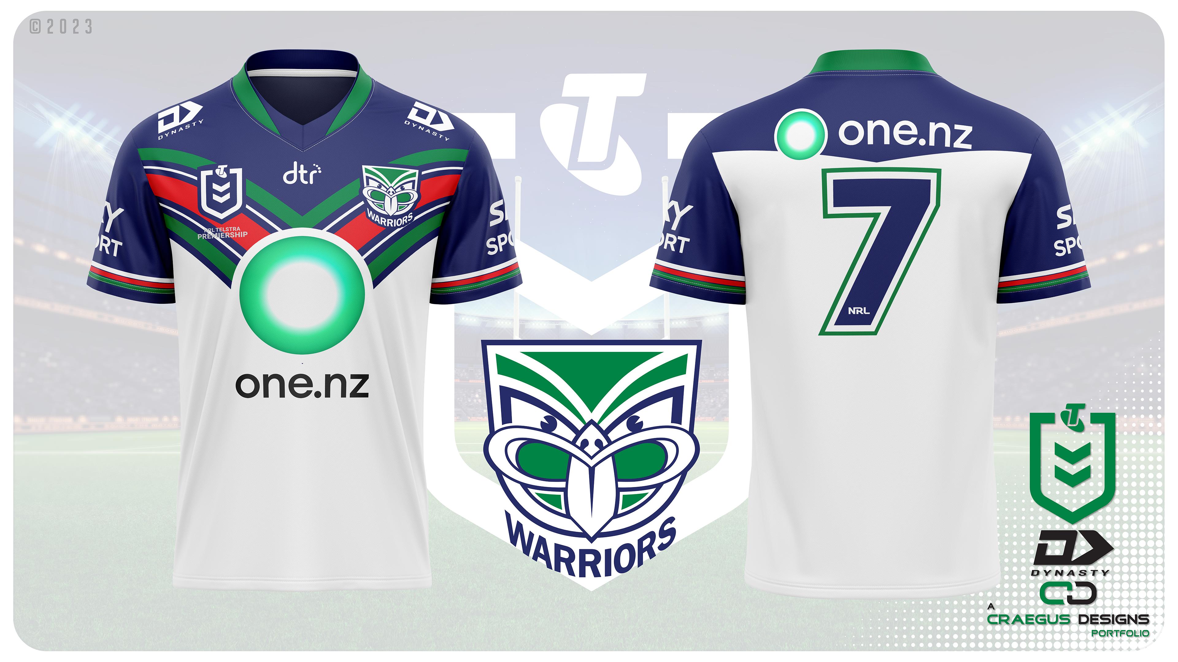
The away should be easy to figure out, but we will see.
 

Remove this Banner Ad

Back
Top