- Moderator
- #1
Money.
But – there's a bit more to the story than that. Yes, the change and introduction of an "innovative" new pre-season jumper alongside an evolutionary home jumper coincided with a lucrative Adidas merchandising contract, but Eddie and the Pies also spun history and a return to tradition as a reason for their controversial 2001 guernsey change.
The Pies, despite their strong beliefs, had not relented in adopting alternative strips throughout the 1990s. With the AFL keen for clubs to expand their design horizons during the pre-season competition, the mid-90s saw a number of clubs look for extra revenue through the adoption of radically different guernsey designs.
The 1995 Ansett Cup – the first year these alternative strips were displayed – saw Fitzroy, Footscray, Hawthorn and North Melbourne experiment with new colours and patterns. The following year saw Adelaide, Collingwood, Melbourne and St Kilda also jump on the pre-season bandwagon. The Pies' 'barcode' attempt was arguably the most garish of the lot, but it showed that the club was not afraid of change.

Gavin Brown, Damian Monkhorst and Nathan Buckley model the club's new pre-season kit in 1996.
The first inkling of the club potentially changing its kit in the home-and-away season was raised by Age journalist Rohan Connolly in an article published on the 20th of April, 1997. Then-president Kevin Rose declared that the black and white colours were "sacrosanct", but that the club was open to the idea of changing their design for an away strip.
Connolly explained how Rose quickly hosed down suggestions that the Pies were to "relinquish the black-and-white stripes" as part of a proposed sponsorship deal with insurance company FAI.
"I think the day will come when most clubs will change their jumper for away games as a marketing tool," Rose said.
Kevin Rose, Collingwood's president from 1996–99.
"The traditional colors will always remain and maybe we would just do something like we had in the pre-season competition with a Magpie on the jumper. But I think there will be some changes to away jumpers in the "not too distant" future," Rose continued.
"We would consider it, we consider every proposal. The thing we must be very careful about is that the traditions of Collingwood don't blur our vision for the future."
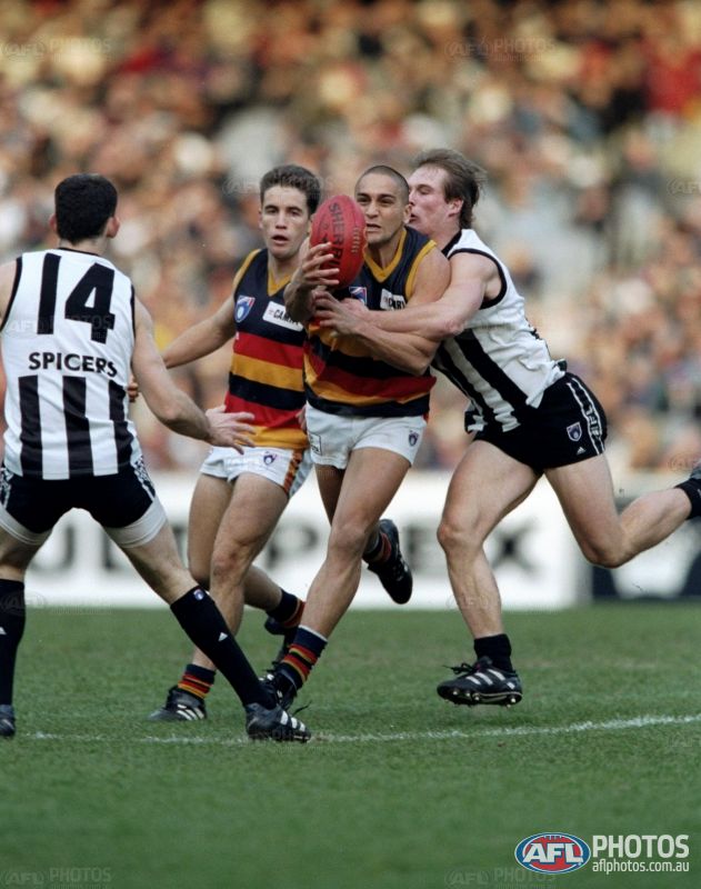
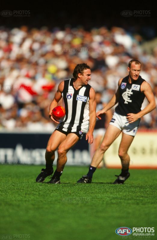
By 1998, the club had switched apparel sponsors from Puma to Adidas and "the brand with the three stripes" had inventive plans for their portfolio of AFL clubs. Geelong was earning nearly a quarter of a million dollars a year wearing a controversial navy blue 'away' strip that prominently showed off the three stripes in full view on the chest; Fremantle utilised the wonders of sublimation with a 3D anchor; Adelaide had a new away guernsey in the pipeline for the following season to replace their existing pre-season jumper; and Collingwood explored white numbers on a black base for the first time with a tasteful new away jumper that featured a condensed version of the Magpie crest on the front.
Nathan Buckley in the Pies' first 'away' strip, worn from 1998–2000.
Veteran Age journalist Martin Flanagan exclaimed in his piece on "away clobber" in the paper's 1st April, 1998 edition, that Collingwood's new alternate guernsey was the pick of the bunch. "Its new guernsey actually emphasises its tradition," Flanagan said, "and serves to express the character of the club in a mildly different way".
The guernsey would last three seasons, scrapped at the same time the club renegotiated a merchandising deal with Adidas that would see a new home jumper and pre-season jumper (later to also become an away/clash jumper) introduced to the Magpies' wardrobe.
"Magpies get new look, but stripes still in" was the headline that the Age ran with on Saturday the 10th of February, 2001, ahead of Wednesday's guernsey reveal at the then-Colonial Stadium. The designs were still under wraps at this stage, but journalists had caught wind of the fact that the Ansett Cup design would feature "a much larger magpie" and that the club would wear only one uniform throughout the regular season.
Adidas and the Pies went with a new 'swooping magpie' motif for the 2001 Ansett Cup guernsey, which became the club's away/clash strip in the three seasons following.
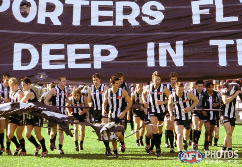
After Collingwood's VFL side dissolved at the conclusion of the 2000 season, the club aligned with traditional VFA stalwarts Williamstown for the beginning of 2001 and manufactured a divisive agreement that would see the Seagulls wear the Collingwood pre-season strip for two curtain-raiser games in the regular VFL season, while donning their traditional blue and gold for all other matches. Collingwood president Eddie McGuire saw this as a way to emphasise the importance of the black and white stripes in the senior team, and the new-found exclusivity of the design, saying it would now "mean something more special".
McGuire also said that the reaction from sports retailers towards the club's new pre-season jumper was far beyond its expectations. "We gave some of the trade stores a sneak preview and they've already tripled their orders," he boasted.
The Mercury ran a syndicated article on the 15th of February, 2001, post the announcement of the designs and the headline spoke of the Pies going "back to the future". The lead paragraph, believe it or not, read as follows:
"COLLINGWOOD turned back the clock today with the unveiling of its new football guernsey.
"The new jumper has the traditional white-on-black stripes, first worn by the 1917 premiership side -- as opposed to the black-on-white stripes of recent seasons."
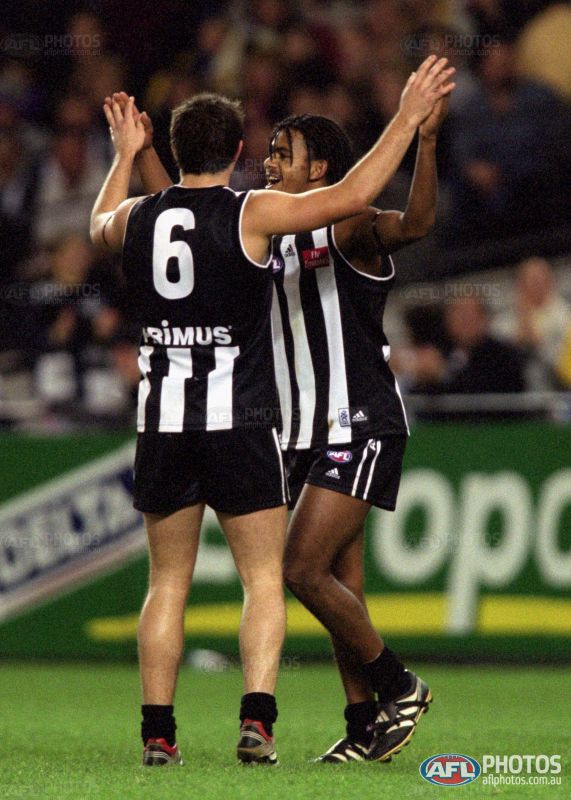
Collingwood's new home jumper for the 2001 season.
Brodie Holland and Leon Davis celebrate in the new black-backed guernsey.
The article went on to say:
"As well as being worn by the 1917 premiership side, the traditional jumper also featured in the first two of the club's record-breaking sequence of four premierships between 1927-30."
McGuire hoped to generate merchandise sales of over $1 million in the 2001 season alone from the release of these jumpers. But it is the 'tradition' line that draws the most attention to us guernsey fanatics. The dates, in particular, prompt further investigation.
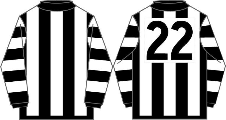
Mero's depiction of the Pies' 1917 jumper – which he states was worn from 1912 to 1922 – does actually feature white stripes on a black base. This is most evident by the middle stripe being white, as it is on the current home guernsey, compared to the rest of the jumpers following it which all have a black middle stripe.
Collingwood's 1917 jumper, courtesy of footyjumpers.com
What loses the illusion of this being a black based jumper is the stitched-on white number panel. Due to the manufacturing limits of the time, the stripes couldn't be cut off at the back like they are today, therefore a number panel was necessary, and it can only be assumed that the white panel with black numbers was not only easier to source but was also more readable in adverse weather.
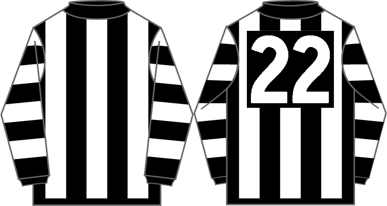
If we modify the above guernsey to have a black number panel instead of a white one, the base colour is more evident.
Collingwood's 1917 jumper, modified to feature a black number panel rather than white.
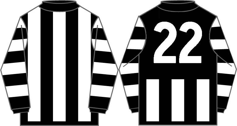
Furthermore, cutting off the stripes at the top and bottom like what is the norm in today's day and age, even more so highlights that the Magpies did in fact wear a black jumper with white stripes nearly 100 years ago.
The 1917 strip further modified to feature modern cut-off stripes.
Without the close inspection and the articles I researched, I was never aware of this revelation and I'm sure many of you are the same. But the more puzzling of the claims in the article is that the Pies wore a black-based guernsey in 1927 and '28 – the first two of the four premierships in the famed 'Machine' dynasty.
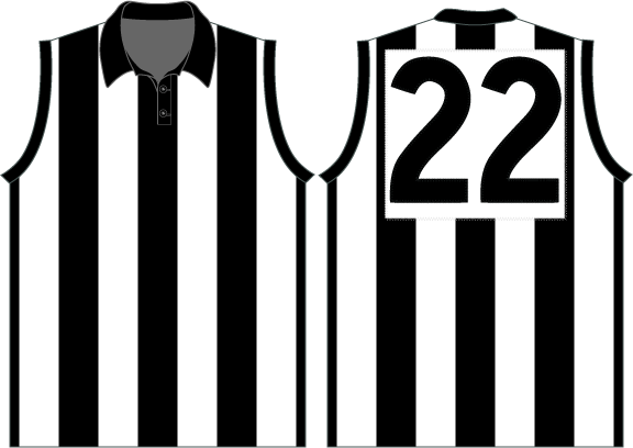
Our favourite footy jumper expert Mero has the following jumper – the basic design being Collingwood's most well-known – starting to be worn in 1923.
Collingwood's 1923–52 jumper, courtesy of footyjumpers.com
My own somewhat limited research doesn't necessary link up with this timeline (and I endeavour to explore this further over the summer), and the historic collection of Boyles Football Photos can be used to back up this claim. The split between black-on-white and white-on-black appeared to be 50/50 for most of the 'tens' decade, likely due to there being no standardised manufacturer, but by 1922 the club appeared more uniform in its appearance.
The majority of players in this 1922 team photo wear a guernsey with a black base.
The 1927 side wore guernseys that looked almost like rowing singlets of the time, but again featured a white stripe in the middle with distinctive buttons allowing the guernsey to be loosened or tightened to the player's preference.
The 1927 Collingwood premiership team wore a black-based variant.
In 1928, the Pies changed their uniform once more, and this time progressed to the 'black stripes on white' which we most associate the club with during the 20th century. These guernseys feature a regular collar and leads me to believe that the guernsey which footyjumpers.com has starting in 1923, in fact began in 1928.
Only three players – Jack Beveridge, Percy Rowe and John 'Jiggy' Harris – wore the collarless, black-based guernseys of the previous season in this 1928 team photo.
The 1929 and 1930 'Machine' premiership photos utilised the same design, which continued in various guises until that defining redesign in 2001.
A cursory glance at Collingwood's home guernseys on footyjumpers.com show that the Magpies began wearing a black-based guernsey with a white middle stripe from the time that woollen jumpers were most commonly worn, around 1908. Prior to this, it is difficult to ascertain the base colour on early lace-up jumpers.
Ultimately, it can be said with relative confidence that Collingwood wore a black-based guernsey for at least 20 seasons throughout the early years of their history, and the 2001 redesign was not revolutionary – merely evolutionary, and based heavily on the premiership-winning designs of decades gone by.
But – there's a bit more to the story than that. Yes, the change and introduction of an "innovative" new pre-season jumper alongside an evolutionary home jumper coincided with a lucrative Adidas merchandising contract, but Eddie and the Pies also spun history and a return to tradition as a reason for their controversial 2001 guernsey change.
The Pies, despite their strong beliefs, had not relented in adopting alternative strips throughout the 1990s. With the AFL keen for clubs to expand their design horizons during the pre-season competition, the mid-90s saw a number of clubs look for extra revenue through the adoption of radically different guernsey designs.
The 1995 Ansett Cup – the first year these alternative strips were displayed – saw Fitzroy, Footscray, Hawthorn and North Melbourne experiment with new colours and patterns. The following year saw Adelaide, Collingwood, Melbourne and St Kilda also jump on the pre-season bandwagon. The Pies' 'barcode' attempt was arguably the most garish of the lot, but it showed that the club was not afraid of change.
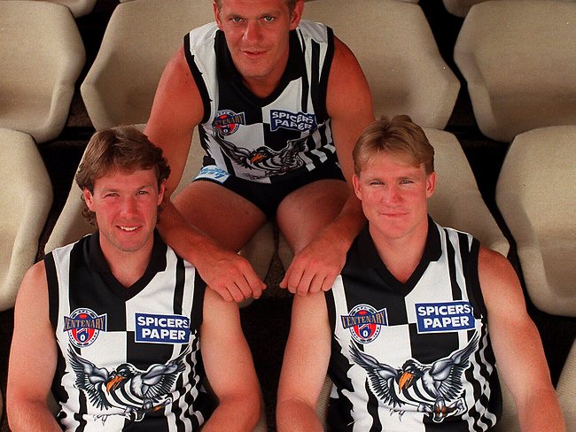
Gavin Brown, Damian Monkhorst and Nathan Buckley model the club's new pre-season kit in 1996.
The first inkling of the club potentially changing its kit in the home-and-away season was raised by Age journalist Rohan Connolly in an article published on the 20th of April, 1997. Then-president Kevin Rose declared that the black and white colours were "sacrosanct", but that the club was open to the idea of changing their design for an away strip.
Connolly explained how Rose quickly hosed down suggestions that the Pies were to "relinquish the black-and-white stripes" as part of a proposed sponsorship deal with insurance company FAI.
"I think the day will come when most clubs will change their jumper for away games as a marketing tool," Rose said.

Kevin Rose, Collingwood's president from 1996–99.
"The traditional colors will always remain and maybe we would just do something like we had in the pre-season competition with a Magpie on the jumper. But I think there will be some changes to away jumpers in the "not too distant" future," Rose continued.
"We would consider it, we consider every proposal. The thing we must be very careful about is that the traditions of Collingwood don't blur our vision for the future."
By 1998, the club had switched apparel sponsors from Puma to Adidas and "the brand with the three stripes" had inventive plans for their portfolio of AFL clubs. Geelong was earning nearly a quarter of a million dollars a year wearing a controversial navy blue 'away' strip that prominently showed off the three stripes in full view on the chest; Fremantle utilised the wonders of sublimation with a 3D anchor; Adelaide had a new away guernsey in the pipeline for the following season to replace their existing pre-season jumper; and Collingwood explored white numbers on a black base for the first time with a tasteful new away jumper that featured a condensed version of the Magpie crest on the front.
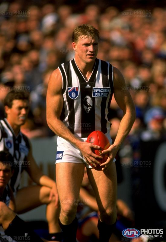
Nathan Buckley in the Pies' first 'away' strip, worn from 1998–2000.
Veteran Age journalist Martin Flanagan exclaimed in his piece on "away clobber" in the paper's 1st April, 1998 edition, that Collingwood's new alternate guernsey was the pick of the bunch. "Its new guernsey actually emphasises its tradition," Flanagan said, "and serves to express the character of the club in a mildly different way".
The guernsey would last three seasons, scrapped at the same time the club renegotiated a merchandising deal with Adidas that would see a new home jumper and pre-season jumper (later to also become an away/clash jumper) introduced to the Magpies' wardrobe.
"Magpies get new look, but stripes still in" was the headline that the Age ran with on Saturday the 10th of February, 2001, ahead of Wednesday's guernsey reveal at the then-Colonial Stadium. The designs were still under wraps at this stage, but journalists had caught wind of the fact that the Ansett Cup design would feature "a much larger magpie" and that the club would wear only one uniform throughout the regular season.
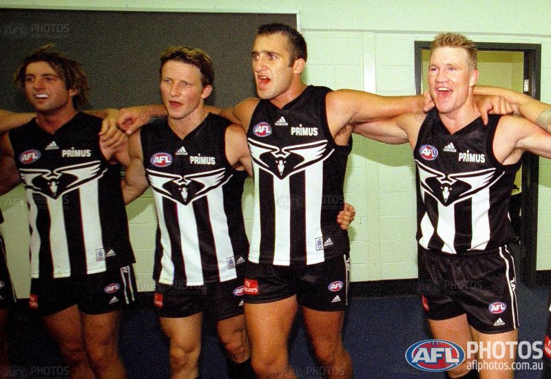
Adidas and the Pies went with a new 'swooping magpie' motif for the 2001 Ansett Cup guernsey, which became the club's away/clash strip in the three seasons following.
After Collingwood's VFL side dissolved at the conclusion of the 2000 season, the club aligned with traditional VFA stalwarts Williamstown for the beginning of 2001 and manufactured a divisive agreement that would see the Seagulls wear the Collingwood pre-season strip for two curtain-raiser games in the regular VFL season, while donning their traditional blue and gold for all other matches. Collingwood president Eddie McGuire saw this as a way to emphasise the importance of the black and white stripes in the senior team, and the new-found exclusivity of the design, saying it would now "mean something more special".
McGuire also said that the reaction from sports retailers towards the club's new pre-season jumper was far beyond its expectations. "We gave some of the trade stores a sneak preview and they've already tripled their orders," he boasted.
The Mercury ran a syndicated article on the 15th of February, 2001, post the announcement of the designs and the headline spoke of the Pies going "back to the future". The lead paragraph, believe it or not, read as follows:
"COLLINGWOOD turned back the clock today with the unveiling of its new football guernsey.
"The new jumper has the traditional white-on-black stripes, first worn by the 1917 premiership side -- as opposed to the black-on-white stripes of recent seasons."
Collingwood's new home jumper for the 2001 season.
Brodie Holland and Leon Davis celebrate in the new black-backed guernsey.
The article went on to say:
"As well as being worn by the 1917 premiership side, the traditional jumper also featured in the first two of the club's record-breaking sequence of four premierships between 1927-30."
McGuire hoped to generate merchandise sales of over $1 million in the 2001 season alone from the release of these jumpers. But it is the 'tradition' line that draws the most attention to us guernsey fanatics. The dates, in particular, prompt further investigation.
Mero's depiction of the Pies' 1917 jumper – which he states was worn from 1912 to 1922 – does actually feature white stripes on a black base. This is most evident by the middle stripe being white, as it is on the current home guernsey, compared to the rest of the jumpers following it which all have a black middle stripe.
Collingwood's 1917 jumper, courtesy of footyjumpers.com
What loses the illusion of this being a black based jumper is the stitched-on white number panel. Due to the manufacturing limits of the time, the stripes couldn't be cut off at the back like they are today, therefore a number panel was necessary, and it can only be assumed that the white panel with black numbers was not only easier to source but was also more readable in adverse weather.
If we modify the above guernsey to have a black number panel instead of a white one, the base colour is more evident.
Collingwood's 1917 jumper, modified to feature a black number panel rather than white.
Furthermore, cutting off the stripes at the top and bottom like what is the norm in today's day and age, even more so highlights that the Magpies did in fact wear a black jumper with white stripes nearly 100 years ago.
The 1917 strip further modified to feature modern cut-off stripes.
Without the close inspection and the articles I researched, I was never aware of this revelation and I'm sure many of you are the same. But the more puzzling of the claims in the article is that the Pies wore a black-based guernsey in 1927 and '28 – the first two of the four premierships in the famed 'Machine' dynasty.
Our favourite footy jumper expert Mero has the following jumper – the basic design being Collingwood's most well-known – starting to be worn in 1923.
Collingwood's 1923–52 jumper, courtesy of footyjumpers.com
My own somewhat limited research doesn't necessary link up with this timeline (and I endeavour to explore this further over the summer), and the historic collection of Boyles Football Photos can be used to back up this claim. The split between black-on-white and white-on-black appeared to be 50/50 for most of the 'tens' decade, likely due to there being no standardised manufacturer, but by 1922 the club appeared more uniform in its appearance.
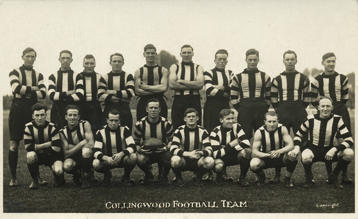
The majority of players in this 1922 team photo wear a guernsey with a black base.
The 1927 side wore guernseys that looked almost like rowing singlets of the time, but again featured a white stripe in the middle with distinctive buttons allowing the guernsey to be loosened or tightened to the player's preference.
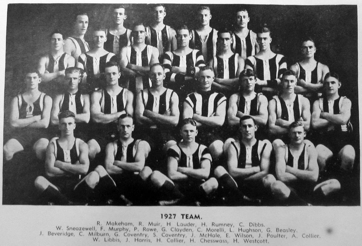
The 1927 Collingwood premiership team wore a black-based variant.
In 1928, the Pies changed their uniform once more, and this time progressed to the 'black stripes on white' which we most associate the club with during the 20th century. These guernseys feature a regular collar and leads me to believe that the guernsey which footyjumpers.com has starting in 1923, in fact began in 1928.
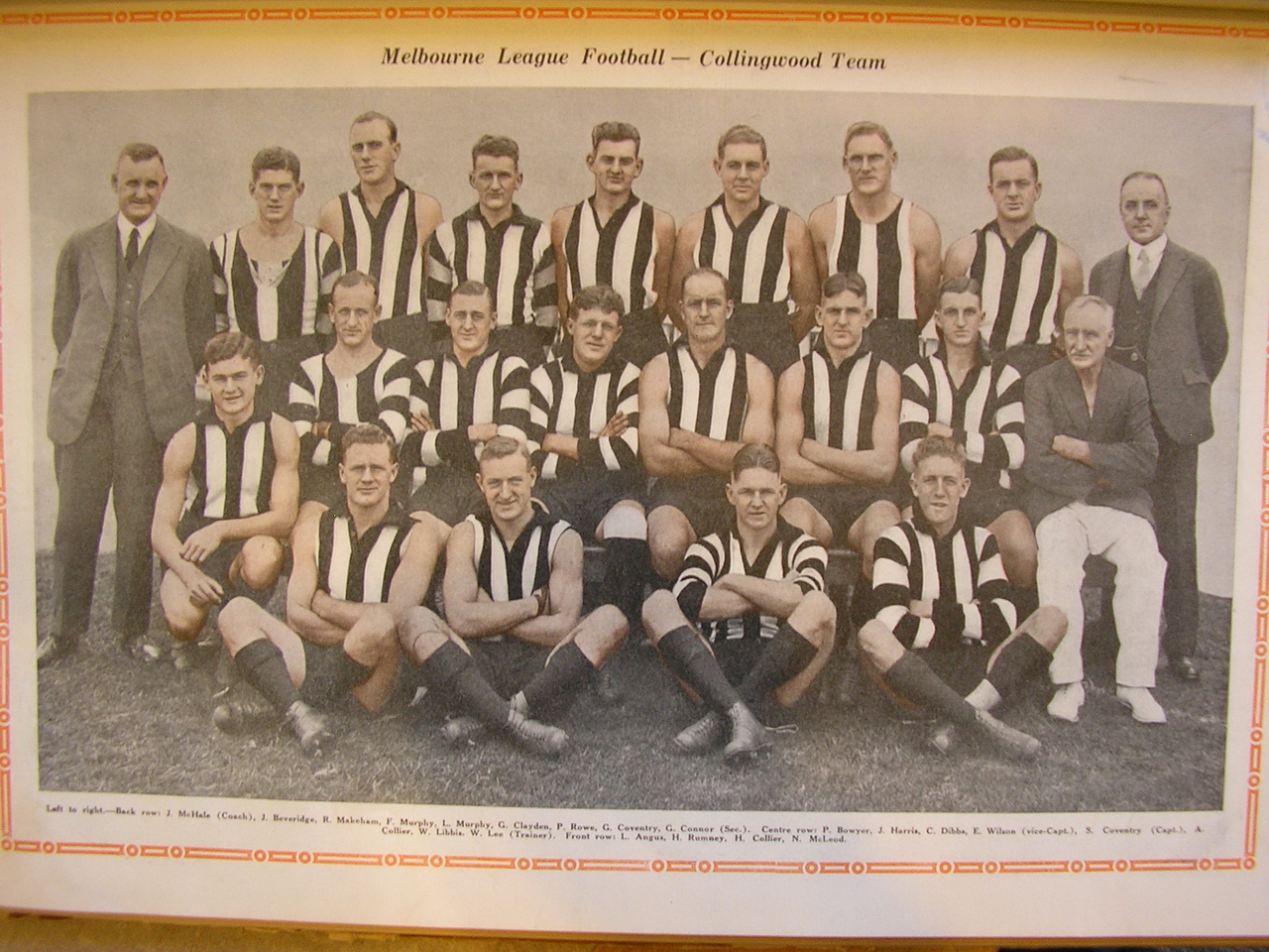
Only three players – Jack Beveridge, Percy Rowe and John 'Jiggy' Harris – wore the collarless, black-based guernseys of the previous season in this 1928 team photo.
The 1929 and 1930 'Machine' premiership photos utilised the same design, which continued in various guises until that defining redesign in 2001.
A cursory glance at Collingwood's home guernseys on footyjumpers.com show that the Magpies began wearing a black-based guernsey with a white middle stripe from the time that woollen jumpers were most commonly worn, around 1908. Prior to this, it is difficult to ascertain the base colour on early lace-up jumpers.
Ultimately, it can be said with relative confidence that Collingwood wore a black-based guernsey for at least 20 seasons throughout the early years of their history, and the 2001 redesign was not revolutionary – merely evolutionary, and based heavily on the premiership-winning designs of decades gone by.
Last edited: